
- ホスト アクティビティ:
TelecomActivity - Fragment:
DialpadFragment
横表示
レイアウト
@layout/dialpad_fragment を更新します
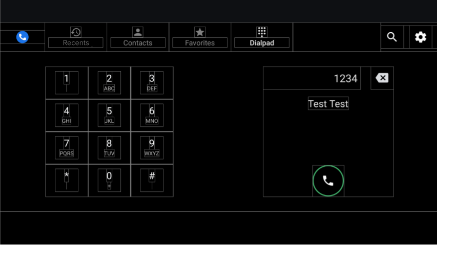
図 1. ダイヤルパッド画面
| コンポーネント [id:]ClassName | プロパティ | 値 |
|---|---|---|
keypad: KeypadFragment |
width |
主要ボタンの高さ、幅、パディングによって決まります |
| height | ||
dialpad_info: FrameLayout |
height |
キーパッドの高さと同じ |
width |
高さと同じ | |
divider: View |
layout_constraintGuide_percent |
0.5 |
キーパッド
- Fragment。
KeypadFragment - レイアウト。
@layout/keypad
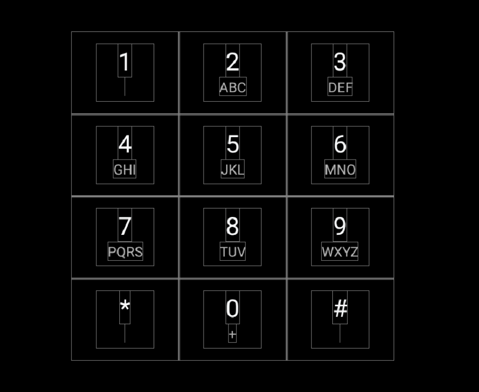
図 2. キーパッド
| コンポーネント [id:]ClassName | プロパティ | 値 |
|---|---|---|
| KeypadButtons | app:numberText |
1,2,3,4,5,6,7,8,9,*,0,# |
app:letterText |
"",ABC,DEF,GHI,JKL,MNO,PQRS,TUV,WXYZ,"",+,"" |
|
style |
@style/KeypadButtonStyle |
|
Layout |
縦横に詰められたチェーン |
分割線
@layout/keypad_dividers を更新します。456 dp 未満の短い画面では分割線を使用しないでください。
| コンポーネント [id:]ClassName | プロパティ | 値 |
|---|---|---|
| dividers | height |
@dimen/dialpad_line_divider_height (for horizontal dividers) |
width |
@dimen/dialpad_line_divider_height (for vertical dividers) |
|
background |
@color/divider_color |
KeypadButton
@KeypadButtonStyle は、FrameLayout を拡張する KeypadButton に適用されます。
| コンポーネント [id:]ClassName | プロパティ | 値 |
|---|---|---|
LinearLayout |
width |
@dimen/keypad_minimum_size |
height |
@dimen/keypad_minimum_size |
|
keypad_number: TextView |
style |
@style/KeypadNumber |
keypad_letters: TextView |
style |
@style/KeypadLetter |
textAllCaps |
true |
|
keypad_image: ImageView |
tint |
@color/car_key2 |
visibility |
gone |
ダイヤルパッド情報
レイアウト。@layout/dialpad_info
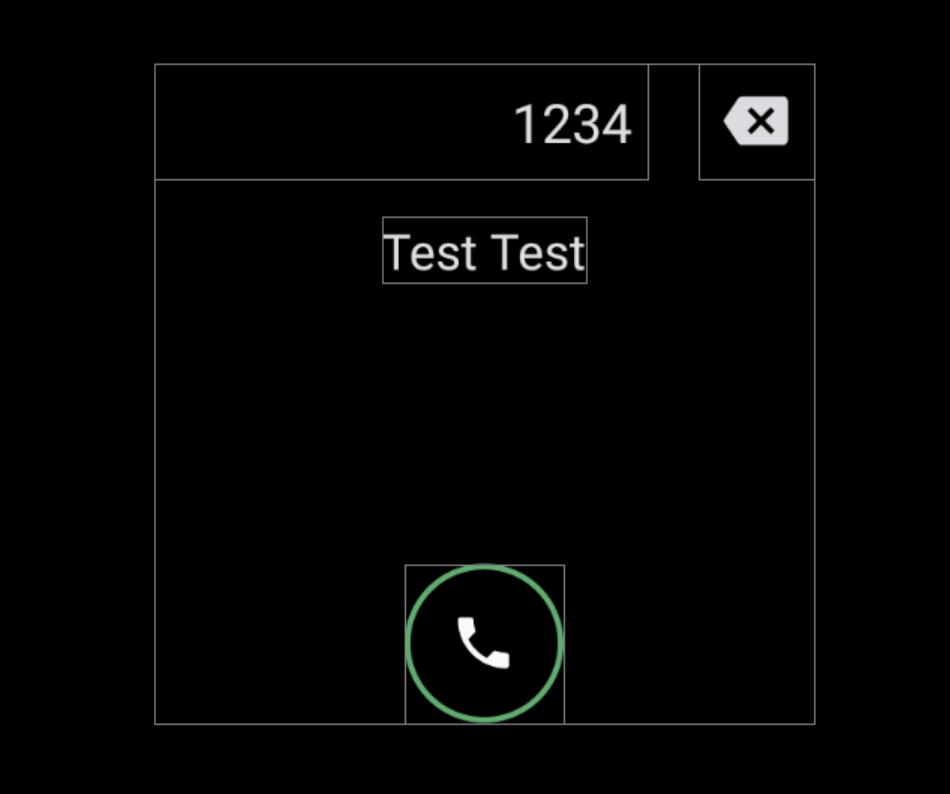
図 3. ダイヤルパッド情報
| コンポーネント [id:]ClassName | プロパティ | 値 |
|---|---|---|
|
AOSP リファレンスが、タイトル フィールドに入力モーションを実装しました。 モーションを無効にするには、 |
height |
@dimen/dialpad_info_title_container_size |
textAppearance |
@style/TextAppearance.DialNumber(このスタイルは、 DialpadFragment のプログラムによってタイトルにも適用されます。) |
|
autoSizeTextType |
uniform |
|
autoSizeMinTextSize |
@dimen/dialpad_info_title_text_size_min |
|
autoSizeMaxTextSize |
@dimen/dialpad_info_title_text_size_max |
|
delete_button: ImageView |
style |
@style/DialpadSecondaryButton |
src |
@drawable/ic_backspace |
|
marginStart/td>
| dimen/dialpad_info_title_padding_size |
|
call_button: ImageView |
style |
@style/DialpadPrimaryButton |
src |
@drawable/icon_call_button |
|
include @layout/dialpad_user_profile |
layout_marginTop |
@dimen/dialpad_user_profile_padding |
-
@layout/dialpad_user_profile- ラベルとアバターの表示について
@bool/config_show_detailed_user_profile_on_dialpadで制御します。デフォルト値はfalseで、表示名のみが表示されます。
コンポーネント [id:]ClassName プロパティ 値 display_name: TextViewtextAppearance@style/TextAppearance.DialpadDisplayNamelabel: TextViewtextAppearance?android:attr/textAppreanceSmalllayout_marginTop@dimen/dialpad_contact_label_margindialpad_contact_avatar: ImageViewwidth@dimen/dialpad_contact_avatar_sizeheight@dimen/dialpad_contact_avatar_size - ラベルとアバターの表示について
縦表示
レイアウト。@layout[-port]/dialpad_fragment
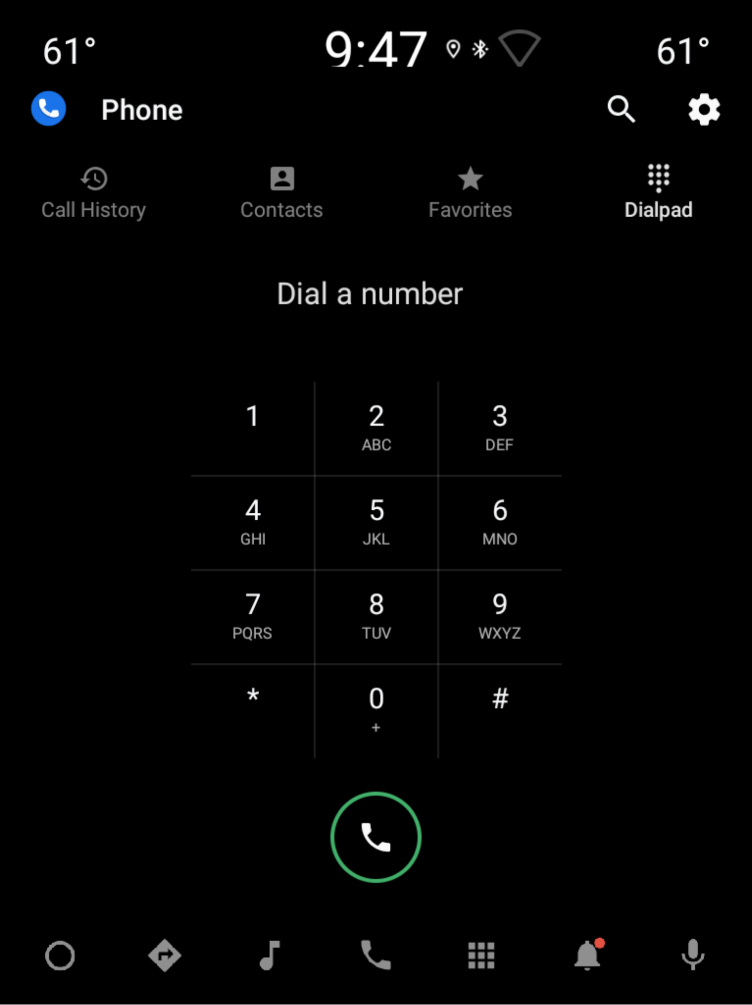
図 4. 縦表示
| コンポーネント [id:]ClassName | プロパティ | 値 |
|---|---|---|
keypad: KeypadFragment |
width |
主要ボタンの高さ、幅、パディングによって決まります。キーパッドをご覧ください。 |
| height | ||
include |
-- | 横表示のダイヤルパッド情報の dialpad_user_profile セクションをご覧ください。 |
divider: View |
layout_constraintGuide_percent |
0.5 |
title: TextView |
横表示のダイヤルパッド情報の title と同じです。 | |
delete_button: ImageView |
横表示のダイヤルパッド情報の delete_button と同じです。 | |
call_button: ImageView |
style |
@style/DialpadPrimaryButton |
height |
@dimen/call_button_height |
|
src |
@drawable/icon_call_button |
|
layout_marginBottom |
@dimen/call_button_bottom_margin |