
- Host activity:
TelecomActivity - Fragment:
DialpadFragment
Landscape mode
Layout
Update @layout/dialpad_fragment
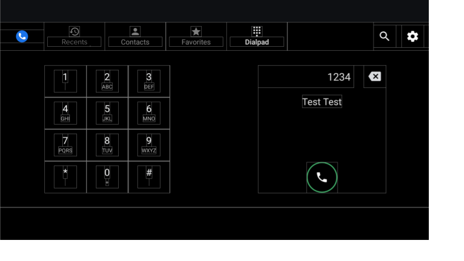
Figure 1. Dialpad screen
| Component [id:]ClassName | Property | Value |
|---|---|---|
keypad: KeypadFragment |
width |
Decided by the height, width, and padding of the key buttons |
| height | ||
dialpad_info: FrameLayout |
height |
Same as height of keypad |
width |
Same as height | |
divider: View |
layout_constraintGuide_percent |
0.5 |
Keypad
- Fragment.
KeypadFragment - Layout.
@layout/keypad
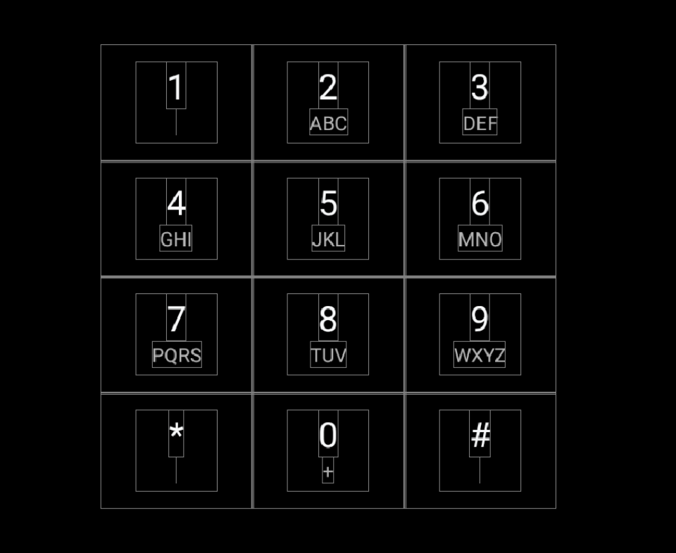
Figure 2. Keypad
| Component [id:]ClassName | Property | Value |
|---|---|---|
| KeypadButtons | app:numberText |
1,2,3,4,5,6,7,8,9,*,0,# |
app:letterText |
"",ABC,DEF,GHI,JKL,MNO,PQRS,TUV,WXYZ,"",+,"" |
|
style |
@style/KeypadButtonStyle |
|
Layout |
Packed chain vertically and horizontally |
Dividers
Update @layout/keypad_dividers. Do not use dividers on short screens less than
456dp.
| Component [id:]ClassName | Property | Value |
|---|---|---|
| dividers | height |
@dimen/dialpad_line_divider_height (for horizontal dividers) |
width |
@dimen/dialpad_line_divider_height (for vertical dividers) |
|
background |
@color/divider_color |
KeypadButton
@KeypadButtonStyle will be applied to the KeypadButton, which extends
FrameLayout.
| Component [id:]ClassName | Property | Value |
|---|---|---|
LinearLayout |
width |
@dimen/keypad_minimum_size |
height |
@dimen/keypad_minimum_size |
|
keypad_number: TextView |
style |
@style/KeypadNumber |
keypad_letters: TextView |
style |
@style/KeypadLetter |
textAllCaps |
true |
|
keypad_image: ImageView |
tint |
@color/car_key2 |
visibility |
gone |
Dialpad info
Layout. @layout/dialpad_info
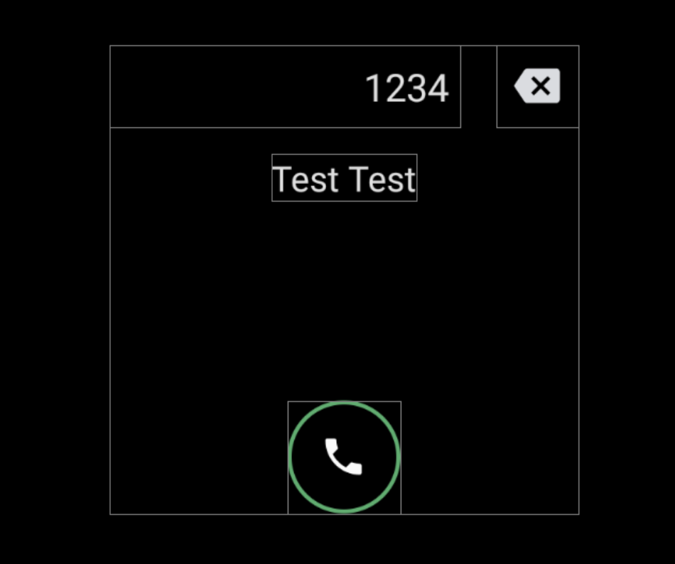
Figure 3. Dialpad info
| Component [id:]ClassName | Property | Value |
|---|---|---|
|
The AOSP reference implemented input motion on the title field. To disable the motion, override |
height |
@dimen/dialpad_info_title_container_size |
textAppearance |
@style/TextAppearance.DialNumber(This style is also applied to the title programmatically in the DialpadFragment.) |
|
autoSizeTextType |
uniform |
|
autoSizeMinTextSize |
@dimen/dialpad_info_title_text_size_min |
|
autoSizeMaxTextSize |
@dimen/dialpad_info_title_text_size_max |
|
delete_button: ImageView |
style |
@style/DialpadSecondaryButton |
src |
@drawable/ic_backspace |
|
marginStart/td>
| dimen/dialpad_info_title_padding_size |
|
call_button: ImageView |
style |
@style/DialpadPrimaryButton |
src |
@drawable/icon_call_button |
|
include @layout/dialpad_user_profile |
layout_marginTop |
@dimen/dialpad_user_profile_padding |
@layout/dialpad_user_profile is gated by
@bool/config_show_detailed_user_profile_on_dialpad to
display the label and avatar. Default value is false, which shows the display
name only.
| Component [id:]ClassName | Property | Value |
|---|---|---|
display_name: TextView |
textAppearance |
@style/TextAppearance.DialpadDisplayName |
label: TextView |
textAppearance |
?android:attr/textAppreanceSmall |
layout_marginTop |
@dimen/dialpad_contact_label_margin |
|
dialpad_contact_avatar: ImageView |
width |
@dimen/dialpad_contact_avatar_size |
height |
@dimen/dialpad_contact_avatar_size |
Portrait mode
Layout. @layout[-port]/dialpad_fragment
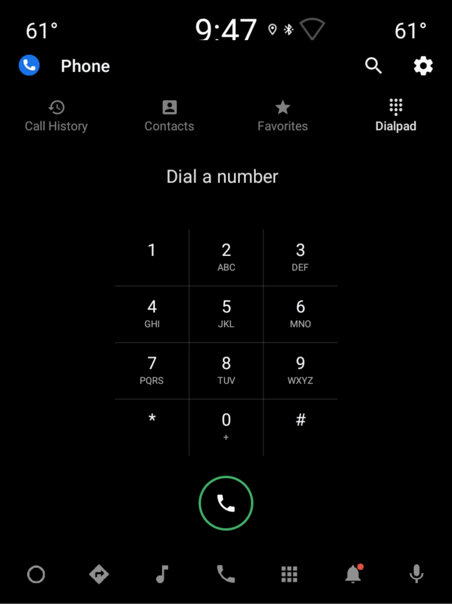
Figure 4. Portrait mode
| Component [id:]ClassName | Property | Value |
|---|---|---|
keypad: KeypadFragment |
width |
Decided by the height, width and padding of the key buttons, See Keypad. |
| height | ||
include |
N/A | See the dialpad_user_profile section in Dialpad info in landscape mode. |
divider: View |
layout_constraintGuide_percent |
0.5 |
title: TextView |
Same as title in Dialpad info in landscape mode. | |
delete_button: ImageView |
Same as delete_button in Dialpad info in landscape mode. | |
call_button: ImageView |
style |
@style/DialpadPrimaryButton |
height |
@dimen/call_button_height |
|
src |
@drawable/icon_call_button |
|
layout_marginBottom |
@dimen/call_button_bottom_margin |