
- Hostaktivität:
TelecomActivity - Fragment:
DialpadFragment
Querformat
Layout
@layout/dialpad_fragment aktualisieren
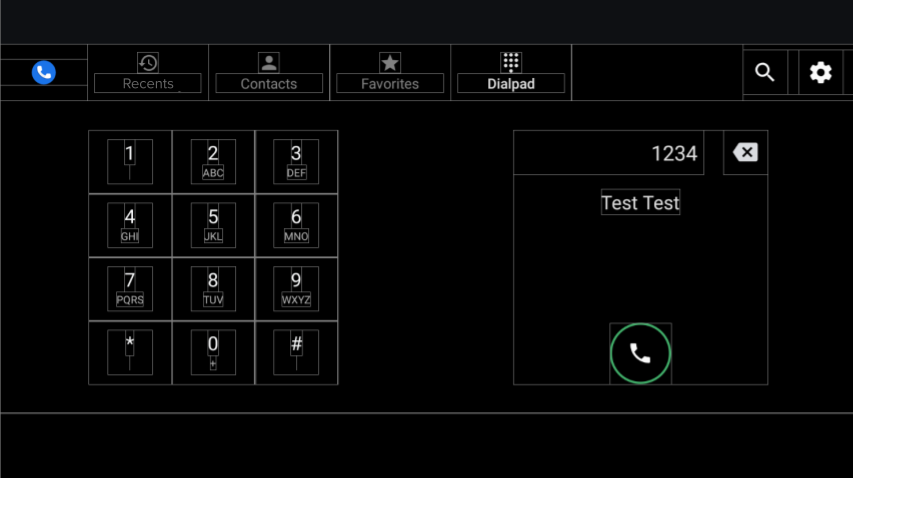
Abbildung 1: Wähltastenbildschirm
| Component [id:]ClassName | Property | Wert |
|---|---|---|
keypad: KeypadFragment |
width |
Wird durch Höhe, Breite und Abstand der wichtigsten Schaltflächen bestimmt |
| Größe | ||
dialpad_info: FrameLayout |
height |
Entspricht der Höhe der Tastatur |
width |
Entspricht der Höhe | |
divider: View |
layout_constraintGuide_percent |
0.5 |
Wähltastatur
- Fragment.
KeypadFragment - Layout.
@layout/keypad
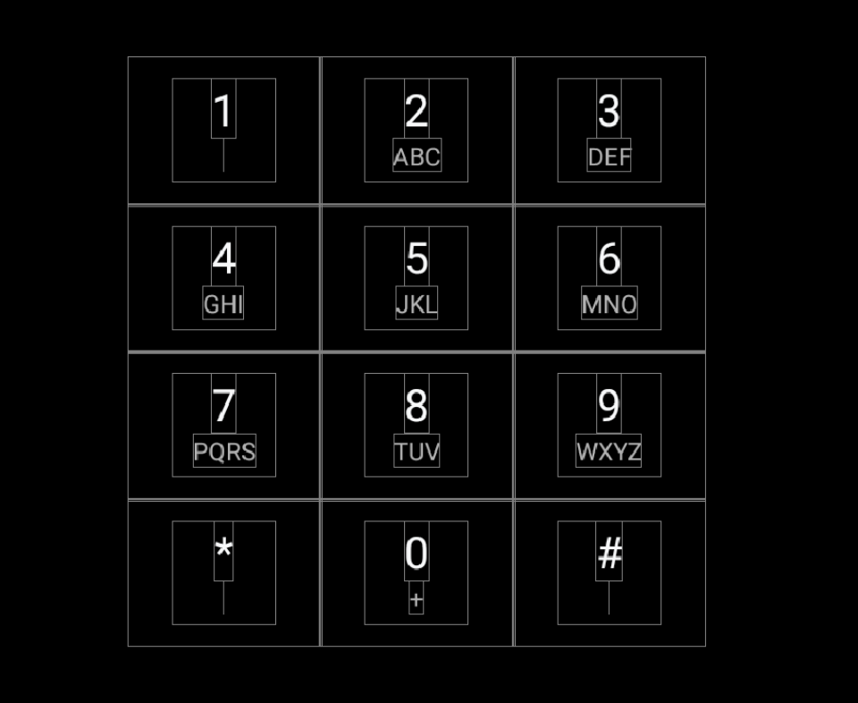
Abbildung 2: Wähltastatur
| Component [id:]ClassName | Property | Wert |
|---|---|---|
| KeypadButtons | app:numberText |
1,2,3,4,5,6,7,8,9,*,0,# |
app:letterText |
"",ABC,DEF,GHI,JKL,MNO,PQRS,TUV,WXYZ,"",+,"" |
|
style |
@style/KeypadButtonStyle |
|
Layout |
Vertikale und horizontale verpackte Kette |
Trennlinien
@layout/keypad_dividers aktualisieren. Verwenden Sie keine Trennlinien auf kurzen Bildschirmen mit weniger als 456 dp.
| Component [id:]ClassName | Property | Wert |
|---|---|---|
| Trennlinien | height |
@dimen/dialpad_line_divider_height (for horizontal dividers) |
width |
@dimen/dialpad_line_divider_height (for vertical dividers) |
|
background |
@color/divider_color |
KeypadButton
@KeypadButtonStyle wird auf KeypadButton angewendet, das FrameLayout erweitert.
| Component [id:]ClassName | Property | Wert |
|---|---|---|
LinearLayout |
width |
@dimen/keypad_minimum_size |
height |
@dimen/keypad_minimum_size |
|
keypad_number: TextView |
style |
@style/KeypadNumber |
keypad_letters: TextView |
style |
@style/KeypadLetter |
textAllCaps |
true |
|
keypad_image: ImageView |
tint |
@color/car_key2 |
visibility |
Nicht da |
Informationen zu Dialpad
Layout. @layout/dialpad_info
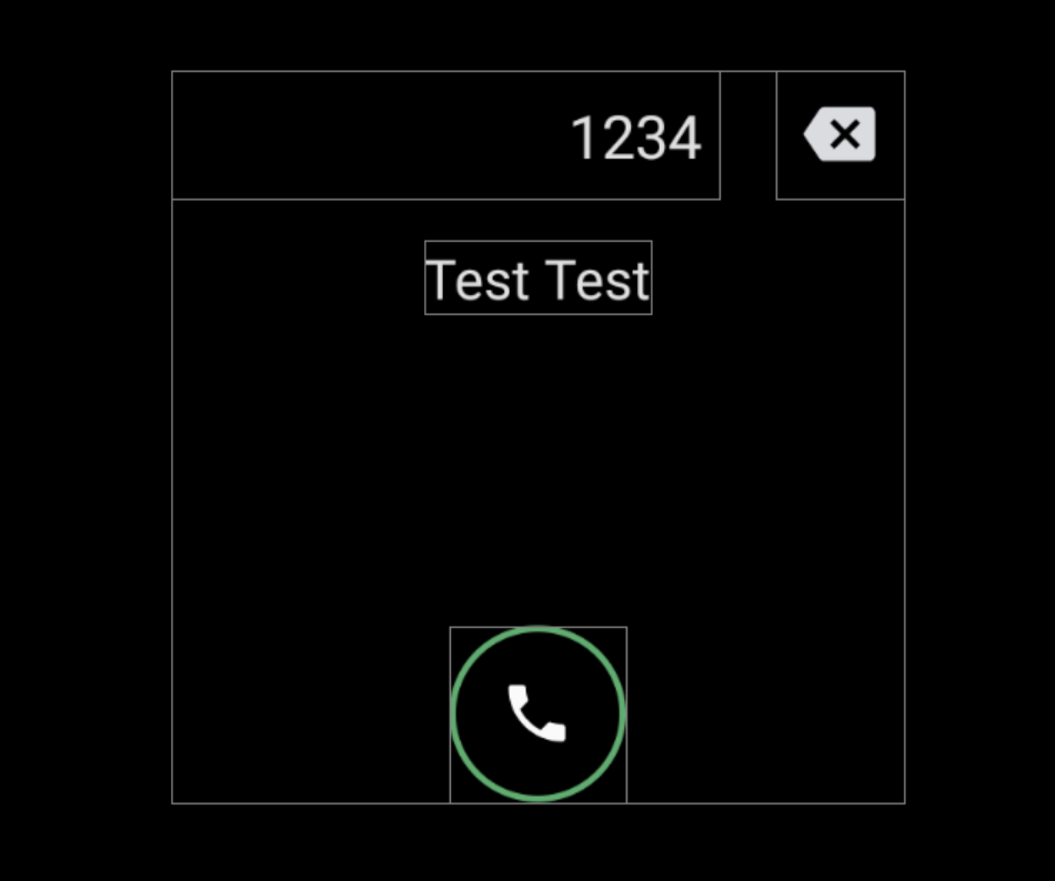
Abbildung 3: Informationen zu Dialpad
| Component [id:]ClassName | Property | Wert |
|---|---|---|
|
In der AOSP-Referenz wurde die Eingabebewegung für das Titelfeld implementiert. Wenn Sie die Bewegung deaktivieren möchten, überschreiben Sie |
height |
@dimen/dialpad_info_title_container_size |
textAppearance |
@style/TextAppearance.DialNumber(Dieser Stil wird auch programmatisch im DialpadFragment auf den Titel angewendet.) |
|
autoSizeTextType |
uniform |
|
autoSizeMinTextSize |
@dimen/dialpad_info_title_text_size_min |
|
autoSizeMaxTextSize |
@dimen/dialpad_info_title_text_size_max |
|
delete_button: ImageView |
style |
@style/DialpadSecondaryButton |
src |
@drawable/ic_backspace |
|
marginStart/td>
| dimen/dialpad_info_title_padding_size |
|
call_button: ImageView |
style |
@style/DialpadPrimaryButton |
src |
@drawable/icon_call_button |
|
include @layout/dialpad_user_profile |
layout_marginTop |
@dimen/dialpad_user_profile_padding |
@layout/dialpad_user_profile ist durch @bool/config_show_detailed_user_profile_on_dialpad geschützt, um das Label und den Avatar anzuzeigen. Der Standardwert ist false, d. h. nur der Anzeigename wird angezeigt.
| Component [id:]ClassName | Property | Wert |
|---|---|---|
display_name: TextView |
textAppearance |
@style/TextAppearance.DialpadDisplayName |
label: TextView |
textAppearance |
?android:attr/textAppreanceSmall |
layout_marginTop |
@dimen/dialpad_contact_label_margin |
|
dialpad_contact_avatar: ImageView |
width |
@dimen/dialpad_contact_avatar_size |
height |
@dimen/dialpad_contact_avatar_size |
Porträtmodus
Layout. @layout[-port]/dialpad_fragment
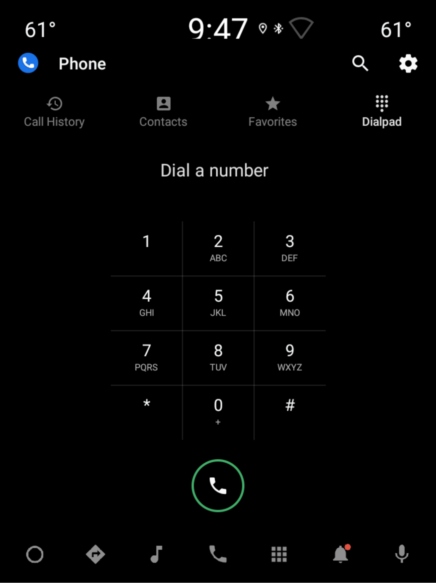
Abbildung 4: Porträtmodus
| Component [id:]ClassName | Property | Wert |
|---|---|---|
keypad: KeypadFragment |
width |
Wird durch die Höhe, Breite und den Abstand der Tasten bestimmt. Weitere Informationen finden Sie unter Tastatur. |
| Größe | ||
include |
– | Sehen Sie sich den Abschnitt „dialpad_user_profile“ unter Dialpad-Informationen im Querformat an. |
divider: View |
layout_constraintGuide_percent |
0,5 |
title: TextView |
Entspricht dem Titel in den Tastaturinformationen im Querformat. | |
delete_button: ImageView |
Entspricht delete_button in den Tastaturinformationen im Querformat. | |
call_button: ImageView |
style |
@style/DialpadPrimaryButton |
height |
@dimen/call_button_height |
|
src |
@drawable/icon_call_button |
|
layout_marginBottom |
@dimen/call_button_bottom_margin |