
- Hostaktivität:
InCallActivity - Stammlayout:
@layout/in_call_activity
Bildschirm „Eingehender Anruf“
Fragment. IncomingCallFragment
Wähltastenbildschirm im Anrufmodus im Querformat
Layout: @layout/ongoing_call_fragment
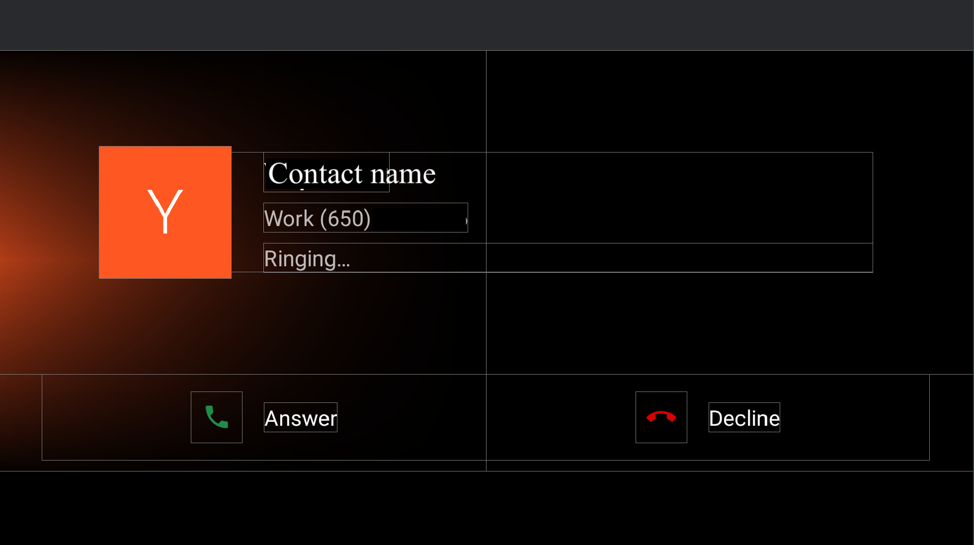
Abbildung 1. Bildschirm „Eingehender Anruf“
| Component [id:]ClassName | Property | Wert |
|---|---|---|
background_image: |
@config/config_background_image_alpha |
1.0 Wird programmatisch für Kontaktavatare verwendet. |
@config/config_background_image_error_alpha |
1.0 Wird programmatisch für Kacheln mit Anschreiben verwendet. Wenn Sie „0,0“ festlegen, wird die Hintergrundfarbe ausgeblendet. |
|
user_profile_container: |
– | – |
ringing_call_controller_bar: |
height |
@dimen/in_call_controller_bar_height |
layout_margintStart |
@dimen/in_call_controller_bar_margin |
- Nutzerprofil.
@layout/user_profile_largeComponent [id:]ClassNameProperty Wert root: LinearLayoutorientationhorizontalpaddingStart
paddingEnd@dimen/in_call_user_profile_marginuser_profile_avatar: ImageViewwidthin_call_avatar_icon_sizeheightin_call_avatar_icon_sizescaleTypefitCenterUser info: LinearLayoutpaddingStart@dimen/in_call_margin_between_avatar_and_textuser_profile_title:TextViewtextAppearance@style/TextAppearance.InCallUserTitleuser_profile_phone_number: TextViewtextAppearance@style/TextAppearance.InCallUserPhoneNumbermarginTop@dimen/in_call_phone_number_margin_topuser_profile_call_state: ChronometertextAppearance@style/TextAppearance.InCallStatemarginTop@dimen/in_call_state_margin_top - RingingCallControllerBarFragment.
@layout/ringing_call_controller_bar_fragmentComponent [id:]ClassNameProperty Wert root: ConstraintLayoutheight@dimen/in_call_controller_bar_heightbackground@android:color/transparentanswer_call_button: ImageViewwidth
height@dimen/ringing_call_button_touch_target_sizebackground@drawable/dialer_ripple_backgroundsrc@drawable/ic_phonetint@color/phone_callscaleTypecenteranswer_call_text: TextViewmarginStart@dimen/ringing_call_text_margintext@string/answer_calltextAppearance?android:attr/textAppearanceLargeend_call_button: ImageViewwidth
height@dimen/ringing_call_button_touch_target_sizebackground@drawable/dialer_ripple_backgroundsrc@drawable/ic_call_endtint@color/phone_end_callscaleTypecenterend_call_text: TextViewmarginStart@dimen/ringing_call_text_margintext@string/decline_calltextAppearance?android:attr/textAppearanceLargemid_line: GuidelineconstraintGuide_percent0,5
Eingehender Anruf im Hochformat
Die Seite für eingehende Anrufe im Hochformat hat dieselbe @layout/ongoing_call_fragment wie im Querformat, mit Ausnahme von @layout[-port]/user_profile_large, das anders dargestellt wird.
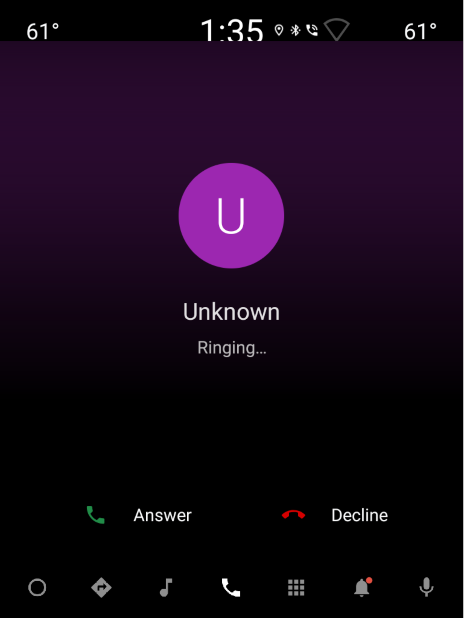
Abbildung 2. Eingehender Anruf im Hochformat
- Nutzerprofil.
@layout/user_profile_largeComponent [id:]ClassNameProperty Wert root: LinearLayoutorientationverticalgravitycenteruser_profile_avatar: ImageViewwidthin_call_avatar_icon_sizeheightin_call_avatar_icon_sizescaleTypefitCenteruser_profile_title: TextViewtextAppearance@style/TextAppearance.InCallUserTitlepaddingTop@dimen/in_call_margin_between_avatar_and_textuser_profile_phone_number: TextViewtextAppearance@style/TextAppearance.InCallUserPhoneNumberpaddingTop@dimen/in_call_phone_number_margin_topuser_profile_call_state: ChronometertextAppearance@style/TextAppearance.InCallStatepaddingTop@dimen/in_call_state_margin_top
Seite mit laufendem Anruf
Fragment. OngoingCallFragment
Querformat
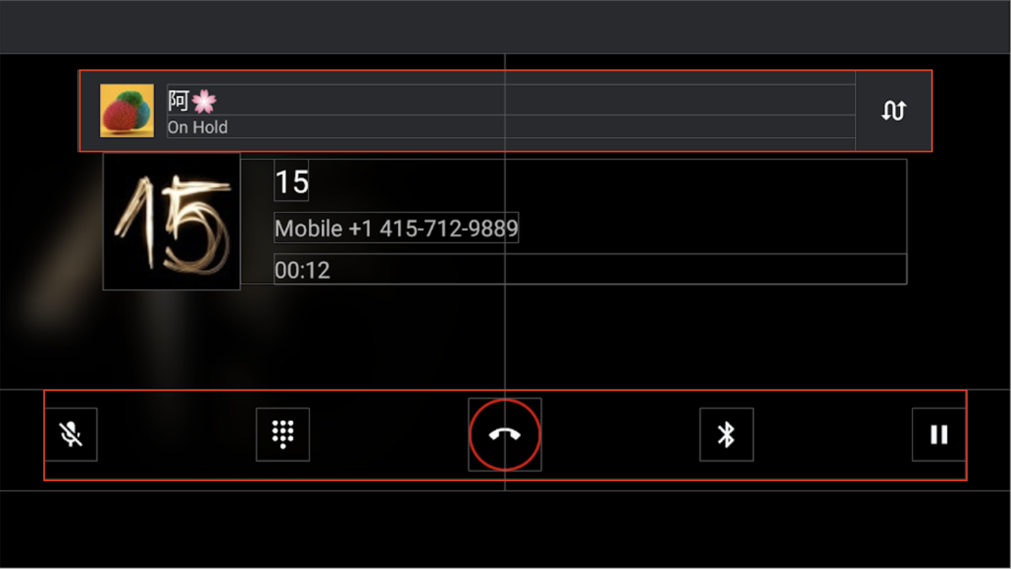
Abbildung 3. Bildschirm für laufenden Anruf im Querformat
Component [id:]ClassName |
Property | Wert | |
|---|---|---|---|
background_image: BackgroundImageView |
@config/config_background_image_alpha |
1.0 Wird programmatisch für Kontaktavatare verwendet. |
|
@config/config_background_image_error_alpha |
1.0 Wird programmatisch für Kacheln mit Anschreiben verwendet. Wenn dieser Wert auf 0,0 gesetzt ist, wird die Hintergrundfarbe ausgeblendet. |
||
Container anderer Ansichten: ConstraintLayout |
background |
@android:color/transparentDamit die Welleneffekte für die Schaltflächen der Steuerleiste funktionieren. |
|
incall_dialpad_fragment: InCallDialpadFragment |
– | Wähltastatur während eines Anrufs | |
user_profile_container: @layout/user_profile_large |
– | Entspricht dem @layout/user_profile_large auf der Seite Eingehender Anruf.
|
|
onhold_user_profile: OnHoldCallUserProfileFragment |
height |
@dimen/onhold_user_info_height |
|
layout_marginTop |
@dimen/onhold_profile_margin_y |
||
layout_marginStart |
@dimen/onhold_profile_margin_x |
||
ongoing_call_control_bar: OnGoingCallControllerBarFragment |
layout_marginBottom |
@dimen/in_call_controller_bar_margin |
|
layout_marginHorizontal |
@dimen/in_call_controller_bar_margin |
||
- OnHoldCallUserProfileFragment.
@layout/onhold_user_profileKomponente [id:]ClassName Property Wert root: CardViewandroid:elevation@dimen/dialer_card_elevationcardBackgroundColor@color/onhold_call_backgroundcardCornerRadius@dimen/onhold_profile_corner_radiusswap_calls_view: ConstraintLayoutbackground?android:attr/selectableItemBackgroundguideline: Guidelinelayout_constraintGuide_begin@dimen/onhold_profile_guidelineicon: ImageViewwidth
height@dimen/avatar_icon_sizescaleTypecenterCroplayout_marginStart@dimen/onhold_profile_avatar_margintitle: TextViewtextAppearance?android:attr/textAppearanceLargetext: TextViewtext@string/onhold_call_labeltextAppearance?android:attr/textAppearanceSmallswap_call_button: ImageViewsrc@drawable/ic_swap_callstint@color/secondary_icon_colorscaleTypecenterpaddingLeft
paddingRight@dimen/swap_call_button_margin - OnGoingCallControllerBarFragment.
@layout/on_going_call_controller_bar_fragmentComponent [id:]ClassNameProperty Wert root: ConstraintLayoutheight@dimen/in_call_controller_bar_heightmute_button: ImageViewwidth
height@dimen/in_call_button_sizescaleTypecentersrc@drawable/ic_mute_activatablebackground@drawable/dialer_ripple_backgroundtoggle_dialpad_button: ImageViewwidth
height@dimen/in_call_button_sizescaleTypecentersrc@drawable/ic_dialpad_activatablebackground@drawable/dialer_ripple_backgroundend_call_button: ImageViewstyle@style/DialpadPrimaryButtonsrc@drawable/ic_call_end_buttonvoice_channel_view: LinearLayoutorientationverticalvoice_channel_button: ImageViewwidth
height@dimen/in_call_button_sizescaleTypecentersrc@drawable/ic_audio_route_vehicle_activatablebackground@drawable/dialer_ripple_backgroundvoice_channel_text: TextViewvisibilitygonepause_button: ImageViewwidth
height@dimen/in_call_button_sizescaleTypecentersrc@drawable/ic_pause_activatablebackground@drawable/dialer_ripple_background
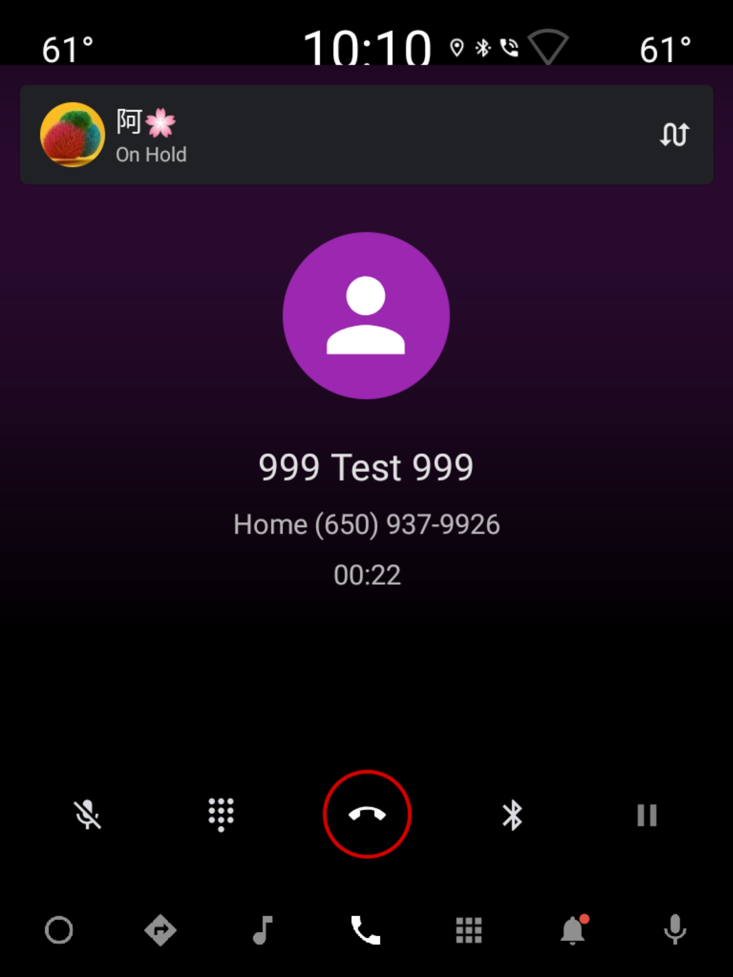
Abbildung 4. Seite mit laufendem Anruf im Hochformat
Im Hochformat ist das Layout identisch, nur die @layout/user_profile_large ist anders angeordnet. Weitere Informationen finden Sie auf der Seite Eingehender Anruf unter Porträtmodus.
Wähltasten während eines Anrufs
Fragment. InCallDialpadFragment
Querformat
Layout. @layout/incall_dialpad_fragment
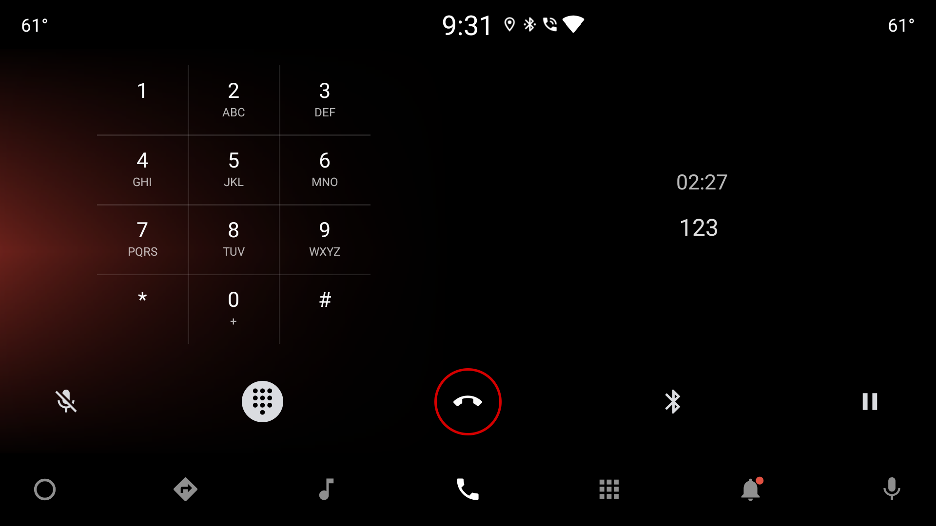
Abbildung 5. Wähltastatur im Anruf im Querformat
| Component [id:]ClassName | Property | Wert |
|---|---|---|
divider: Guideline |
layout_constraintGuide_percent |
0,5 |
dialpad_fragment: KeypadFragment |
– | Ziffernblock |
dialpad_info_boundaries: View |
height |
Gleich wie bei dialpad_fragment |
layout_constraintDimensionRatio |
W, 1:1 |
|
call_state: Chronometer |
layout_width |
match_parent, um zu vermeiden, dass die gesamte Ansicht bei Textaktualisierungen neu gezeichnet wird |
textAppearance |
@style/TextAppearance.InCallState |
|
marginBottom |
@dimen/call_state_padding |
|
title: TextView |
textAppearance |
@style/TextAppearance.DialNumber |
Wähltastatur im Anruf im Hochformat
Layout. @layout[-port]/incall_dialpad_fragment
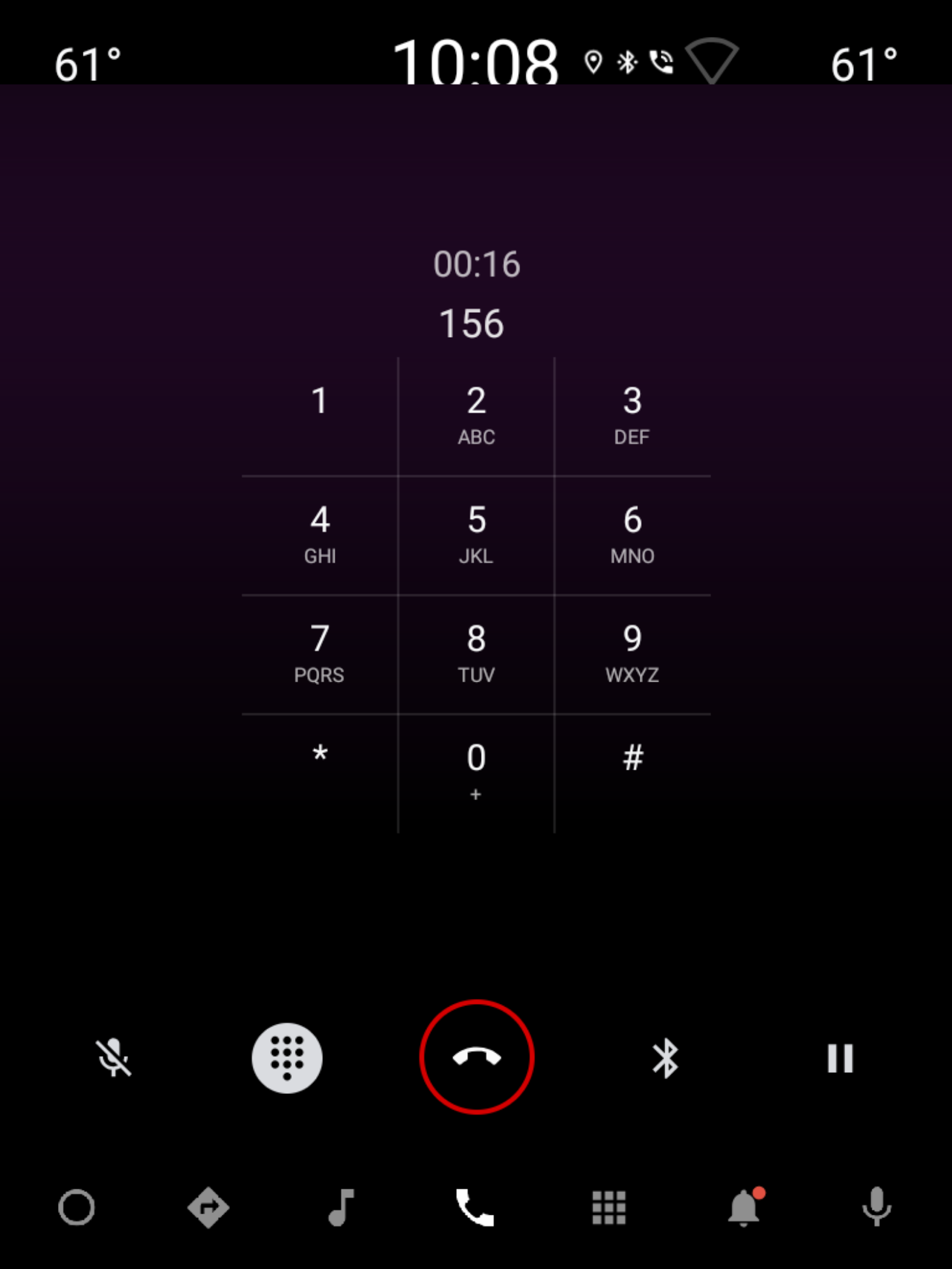
Abbildung 6. Wähltastatur im Anrufmodus im Porträtmodus
| Component [id:]ClassName | Property | Wert |
|---|---|---|
dialpad_fragment: KeypadFragment |
layout_marginTop |
@dimen/keypad_margin |
call_state: Chronometer |
layout_width |
match_parent, um zu vermeiden, dass die gesamte Ansicht bei Textaktualisierungen neu gezeichnet wird. |
gravity |
center |
|
textAppearance |
@style/TextAppearance.InCallState |
|
marginStart |
@dimen/dialpad_info_edge_padding_size |
|
title: TextView |
gravity |
„End“ zusammen mit „width“ auf wrap_content einstellen, um die gewählte Nummer zu zentrieren und beim Start auszublenden. |
textAppearance |
@style/TextAppearance.DialNumber |
|
marginStart |
@dimen/dialpad_info_edge_padding_size |
KeypadFragment. Weitere Informationen finden Sie unter Wähltastatur.