
This page describes how to use and customize elements in the
com.android.car.ui.preference package, which includes UI elements
that can be used to present preferences for apps.
Most elements are subclassing com.androidx.preference classes to which you add
CarUi customizations. In most cases, you can use the elements in the
com.android.car.ui.preferences package by using
com.android.car.PreferenceFragment. PreferenceFragment replaces all
androidx.preference elements with their equivalents in
car.ui.preferences. To view these functionalities in action, see the car-ui-lib
Paintbooth reference app. For example:
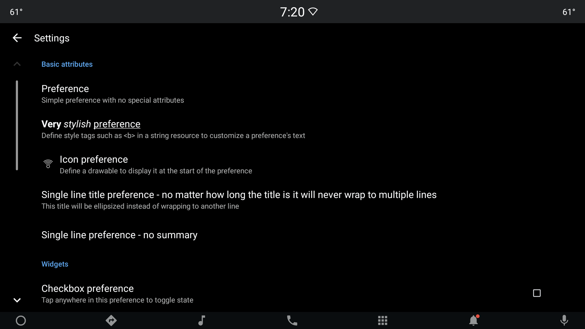
Figure 1. Car UI preference layout.
Available preference types
This section describes Car UI preference types.
PreferenceFragment
PreferenceFragment is a subclass of
androidx.preference.PreferenceFragmentCompat and is the base class that
clients should use. During a call to setPreferenceScreen, this class
automatically replaces the elements from androidx.preference with the
available equivalent from car.ui.preference elements.
<style name="PreferenceFragment.CarUi">
        <item name="android:divider">?android:attr/listDivider</item>
        <item name="android:layout">@layout/car_ui_preference_fragment_with_toolbar</item>
</style>
CarUiPreference
This is the CarUi equivalent of the androidx.preference.Preference class that
supports the following attributes, which can be customized using a runtime resource overlay (RRO).
All other CarUi elements that use a variant of CarUiPreference style also
support the following attributes.
<declare-styleable name="CarUiPreference">
      <!-- Toggle for showing chevron -->
      <attr name="showChevron" format="boolean" />
      <!-- Show ripple when disabled preference is clicked -->
      <attr name="showRippleOnDisabledPreference" format="boolean" />
</declare-styleable>
The following is the base style for com.android.car.ui.preference, which extends
the androidx.Preference theme. The chevron drawable is defined in
car_ui_preference_icon_chevron.xml.
<selector xmlns:android="http://schemas.android.com/apk/res/android">
  <item android:state_enabled="false" android:drawable="@drawable/car_ui_preference_icon_chevron_disabled"/>
  <item android:state_enabled="true" android:drawable="@drawable/car_ui_preference_icon_chevron_enabled"/>
</selector>
The ripple is defined in
car_ui_recyclerview_button_ripple_background.
<ripple
    xmlns:android="http://schemas.android.com/apk/res/android"
    android:color="@color/car_ui_ripple_color" />
<style name="Preference.CarUi">
        <item name="allowDividerBelow">false</item>
        <item name="allowDividerAbove">false</item>
        <item name="android:layout">@layout/car_ui_preference</item>
</style>
If the layout in the style above is being overlaid, clients need to make sure
the new layout at least provides the ids that are expected by corresponding
androidx classes. This also applies to the other elements that use
this base style.
CarUiDropDownPreference
This is the CarUi equivalent of the androidx.preference.DropDownPreference
class and uses the following style:
<style name="Preference.CarUi.DropDown">
        <item name="android:layout">@layout/car_ui_preference_dropdown</item>
</style>
CarUiRadioButtonPreference
This subclass of androidx.preference.TwoStatePreference
inflates car_ui_radio_button_preference_widget layout during
initialization. If this layout is being overlaid in an RRO, the new layout must
contain an element of type android.widget.RadioButton, with id
R.id.radio_button and must also contain other elements and ids
required by the base class.
CarUiSwitchPreference
This is the CarUi equivalent of the androidx.preference.SwitchPreference class.
The difference is that when this element is not enabled, a toast message is shown. The toast
message can be customized by calling the
setMessageToShowWhenDisabledPreferenceClicked method in
Android 10 and Android 11. This element
uses the following style:
<style name="Preference.CarUi.SwitchPreference">
        <item name="android:widgetLayout">@layout/car_ui_preference_widget_switch</item>
        <item name="android:switchTextOn">@string/car_ui_preference_switch_on</item>
        <item name="android:switchTextOff">@string/car_ui_preference_switch_off</item>
</style>
CarUiTwoActionPreference
A subclass of CarUiPreference that enables a secondary action. The of
attributes that can be used to customize this element are provided below:
<declare-styleable name="CarUiTwoActionPreference">
        <!-- Determines if the secondary action is initially shown -->
        <attr name="actionShown" format="boolean"/>
</declare-styleable>
This element uses the same style as the base class and requires
R.id.action_widget_container, and android.R.id.widget_frame.
CarUiDialogFragment
This class is borrowed as is from
androidx.preference.PreferenceDialogFragmentCompat with some additions
specific to CarUi. Clients should use subclasses of this class to present
themed platform AlertDialog.
PreferenceDialogFragment
A direct subclass of CarUiDialogFragment . Clients should subclass this class
to present any themed platform AlertDialog.
CarUiEditTextPreference
This is the CarUi equivalent of the androidx.preference.EditTextPreference
class:
<style name="Preference.CarUi.DialogPreference.EditTextPreference">
        <item name="android:dialogLayout">@layout/car_ui_preference_dialog_edittext</item>
</style>
If the layout in the style above is being overlaid, clients need to make sure the new layout
provides the ids expected by androidx.preference.EditTextPreference class.
EditTextPreferenceDialogFragment
A direct subclass of PreferenceDialogFragment. Also, the CarUi equivalent of
the androidx.preference.PreferenceDialogFragments class. Clients should
use this class to present any themed platform AlertDialog.
CarUiSeekBarDialogPreference
An implementation of androidx.preference.DialogPreference class,
which provides
SeekBar
functionality:
<style name="Preference.CarUi.SeekBarPreference">
        <item name="android:layout">@layout/car_ui_preference_widget_seekbar</item>
        <item name="adjustable">true</item>
        <item name="showSeekBarValue">false</item>
</style>
SeekBarPreferenceDialogFragment
A fragment that provides a layout with a SeekBar in a dialog.
CarUiListPreference
CarUi equivalent of androidx.preference.ListPreference class.
ListPreferenceFragment
A fragment that provides a layout with
androidx.preference.ListPreference in it.
CarUiMultiSelectListPreference
The CarUi equivalent of the androidx.preference.Preference class.
MultiSelectListPreferenceFragment
A fragment that provides a layout with
com.android.car.ui.CarUiMultiSelectListPreference in it.