
Media belongs to a suite of system apps (for example, Dialer and App Launcher). These apps share common styles and assets defined at different levels in the AOSP structure.
framework/base. All Android base styles are defined here.packages/services/Car/car_product/overlay. Contains build-time overlays that modify standard framework/base resources to produce the AOSP look-and-feel of Android Automotive OS. OEMs may opt to exclude this overlay and use their own.packages/apps/Car/libs/car-ui-lib. This library defines AAOS components and resources common to system apps and unbundled apps designed for customization. For details, see the Car UI Library Integration Guide.packages/apps/Car/libs/car_app_common. Common colors and styles shared between Automotive system apps. OEMs can use overlays to customize these elements (similar tocar_product/overlaydescribed above).packages/apps/Car/libs/car_media_common. Contains elements shared between Media and other media UIs. For example, the Home screen Media widget.packages/apps/Car/Media.All system apps use their own theme, which extends fromTheme.CarUi, as defined incar-ui-lib.
Android Automotive AOSP provides two presentations of media.
- Media UI. Enables users to sign in, browse content, and use detailed playback controls.
- Home screen media widget. Enables the use of core media playback control features to the Home screen.
Media user interface
This figure describes the structure of the Media UI:
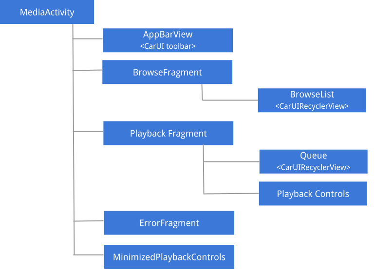
Figure 1. Media user interface.
For details about UX and UI guidelines as well as the spatial structure of the different components of Media, see Spatial model.
AppBarView: Toolbar
The Media UI toolbar is a component shared with other system apps, such as Dialer and Radio. To learn how to customize the toolbar, see the Car UI Library Integration Guide.
Media maximum artwork size
To notify media apps of the maximum size of the artwork to fetch, you can overlaymedia_items_bitmap_max_size_px in your system. To do so, send
EXTRA_MEDIA_ART_SIZE_HINT_PIXELS as a root hint. As a result, you'll save
bandwidth when downloading images. To learn more, see
MediaConstants
on developer.android.com.
Browse fragment
Browse consists primarily of a Car UI RecyclerView, which handles scrollbar position, arrows, and margins and can browse items of different types, such as headers, grid items, icon grid items, list items, and icon list items.
Minimized playback controls
When the browse fragment is being displayed, and when a media item is selected, a minimized playback controls view is displayed. The following figure illustrates the structure of this view:
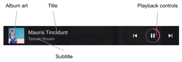
Figure 2. Minimized playback controls.
Browse list
Developers can use a set of style hint (see Apply Content Styles) to customize the presentation of media browse content. OEMs must adhere to these styles, adjusting presentation to their design system.
Supported item types and the respective layouts are located as follows:
LIST_ITEM(media_browse_list_item.xml). Commonly used for episodes in a podcast, such as playlist items, and favorites.ICON_LIST_ITEM(media_browse_list_icons_item.xml). Used for categories or menu options, in which the image included with the media item is not actual album art but an icon.GRID_ITEM(media_browse_grid_item.xml). Commonly used for playable items, like songs or playlists.ICON_GRID_ITEM(media_browse_grid_icons_item.xml). Used for categories, similar toICON_LIST_ITEM.HEADER(media_browse_header_item.xml). Used to organize media items into sections.
Playback screen
To display this screen, expand the minimized playback controls:
- Currently playing media item medata (including title and subtitle).
- Complete playback controls.
- Playback queue (used to display recently played or next items to play).
Components of the Playback screen are identified in the figures below.
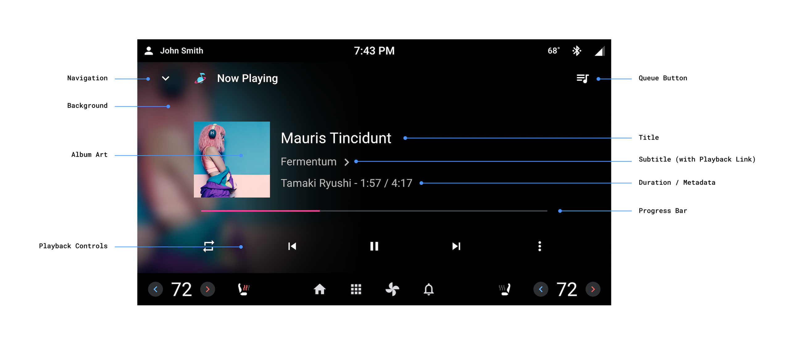
Figure 3. Playback screen.
The Playback screen doesn’t share the toolbar with the rest of the app. Instead, this screen individually manages the elements on the top of the screen.
Audio formatting attribution
When apps set the
KEY_CONTENT_FORMAT_TINTABLE_LARGE_ICON_URI
or the
KEY_CONTENT_FORMAT_TINTABLE_SMALL_ICON_URI
in the extras of the currently playing media item. OEMs must render the appropriate vector
drawable as indicated by the URI.
The large version of the Content Format icon must be used on the main playback
view. On secondary views, such as a smaller playback bar, OEMs can use the smaller version of the
Content Format icon. The
ContentFormatView
renders the optimal icon based on its logoSize attribute.
Playback links
When apps setKEY_SUBTITLE_LINK_MEDIA_ID
or
KEY_DESCRIPTION_LINK_MEDIA_ID,
OEMs must render the subtitle or description in a way that suggests they can be tapped, and then
open the Browse view to show the linked media item upon a user tap.
Playback controls
The Playback screen includes an extended set of playback controls, organized in control
rows. The secondary row (displayed below as the row on the top) is only displayed if the space
on the first row is not enough to display all the actions returned by the media app from
PlaybackStateCompat#getActions().
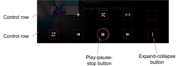
Figure 4. Playback controls.
OEMs can customize the icons of standard actions. Custom actions that specify the
EXTRAS_KEY_COMMAND_BUTTON_ICON_COMPAT
key in the action's extras can also be customized through an RRO of the CarMediaCommon Library
that targets
these drawables.
Icons of custom actions without the extra must be presented as they are provided by the media
apps.
Home screen media widget
This widget is implemented as a fragment in car-media-common.
This fragment includes a minimized version of the Playback screen described above. All the same
customization rules and capabilities apply.
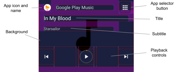
Figure 5. Home screen media widget.
The App Selector button displayed above uses the switch functionality described in Media Source Switching User Flow.
To use the current Media Source icon for the App Selector button, overlay the
use_media_source_logo_for_app_selector flag defined in
platform/packages/apps/Car/libs/car-media-common/res/values/bools.xml and set it to
true. With this change, the Media Source icon on the opposite side of the app toolbar
will be hidden. The customization also applies to the Media Center app and the reference
Radio app.
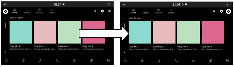
Figure 6. Media App Selection button.
Play, Pause, and Stop button layout
The Play/Pause/Stop button layout can be customized for "Now playing" and
the minimized playback controls view. Both layouts are defined in
packages/apps/Car/libs/car-media-common/res/layout/.
To customize button layouts, apply build-time overlays to
play_pause_stop_button_layout.xml and
minimized_play_pause_stop_button_layout.xml.
Highlight the current item in the play queue
The state of the current play queue item is set to selected, so it can be
customized using state resources such as color state lists (see
Color state list resource
) and state list drawables (see
Drawable resources).
To apply the necessary styling changes, you can override the queue item layout
packages/apps/Car/Media/res/layout/queue_list_item.xml,
or a separate
You can also show an icon next to the current play queue item:
- Overlay the
show_icon_for_now_playing_queue_list_itemBoolean flag defined in packages/apps/Car/Media/res/layout/queue_list_item.xml, or a separateTo hide the play timer, set
show_time_for_now_playing_queue_list_itemtofalse. - Use a state drawable, for example, foreground or background of the item root view (see packages/apps/Car/Media/res/layout/queue_list_item.xml, or a separate view in the item's view hierarchy.
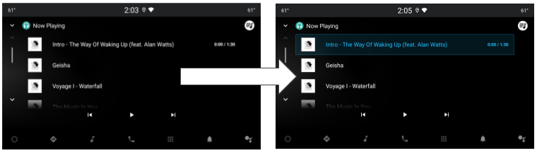
Figure 7. Highlighted current item in play queue.