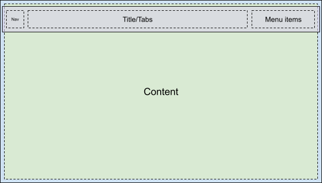
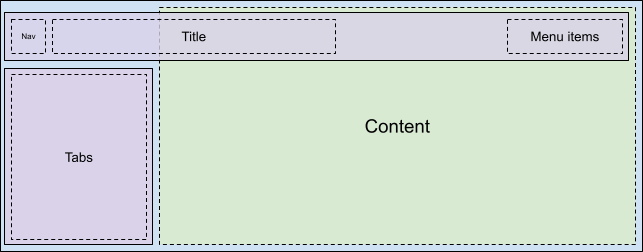
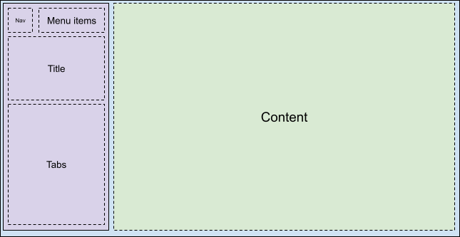
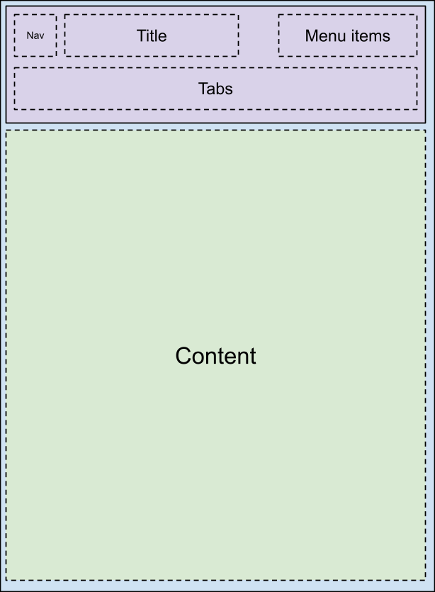
自 2025 年 3 月 27 日起,我们建议您使用 android-latest-release
而非 aosp-main
构建 AOSP 并为其做出贡献。如需了解详情,请参阅 AOSP 的变更。
使用运行时资源叠加层来自定义工具栏
使用集合让一切井井有条
根据您的偏好保存内容并对其进行分类。
基本布局概览
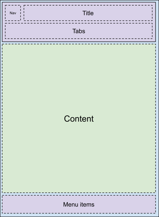
car-ui-lib 工具栏是通过 car_ui_base_layout_toolbar.xml
布局文件自定义的。此工具栏也称为“基本布局”工具栏,因为此布局文件包含 ID 为 car_ui_base_layout_content_container
的 FrameLayout
,可在布局膨胀后不久包含应用的所有内容。采用这种结构时,OEM 可以将工具栏放置在屏幕顶部以外的位置。
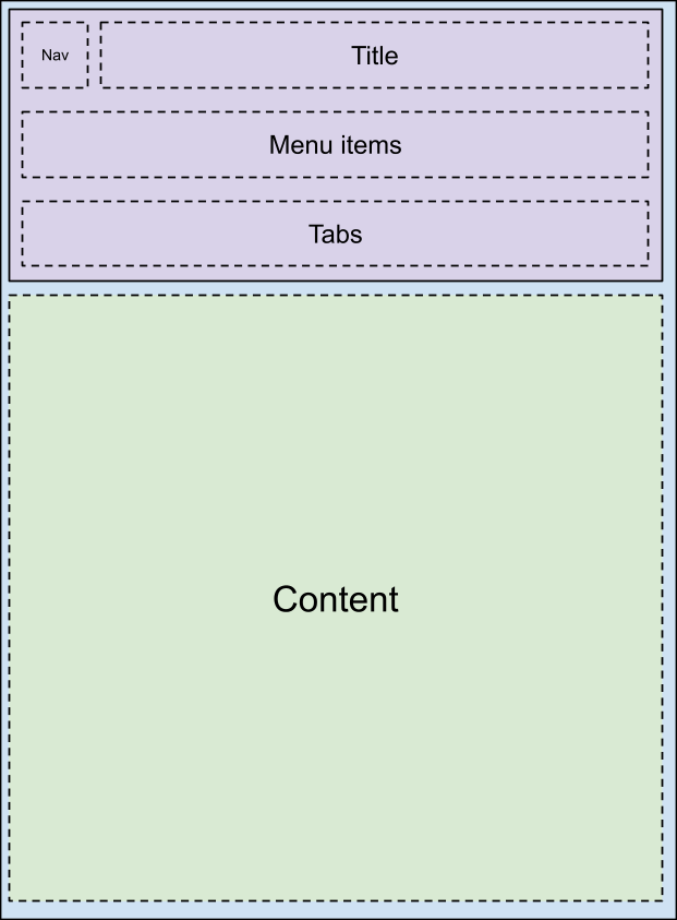
通过更改 car_ui_base_layout_content_container
中的布局参数,可以将应用所在区域压缩成较小区域,以便为工具栏腾出空间。不过,某些自定义设置可能会要求工具栏处于透明状态并叠加在应用上。在这种情况下,可以为视图添加 car_ui_top/bottom/left/right_inset
标记。如果 car-ui-lib 检测到带有这样标记的视图,就会将该视图的位置和尺寸传达给应用。这样一来,应用就可以按照相应值向内缩进其内容,但仍会在工具栏下方的空间中保留合理的背景空间。例如,对于大多数应用,其 CarUiRecyclerView 中的第一项将在指定边衬区下方启动,但当用户向下滚动时,仍会在工具栏后面可见。
旋转支持
如需支持旋控器,基本布局必须尽早在布局中包含 FocusParkingView
。当没有焦点对用户可见时,此视图便会获得焦点。工具栏还必须封装在 FocusParkingView
中,用于指定这是旋控器的一个独立的轻推操控区域。如果未封装在 FocusParkingView 中,用户就无法与使用旋控器的工具栏互动。
标签页
工具栏标签页通过 car_ui_toolbar_tab_item.xml
或 car_ui_toolbar_tab_item_flexible.xml
布局文件进行自定义。这两个文件在功能方面没有任何区别,具体使用哪个文件取决于 car_ui_toolbar_tab_flexible_layout
布尔值资源。因此,建议继续将 car_ui_toolbar_tab_flexible_layout
设置为 false
且仅自定义常规布局文件。
标签页的 ImageView
将使用 Java 代码中的 car_ui_toolbar_tab_item_selector
颜色进行着色,因此 car_ui_toolbar_tab_item_selector
必须与布局一同自定义。应用也可以请求不使用此颜色对标签页图标进行着色。
标签页的 TextView
的文本外观会设置为 Java 代码中的 TextAppearance.CarUi.Widget.Toolbar.Tab
或 TextAppearance.CarUi.Widget.Toolbar.Tab.Selected
,因此系统不会应用布局文件中设置的文本外观。这些样式也必须进行自定义。
MenuItems
是指位于默认工具栏右上角的按钮。这些按钮可以是文本、图标、图标和文本,或者开关。这些变体都是 car_ui_toolbar_menu_item
布局文件的一部分,因为当应用请求 MenuItems
时,后者需要能够在各种形式之间切换。
MenuItems
可能是主要项,用于膨胀不同的布局文件:car_ui_toolbar_menu_item_primary
。主要 MenuItem 必须能够在视觉上与常规 MenuItem 区分开来,例如通过按钮有无边框加以区分。默认情况下,car_ui_toolbar_menu_item_primary
只是重定向到 car_ui_toolbar_menu_item
,因此两者看起来一样。
MenuItems
可能会处于“已启用”状态,这是另一种视觉状态,用于指明此 MenuItem 已进行切换。此状态是通过对 MenuItem 视图调用 setActivated(true)
实现的,这可向 MenuItem 视图中的所有可绘制对象添加 state_activated
状态。可使用运行时资源叠加层 (RRO) 中的可绘制对象选择器响应这种可绘制对象状态。
MenuItems
可能会在车辆行驶时处于“受用户体验限制”状态。就像“已启用”状态一样,“受用户体验限制”只是另一种可绘制对象状态,但状态这次是在应用(而非 Android 框架)中定义的。也就是说,还必须在 state_ux_restricted
属性上叠加 RRO,这样 RRO 中定义的属性才能与应用中定义的属性相匹配。
搜索
搜索栏包含在单独的
car_ui_toolbar_search_view
布局文件中,用于提升不需要搜索栏的应用的布局膨胀效果。ID 为
car_ui_toolbar_search_view_container
的
FrameLayout
膨胀后将包含搜索栏。
本页面上的内容和代码示例受内容许可部分所述许可的限制。Java 和 OpenJDK 是 Oracle 和/或其关联公司的注册商标。
最后更新时间 (UTC):2025-07-27。
[[["易于理解","easyToUnderstand","thumb-up"],["解决了我的问题","solvedMyProblem","thumb-up"],["其他","otherUp","thumb-up"]],[["没有我需要的信息","missingTheInformationINeed","thumb-down"],["太复杂/步骤太多","tooComplicatedTooManySteps","thumb-down"],["内容需要更新","outOfDate","thumb-down"],["翻译问题","translationIssue","thumb-down"],["示例/代码问题","samplesCodeIssue","thumb-down"],["其他","otherDown","thumb-down"]],["最后更新时间 (UTC):2025-07-27。"],[],[],null,["# Customize the toolbar with runtime resource overlays\n\nBase layout overview\n--------------------\n\nThe car-ui-lib toolbar is customized through the `car_ui_base_layout_toolbar.xml`\nlayout file. It's called the \\*base layout\\* toolbar because this layout file\ncontains a `FrameLayout` with id `car_ui_base_layout_content_container`, which\nwill contain all of the app's content shortly after the layout is inflated. This structure lets\nthe OEM place the toolbar in locations other than the top of the screen.\n\n| Possible layouts |||\n|---|---|---|\n| | | |\n| | | |\n\nBy changing the layout parameters on the `car_ui_base_layout_content_container`, the\napp can be compressed into a smaller area to make space for the toolbar. However, some\ncustomizations may call for the toolbar to be transparent and overlaid on top of the app. In this\ncase, views can be tagged with `car_ui_top/bottom/left/right_inset`. If car-ui-lib\ndetects a view with such a tag, it communicates the position and dimensions of that view to the app,\nso it can indent its content inward by that amount, but still keep a reasonable background in the\nspace underneath the toolbar. For example, most apps will have the first item in their\nCarUiRecyclerView start below the specified insets, but still be visible behind the toolbar when the\nuser scrolls down.\n\nRotary support\n--------------\n\nTo support rotary controllers, the base layout must contain a `FocusParkingView` as\nearly as possible in the layout. This view is what gets focused when there is no focus\nvisible to the user. The toolbar must also be wrapped in a `FocusParkingView`, which\nspecifies that it's a separate nudge zone for the rotary controller. If it is not wrapped in a\nFocusParkingView, then the user can't interact with the toolbar with the rotary controller.\n\nTabs\n----\n\nToolbar tabs are customized by either the `car_ui_toolbar_tab_item.xml` or\n`car_ui_toolbar_tab_item_flexible.xml` layout files. There is no functional difference\nbetween the files, the `car_ui_toolbar_tab_flexible_layout` Boolean resource determines\nwhich is used. As a result, it's recommended to keep `car_ui_toolbar_tab_flexible_layout`\nset to `false` and only customize the regular layout file.\n\nThe tab's `ImageView` will be tinted with the color\n`car_ui_toolbar_tab_item_selector` in Java code, so\n`car_ui_toolbar_tab_item_selector` must be customized alongside the layout. Apps can\nrequest that their tab's icons not be tinted with this color as well.\n\nThe tab's `TextView` has its text appearance set to either\n`TextAppearance.CarUi.Widget.Toolbar.Tab` or\n`TextAppearance.CarUi.Widget.Toolbar.Tab.Selected` in Java code, so the text appearance\nset on the layout file won't apply. These styles must be customized as well.\n\nMenuItems\n---------\n\n`MenuItems` are the buttons in the top right corner of the default toolbar. They can\nbe text, icons, icons and text, or switches. These variations are all part of the\n`car_ui_toolbar_menu_item` layout file, as the `MenuItems` need to be able to\nchange between each form if the app requests it.\n\n`MenuItems` can be *primary* , which inflates a different layout file:\n`car_ui_toolbar_menu_item_primary`. A primary MenuItem must look visually\ndistinct from the normal MenuItem, for example via a bordered/borderless button. By default,\n`car_ui_toolbar_menu_item_primary` just redirects to\n`car_ui_toolbar_menu_item`, so they look the same.\n\n`MenuItems` can be *activated* , which is another visual state that indicates\nthat this MenuItem is toggled. This state is implemented by calling `setActivated(true)`\non the MenuItem view, which adds the `state_activated` state to all the drawables in the\nMenuItem's views. This drawable state can be responded to with a drawable selector in the runtime\nresource overlay (RRO).\n\n`MenuItems` can be *UX restricted* when the vehicle is moving. UX restricted is\njust another drawable state like *activated* , but this time the state is defined in the app\ninstead of the Android framework. This means the `state_ux_restricted` attribute must\nalso be overlaid with the RRO, so that the attribute defined in the RRO matches the attribute\ndefined in the app.\n\nSearch\n------\n\nThe search bar is contained in a separate `car_ui_toolbar_search_view` layout file, in order to improve layout inflation performance for apps that don't need a search bar. The `FrameLayout` with id `car_ui_toolbar_search_view_container` will contain the search bar when it is inflated."]]