
Android 12 introduces a dual pane design, with a static L0 menu on the left and a content pane on the right. This feature introduces many new customization options. This page details those features and explains how you can customize your own preferences.
Revert to single pane
By default, CarSettings now displays the dual pane view when the app window is greater than or equal to 1400dp in width and the single pane view otherwise. To customize this for a specific device, use a runtime resource overlay (RRO) to target the necessary configuration values:
| Value | Description |
|---|---|
config_global_force_single_pane |
Set to true if the entire app is to run in single-pane
configuration. |
config_homepage_fragment_class |
Specifies the starting fragment for the homepage. In dual pane, this is used for the initial fragment in the content pane. In single-pane, this should be the homepage fragment. |
Header keys
Because different CarSettings activities can have a customized IA, a header key mapping
is provided to simplify customizations. In AndroidManifest.xml, every activity
that supports dual pane has a TOP_LEVEL_HEADER_KEY specified in its metadata.
This value points to a key specified in res/values/header_keys.xml, which is
mapped to the preference key of the top-level menu item that the starting fragment falls under.
Therefore, if the starting fragment of an activity is changed or the IA is rearranged such
that a particular fragment falls under a different top-level preference, the relevant mapping(s)
in the header_keys.xml file can be updated to specify the correct value.
Customize activity layout
The layout for BaseCarSettingsActivity is located in
res/layout/car_setting_activity and in these sections:
| Value | Description |
|---|---|
top_level_menu |
Top-level menu fragment shown in dual pane configurations. Width of this section is
specified by top_level_menu_width. A chassis base layout (with toolbar)
is wrapped around this view. |
top_level_divider |
Vertical line that splits the two panes and whose width you can customize with
top_level_divider_width. |
fragment_container_wrapper |
Wrapper layout for the content pane (or the main pane in a singlepane configuration). A chassis baselayout (with toolbar) is wrapped around this view. |
settings_focus_parking_view |
Custom implementation of FocusParkingView to hold rotary focus
when needed. |
fragment_container |
Main content container. Content fragments use this as the target layout. |
restricted_message |
UX-restricted blocking view to be shown on instances of BaseFragment. |
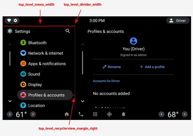
Figure 1. Dual pane layout
Top-level preferences
Top-level preferences are custom CarUiPreferences with a slightly modified layout to change the preference height and background shape. There are many different ways to customize the look of these preferences:
| Value | Description |
|---|---|
res/layout/top_level_preference.xml |
Overlay the entire preference layout. |
top_level_preference_min_height |
Minimum height of the top-level preference. Depending on content (for example, a subtitle is present), preferences may be taller than this value. |
top_level_preference_corner_radius |
Radius of the corner rounding. |
top_level_preference_background |
Background of the top-level preferences when not currently highlighted. |
top_level_preference_highlight |
Background of top-level preferences when highlighted. |
Top-level icons
Figure 2 illustrates how the top-level icons now consist of a vector icon inside a colored background shape. This shape is currently configured to support either an oval a rectangular shape. By default, shape is set to oval.
To change the default, modify the value in config_top_level_icon_shape
(where 0 is rectangle and 1 is oval). The icons are created by insetting the foreground icon by
top_level_foreground_icon_inset from the background shape. Each top-level icon has
a foreground color specified in res/values/colors.xml and a background color
specified in the res/color folder.
To create a customized appearance, you can override all color values.
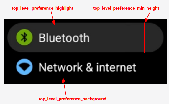
Figure 2. Top-level preference components
Icons for injected preferences that fall into the categories specified by
config_top_level_injection_categories are also treated as top-level icons.
The provided icons are inset by the same value and into the same shape as specified for
all other top-level icons (see above). However, the background is determined by looking
at the following attributes in this order:
com.android.settings.bg.argbMeta data from the injecting app.com.android.settings.bg.hintMeta data from the injecting app.top_level_injected_default_backgroundSpecified inres/values/colors.xml.
To ignore the injecting app data and always use the default background, set
config_top_level_injection_background_always_use_default to true.