
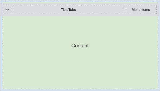
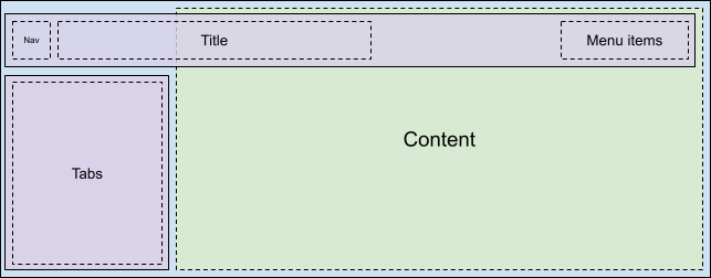
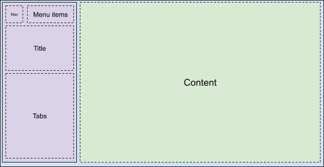
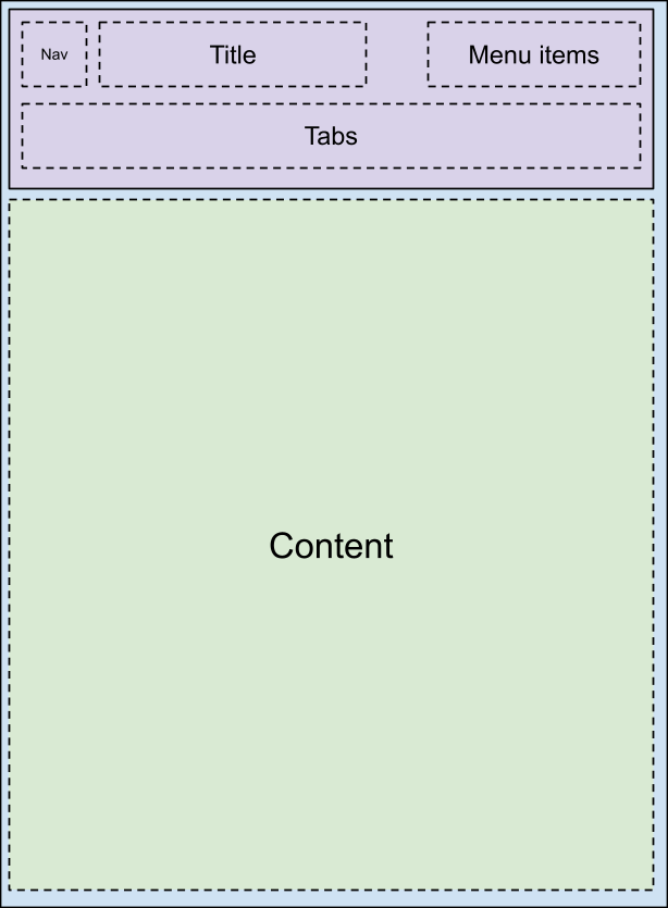
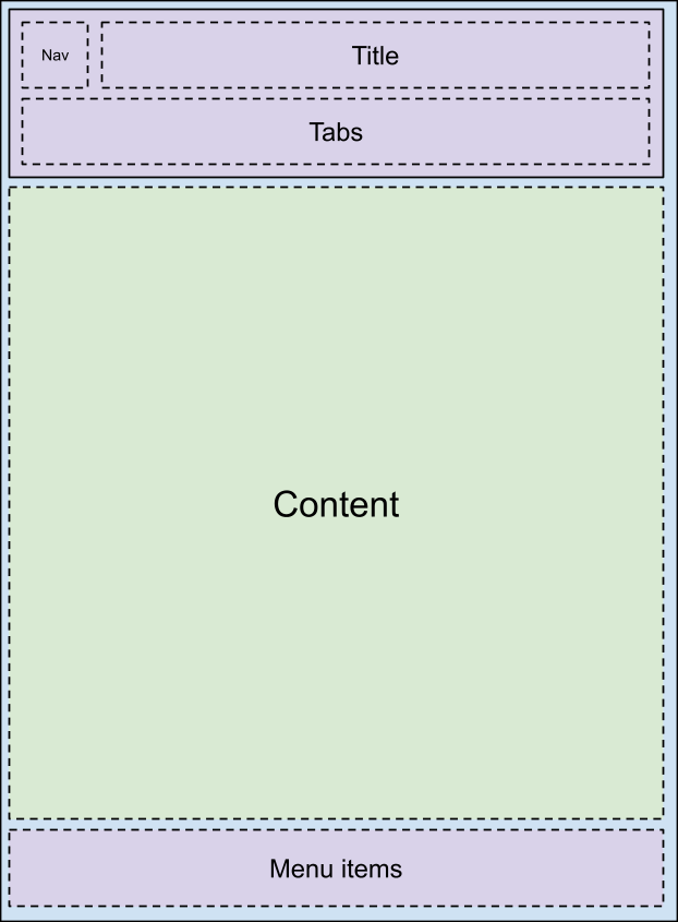
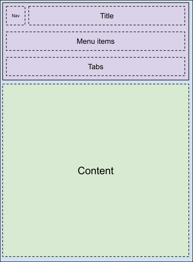
Base layout overview
The car-ui-lib toolbar is customized through the car_ui_base_layout_toolbar.xml
layout file. It's called the *base layout* toolbar because this layout file
contains a FrameLayout with id car_ui_base_layout_content_container, which
will contain all of the app's content shortly after the layout is inflated. This structure lets
the OEM place the toolbar in locations other than the top of the screen.
| Possible layouts | ||
|---|---|---|
 |
 |
 |
 |
 |
 |
By changing the layout parameters on the car_ui_base_layout_content_container, the
app can be compressed into a smaller area to make space for the toolbar. However, some
customizations may call for the toolbar to be transparent and overlaid on top of the app. In this
case, views can be tagged with car_ui_top/bottom/left/right_inset. If car-ui-lib
detects a view with such a tag, it communicates the position and dimensions of that view to the app,
so it can indent its content inward by that amount, but still keep a reasonable background in the
space underneath the toolbar. For example, most apps will have the first item in their
CarUiRecyclerView start below the specified insets, but still be visible behind the toolbar when the
user scrolls down.
Rotary support
To support rotary controllers, the base layout must contain a FocusParkingView as
early as possible in the layout. This view is what gets focused when there is no focus
visible to the user. The toolbar must also be wrapped in a FocusParkingView, which
specifies that it's a separate nudge zone for the rotary controller. If it is not wrapped in a
FocusParkingView, then the user can't interact with the toolbar with the rotary controller.
Tabs
Toolbar tabs are customized by either the car_ui_toolbar_tab_item.xml or
car_ui_toolbar_tab_item_flexible.xml layout files. There is no functional difference
between the files, the car_ui_toolbar_tab_flexible_layout Boolean resource determines
which is used. As a result, it's recommended to keep car_ui_toolbar_tab_flexible_layout
set to false and only customize the regular layout file.
The tab's ImageView will be tinted with the color
car_ui_toolbar_tab_item_selector in Java code, so
car_ui_toolbar_tab_item_selector must be customized alongside the layout. Apps can
request that their tab's icons not be tinted with this color as well.
The tab's TextView has its text appearance set to either
TextAppearance.CarUi.Widget.Toolbar.Tab or
TextAppearance.CarUi.Widget.Toolbar.Tab.Selected in Java code, so the text appearance
set on the layout file won't apply. These styles must be customized as well.
MenuItems
MenuItems are the buttons in the top right corner of the default toolbar. They can
be text, icons, icons and text, or switches. These variations are all part of the
car_ui_toolbar_menu_item layout file, as the MenuItems need to be able to
change between each form if the app requests it.
MenuItems can be primary, which inflates a different layout file:
car_ui_toolbar_menu_item_primary. A primary MenuItem must look visually
distinct from the normal MenuItem, for example via a bordered/borderless button. By default,
car_ui_toolbar_menu_item_primary just redirects to
car_ui_toolbar_menu_item, so they look the same.
MenuItems can be activated, which is another visual state that indicates
that this MenuItem is toggled. This state is implemented by calling setActivated(true)
on the MenuItem view, which adds the state_activated state to all the drawables in the
MenuItem's views. This drawable state can be responded to with a drawable selector in the runtime
resource overlay (RRO).
MenuItems can be UX restricted when the vehicle is moving. UX restricted is
just another drawable state like activated, but this time the state is defined in the app
instead of the Android framework. This means the state_ux_restricted attribute must
also be overlaid with the RRO, so that the attribute defined in the RRO matches the attribute
defined in the app.
Search
The search bar is contained in a separatecar_ui_toolbar_search_view layout file,
in order to improve layout inflation performance for apps that don't need a search bar. The
FrameLayout with id car_ui_toolbar_search_view_container will contain
the search bar when it is inflated.