自 2025 年 3 月 27 日起,我們建議您使用 android-latest-release
而非 aosp-main
建構及貢獻 AOSP。詳情請參閱「Android 開放原始碼計畫變更」。
使用執行階段資源覆蓋自訂工具列
透過集合功能整理內容
你可以依據偏好儲存及分類內容。
基本版面配置總覽
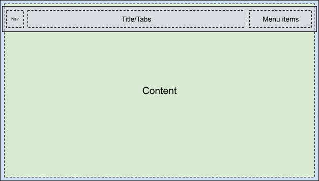
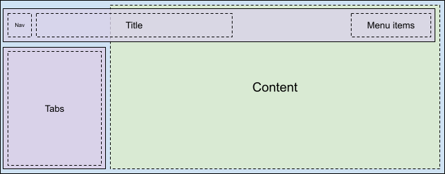
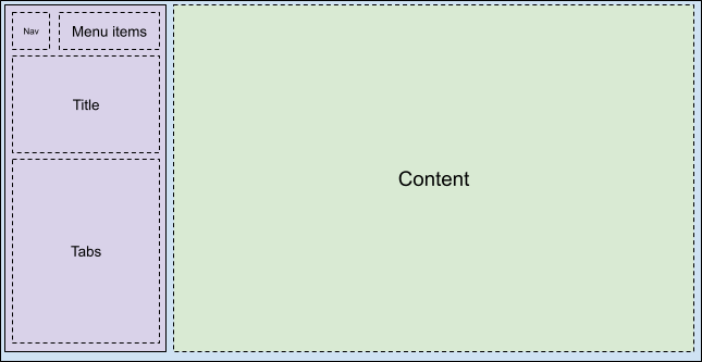
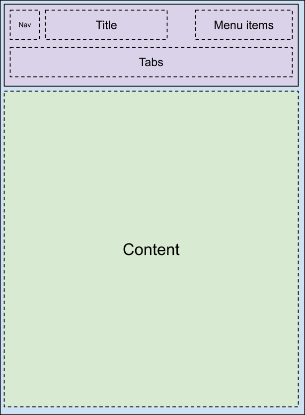
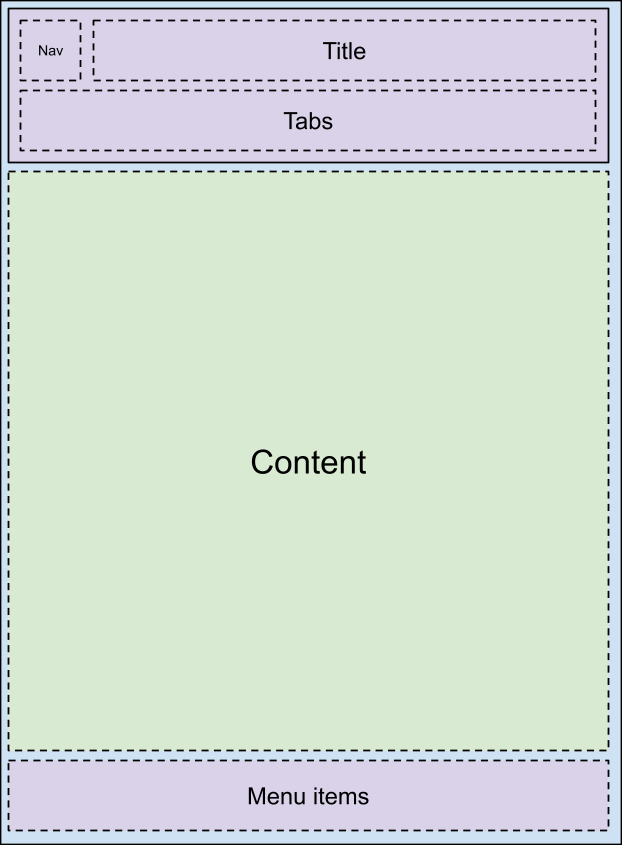
您可以透過 car_ui_base_layout_toolbar.xml
版面配置檔案自訂 car-ui-lib 工具列。之所以稱為「*Base Layout*」工具列,是因為這個版面配置檔案包含 ID 為 car_ui_base_layout_content_container
的 FrameLayout
,該 ID 會在版面配置展開後不久,包含所有應用程式內容。這個結構可讓原始設備製造商 (OEM) 將工具列放在螢幕頂端以外的位置。
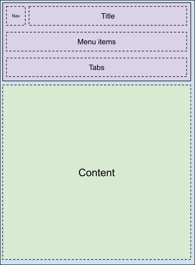
變更 car_ui_base_layout_content_container
上的版面配置參數,即可將應用程式壓縮至較小的區域,為工具列騰出空間。不過,某些自訂設定可能會要求工具列以半透明方式重疊在應用程式上方。在這種情況下,您可以使用 car_ui_top/bottom/left/right_inset
標記檢視畫面。如果 car-ui-lib 偵測到含有這類標記的檢視區塊,就會將該檢視區塊的位置和尺寸傳送至應用程式,以便以該數量向內縮進內容,但仍保留工具列下方空間中的合理背景。舉例來說,大多數應用程式會讓 CarUiRecyclerView 中的首個項目在指定內嵌區下方開始,但在使用者向下捲動時,仍會顯示在工具列後方。
旋轉支援
如要支援旋轉控制器,基本版面配置必須盡早在版面配置中加入 FocusParkingView
。當使用者無法看到焦點時,系統會將焦點放在這個檢視畫面。工具列也必須包裝在 FocusParkingView
中,以指定該工具列為旋轉控制器的獨立推移區域。如果未包裝在 FocusParkingView 中,使用者就無法透過旋轉控制器與工具列互動。
分頁
您可以使用 car_ui_toolbar_tab_item.xml
或 car_ui_toolbar_tab_item_flexible.xml
版面配置檔案自訂工具列分頁。兩個檔案之間沒有功能差異,car_ui_toolbar_tab_flexible_layout
布林值資源會決定要使用哪一個。因此,建議您將 car_ui_toolbar_tab_flexible_layout
設為 false
,並只自訂一般版面配置檔案。
分頁的 ImageView
會以 Java 程式碼中的 car_ui_toolbar_tab_item_selector
顏色著色,因此必須與版面配置一併自訂 car_ui_toolbar_tab_item_selector
。應用程式可以要求不為分頁圖示加上這類色調。
分頁的 TextView
文字外觀設定為 Java 程式碼中的 TextAppearance.CarUi.Widget.Toolbar.Tab
或 TextAppearance.CarUi.Widget.Toolbar.Tab.Selected
,因此版面配置檔案上的文字外觀設定不會套用。這些樣式也必須自訂。
MenuItems
是預設工具列右上角的按鈕。可以是文字、圖示、圖示和文字,或切換鈕。這些變化版本都是 car_ui_toolbar_menu_item
版面配置檔案的一部分,因為 MenuItems
需要能夠在應用程式要求時,在各個表單之間切換。
MenuItems
可以是primary,會將不同的版面配置檔案:car_ui_toolbar_menu_item_primary
加載。主要 MenuItem 必須在視覺上與一般 MenuItem 有所區別,例如透過有邊框/無邊框按鈕。根據預設,car_ui_toolbar_menu_item_primary
只會重新導向至 car_ui_toolbar_menu_item
,因此兩者看起來相同。
MenuItems
可以啟用,這是另一種視覺狀態,表示此 MenuItem 已切換。您可以在 MenuItem 檢視畫面上呼叫 setActivated(true)
來實作此狀態,這會在 MenuItem 檢視畫面中的所有可繪項目中,新增 state_activated
狀態。在執行階段資源重疊 (RRO) 中,您可以使用可繪項目選取器回應此可繪項目狀態。
MenuItems
在車輛行駛時,可限制使用者體驗。UX 限制只是另一個可繪狀態,例如「已啟用」,但這次是在應用程式中定義狀態,而非在 Android 架構中定義。這表示 state_ux_restricted
屬性也必須與 RRO 重疊,以便 RRO 中定義的屬性與應用程式中定義的屬性相符。
搜尋
搜尋列包含在單獨的
car_ui_toolbar_search_view
版面配置檔案中,以便為不需要搜尋列的應用程式改善版面配置填充效能。在 ID 為
car_ui_toolbar_search_view_container
的
FrameLayout
展開時,會包含搜尋列。
這個頁面中的內容和程式碼範例均受《內容授權》中的授權所規範。Java 與 OpenJDK 是 Oracle 和/或其關係企業的商標或註冊商標。
上次更新時間:2025-07-27 (世界標準時間)。
[[["容易理解","easyToUnderstand","thumb-up"],["確實解決了我的問題","solvedMyProblem","thumb-up"],["其他","otherUp","thumb-up"]],[["缺少我需要的資訊","missingTheInformationINeed","thumb-down"],["過於複雜/步驟過多","tooComplicatedTooManySteps","thumb-down"],["過時","outOfDate","thumb-down"],["翻譯問題","translationIssue","thumb-down"],["示例/程式碼問題","samplesCodeIssue","thumb-down"],["其他","otherDown","thumb-down"]],["上次更新時間:2025-07-27 (世界標準時間)。"],[],[],null,["# Customize the toolbar with runtime resource overlays\n\nBase layout overview\n--------------------\n\nThe car-ui-lib toolbar is customized through the `car_ui_base_layout_toolbar.xml`\nlayout file. It's called the \\*base layout\\* toolbar because this layout file\ncontains a `FrameLayout` with id `car_ui_base_layout_content_container`, which\nwill contain all of the app's content shortly after the layout is inflated. This structure lets\nthe OEM place the toolbar in locations other than the top of the screen.\n\n| Possible layouts |||\n|---|---|---|\n| | | |\n| | | |\n\nBy changing the layout parameters on the `car_ui_base_layout_content_container`, the\napp can be compressed into a smaller area to make space for the toolbar. However, some\ncustomizations may call for the toolbar to be transparent and overlaid on top of the app. In this\ncase, views can be tagged with `car_ui_top/bottom/left/right_inset`. If car-ui-lib\ndetects a view with such a tag, it communicates the position and dimensions of that view to the app,\nso it can indent its content inward by that amount, but still keep a reasonable background in the\nspace underneath the toolbar. For example, most apps will have the first item in their\nCarUiRecyclerView start below the specified insets, but still be visible behind the toolbar when the\nuser scrolls down.\n\nRotary support\n--------------\n\nTo support rotary controllers, the base layout must contain a `FocusParkingView` as\nearly as possible in the layout. This view is what gets focused when there is no focus\nvisible to the user. The toolbar must also be wrapped in a `FocusParkingView`, which\nspecifies that it's a separate nudge zone for the rotary controller. If it is not wrapped in a\nFocusParkingView, then the user can't interact with the toolbar with the rotary controller.\n\nTabs\n----\n\nToolbar tabs are customized by either the `car_ui_toolbar_tab_item.xml` or\n`car_ui_toolbar_tab_item_flexible.xml` layout files. There is no functional difference\nbetween the files, the `car_ui_toolbar_tab_flexible_layout` Boolean resource determines\nwhich is used. As a result, it's recommended to keep `car_ui_toolbar_tab_flexible_layout`\nset to `false` and only customize the regular layout file.\n\nThe tab's `ImageView` will be tinted with the color\n`car_ui_toolbar_tab_item_selector` in Java code, so\n`car_ui_toolbar_tab_item_selector` must be customized alongside the layout. Apps can\nrequest that their tab's icons not be tinted with this color as well.\n\nThe tab's `TextView` has its text appearance set to either\n`TextAppearance.CarUi.Widget.Toolbar.Tab` or\n`TextAppearance.CarUi.Widget.Toolbar.Tab.Selected` in Java code, so the text appearance\nset on the layout file won't apply. These styles must be customized as well.\n\nMenuItems\n---------\n\n`MenuItems` are the buttons in the top right corner of the default toolbar. They can\nbe text, icons, icons and text, or switches. These variations are all part of the\n`car_ui_toolbar_menu_item` layout file, as the `MenuItems` need to be able to\nchange between each form if the app requests it.\n\n`MenuItems` can be *primary* , which inflates a different layout file:\n`car_ui_toolbar_menu_item_primary`. A primary MenuItem must look visually\ndistinct from the normal MenuItem, for example via a bordered/borderless button. By default,\n`car_ui_toolbar_menu_item_primary` just redirects to\n`car_ui_toolbar_menu_item`, so they look the same.\n\n`MenuItems` can be *activated* , which is another visual state that indicates\nthat this MenuItem is toggled. This state is implemented by calling `setActivated(true)`\non the MenuItem view, which adds the `state_activated` state to all the drawables in the\nMenuItem's views. This drawable state can be responded to with a drawable selector in the runtime\nresource overlay (RRO).\n\n`MenuItems` can be *UX restricted* when the vehicle is moving. UX restricted is\njust another drawable state like *activated* , but this time the state is defined in the app\ninstead of the Android framework. This means the `state_ux_restricted` attribute must\nalso be overlaid with the RRO, so that the attribute defined in the RRO matches the attribute\ndefined in the app.\n\nSearch\n------\n\nThe search bar is contained in a separate `car_ui_toolbar_search_view` layout file, in order to improve layout inflation performance for apps that don't need a search bar. The `FrameLayout` with id `car_ui_toolbar_search_view_container` will contain the search bar when it is inflated."]]