
The Protected Confirmation user interface (UI) consists of six required elements. You can customize some elements, but they must meet some requirements. Use the following guidelines when customizing the UI and ensure that the requirements are met. If an element is marked with Requirement: that element must use the listed property.
The following guidelines use the Roboto font family, which you can download from Google Fonts.
UI with hardware buttons
Android Protected Confirmation can use hardware buttons on the device for confirming and canceling input.
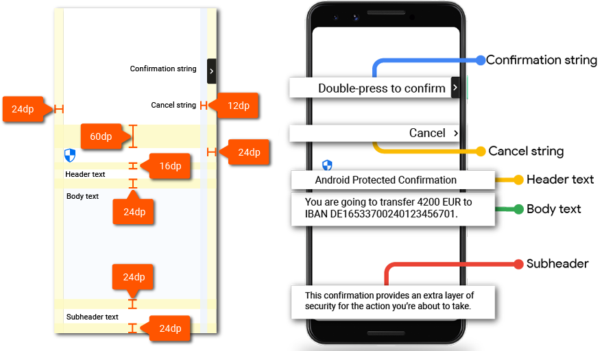
Figure 1. Design layout.
Icons
This section describes the icons used in the UI.
Shield icon
| Icon |  |
|---|---|
| Download | Security shield |
| Icon size | 32dp |
Arrow icon
| Icon |  |
|---|---|
| Download | Keyboard arrow right |
| Icon size | 24dp |
| Container corner radius | 4dp |
Input messages
There are two input types used in Protected Confirmation: confirm and cancel.
Confirmation string
The message must indicate which button is used as confirmation.
| Message | Double-press (button) to confirm |
|---|---|
| Maximum length | Requirement: The confirmation message can't be more than two lines. |
| Color | #000000 87% |
| Font face | Roboto-Medium |
| Font size | Requirement: 14sp |
| Line height | Requirement: 20dp |
Cancel string
The cancel message must be clearly visible and easily distinguished from the confirmation button. Use the following properties along with the single word Cancel:
| Message | Cancel |
|---|---|
| Color | #000000 87% |
| Font face | Roboto-Medium |
| Font size | Requirement: 14sp |
| Line height | Requirement: 20dp |
Header text
Include the header text Android Protected Confirmation in the Trusted UI to identify the feature. Use the following properties for the header text:
| Message | Requirement: Android Protected Confirmation |
|---|---|
| Color | #000000 87% |
| Font face | Roboto-Regular |
| Font size | Requirement: 22sp |
| Line height | Requirement: 28dp |
Body text
Use the following properties when implementing the body text element. The actual message is written by the API developer (app developer).
| Message | The body text is provided by the app developer calling Protected Confirmation. |
|---|---|
| Color | #000000 87% |
| Font face | Roboto-Regular |
| Font size | Requirement: 16sp |
| Line height | Requirement: 24dp |
Subheader text
Use the subheader text to explain why the user is seeing the Protected Confirmation screen. Place this text at the bottom of the screen and use the following properties:
| Message | Requirement: This confirmation provides an extra layer of security for the action you're about to take. |
|---|---|
| Maximum length | Requirement: The confirmation message is a maximum of four lines. |
| Color | #000000 87% |
| Font face | Roboto-Regular |
| Font size | Requirement: 14sp |
| Line height | Requirement: 20dp |
UI with software buttons
Android Protected Confirmation can use software buttons for confirming and canceling input. The following guidelines describe the UI using software buttons:
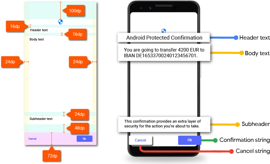
Figure 2. Confirmation UI software design layout.
Shield icon
Download the icon asset at Android Protected Confirmation Shield Icon. Place the icon at the top of the screen.

Figure 3. Shield icon.
The Protected Confirmation shield icon is a required element. You can customize the color of the shield but it must be clearly visible.
Input
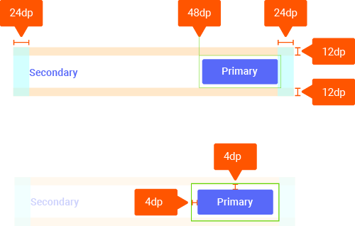
Figure 4. Software button dimensions.
Use the form of a primary and secondary button for the confirmation and cancel inputs.
| Button label | Use sentence case for button labels. |
|---|---|
| Button radius | 4dp |
| Accent color | #1a73e8 |
| Font face | Roboto-Medium |
| Font size | Requirement: 14sp |
Header text
Include the header text Android Protected Confirmation in the Trusted UI to identify the feature. Use the following properties for the header text:
| Message | Requirement: Android Protected Confirmation |
|---|---|
| Color | #000000 87% |
| Font face | Roboto-Medium |
| Font size | Requirement: 24sp |
| Line height | Requirement: 20dp |
Body text
Use the following properties when implementing the body text element. The actual message is written by the app developer.
| Message | The body text is provided by the app developer calling Protected Confirmation. |
|---|---|
| Color | #000000 87% |
| Font face | Roboto-Medium |
| Font size | Requirement: 16sp |
| Line height | Requirement: 24dp |
Subheader text
Use the subheader text to explain why the user is seeing the Protected Confirmation screen. Place this text at the bottom of the screen and use the following properties:
| Message | Requirement: This confirmation provides an extra layer of security for the action you're about to take. |
|---|---|
| Maximum length | Requirement: The confirmation message is a maximum of four lines. |
| Color | #000000 54% |
| Font face | Roboto-Medium |
| Font size | Requirement: 14sp |
| Line height | Requirement: 20dp |
Localization
You can find localizations for the described components in a self-contained C-implementation of a lookup table as part of AOSP.