
This section details how you can customize the Control Center reference app and the UI.
User flows and user interface
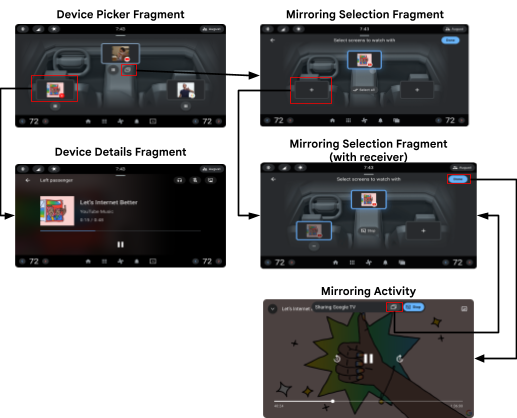
This section describes the user flows and how to launch Control Center.
Launch Control Center
You can launch Control Center through the App Launcher or an icon on the
System UI navigation bar. The icon appears only in builds that have enabled
background visible users (to learn more, see UserHandleAware).
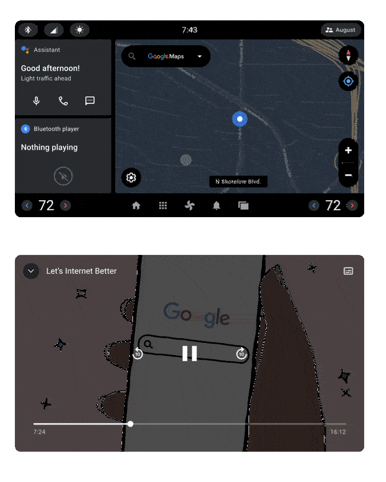
You can view the Control Center at any time. Control Center consists of a combination of translucent windows and transparent backgrounds so it can appear over any other app, including actively playing videos and media. On the Landing page of the app:
- The screen arrangement and use of local and remote screens.
- The screens populated with media and media controls.
- How each screen introduces a detailed view of media (and more) controls.
The arrangement of the screens represents the layout of the screens in
the vehicle. Each screen is a DevicePickerScreen. To customize the location
and size of each screen, use a runtime resource overlay (RRO). To learn more,
see Change the value of an app's resources at runtime.
For each display on which Control Center is open, a different screen with a bright highlighted border is displayed. This is the local screen, the display in use.
Every other screen is a remote screen to represent a different display in
the car that you can identify based on the arrangement of the screens in the
Fragment. To calculate the total number of occupant zones configured in the
vehicle, use CarOccupantZoneManager#getAllOccupantZones.
Each screen defines a custom attribute controlcenter:occupantZoneId to
associate data with the respective occupant zone. When a media app is played on
a specific display, the corresponding screen displays the media album art. A
Play (or Pause) button is displayed below the screen.
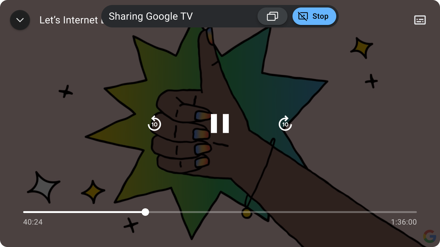
If the active media app is a visible task (opened behind Control Center), a Share button located next to the Play button is enabled to open the Mirroring page. Share lets you share the media app display and is most useful for media apps with video.
Screen elements
Tapping a screen displays a detailed view of the media playing on the display. This is called the Details screen. The view shows media metadata such as title, playback progress, and artist. These buttons provide additional control of the occupant zone.
Audio Output shows which audio output is playing the media, such as cabin speakers or headphones. Audio Output opens a dialog to change the audio output and media volume.
Display Input Lock locks input to the screen. This operation can't be applied to the driver's screen.
Display Power turns off power to the screen. This operation can't be applied to the driver's screen.
The Details view displays a Share button to be tapped when the media is a visible task behind the Control Center app. Share opens the Mirroring page:
Start a co-watching session
The Mirroring page is similar to the Landing page by using an RRO.
To add a screen to co-watch, you tap the screen, and then tap Done.
Doing so opens a Mirroring Activity that hosts the shared app and provides
floating, transient controls to either leave the co-watch session or re-enter
the Mirroring page to add or remove participants.
Summary
The different pages in Control Center are summarized here.
Customization guidelines
Control Center uses Car UI library to let you customize and provides a base theme and structure that can be adopted as is or modified according to these restrictions.
| Customization | Description |
|---|---|
| SHOULD |
Adjust overall theming and styling through an RRO, such as:
|
| MAY | Modify the high-level UI structure of Control Center. |
Control Center belongs to a suite of system apps, which includes Media, Notification Center, and App Launcher. These apps share styles and assets defined in different levels of the AOSP structure:
framework/base/coreTheme.DeviceDefault, the theme designed for use by
OEMs tocustomize device default appearance.packages/services/Car/car_product/overlay:Theme.DeviceDefault that are used to
produce the AOSP look and feel of Android Automotive. OEMs might opt for
excluding this overlay and use their own instead.packages/apps/Car/libs/car-ui-lib:packages/apps/Car/libs/car-apps-common:packages/services/Car/car_product/overlay).packages/apps/Car/MultiDisplay/ControlCenter:Theme.CarUi and are
defined in car-ui-lib. ControlCenterActivity uses custom
Theme.Transparent, that extends Theme.CarUi.To support a flow (such as co-watching that requires the mirrored task to be
visible), the Control Center uses a combination of translucent windows and
transparent backgrounds that don't send the app to the background or send
Lifecycle events.
<style name="Theme.Transparent" parent="@style/Theme.CarUi.NoToolbar">
        <item name="android:windowIsTranslucent">true</item>
        <item name="android:windowBackground">@color/transparent</item>
</style>