ตั้งแต่วันที่ 27 มีนาคม 2025 เป็นต้นไป เราขอแนะนำให้ใช้ android-latest-release
แทน aosp-main
เพื่อสร้างและมีส่วนร่วมใน AOSP โปรดดูข้อมูลเพิ่มเติมที่หัวข้อการเปลี่ยนแปลงใน AOSP
ปรับแต่งแถบเครื่องมือด้วยการซ้อนทับทรัพยากรรันไทม์
จัดทุกอย่างให้เป็นระเบียบอยู่เสมอด้วยคอลเล็กชัน
บันทึกและจัดหมวดหมู่เนื้อหาตามค่ากำหนดของคุณ
ภาพรวมเลย์เอาต์พื้นฐาน
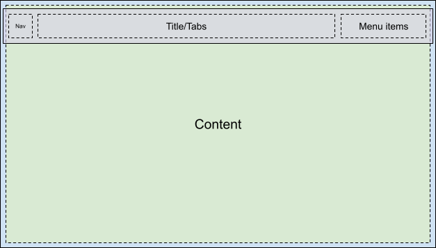
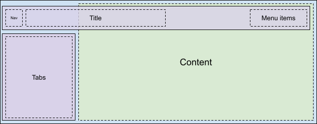
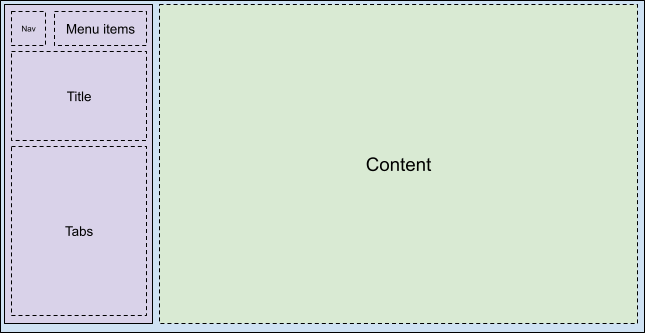
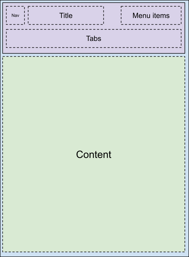
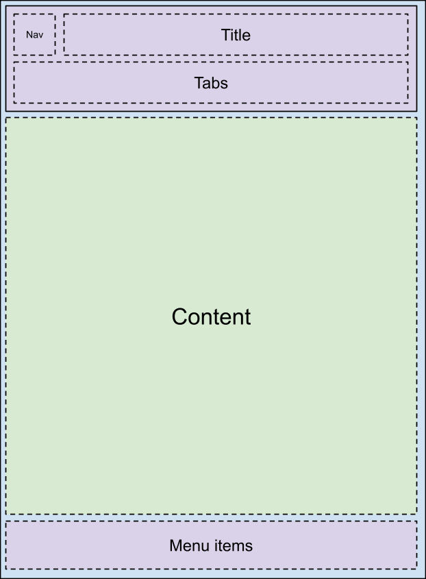
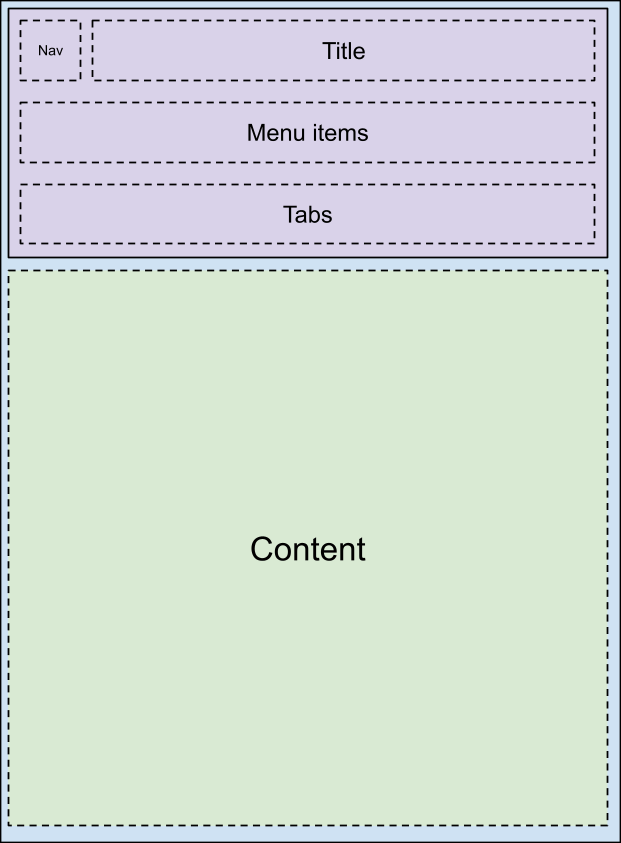
ปรับแต่งแถบเครื่องมือ car-ui-lib ผ่านcar_ui_base_layout_toolbar.xml
ไฟล์เลย์เอาต์ แถบเครื่องมือนี้เรียกว่าแถบเครื่องมือ *เลย์เอาต์พื้นฐาน* เนื่องจากไฟล์เลย์เอาต์นี้มี FrameLayout
ที่มีรหัส car_ui_base_layout_content_container
ซึ่งจะมีเนื้อหาทั้งหมดของแอปหลังจากขยายเลย์เอาต์ไม่นาน โครงสร้างนี้ช่วยให้ OEM วางแถบเครื่องมือในตำแหน่งอื่นที่ไม่ใช่ด้านบนของหน้าจอได้
การเปลี่ยนพารามิเตอร์เลย์เอาต์ใน car_ui_base_layout_content_container
จะทำให้แอปบีบอัดเป็นพื้นที่ขนาดเล็กลงเพื่อให้มีพื้นที่สำหรับแถบเครื่องมือ อย่างไรก็ตาม การปรับแต่งบางอย่างอาจกำหนดให้แถบเครื่องมือมีความโปร่งใสและวางซ้อนอยู่ด้านบนของแอป ในกรณีนี้ คุณสามารถติดแท็กมุมมองด้วย car_ui_top/bottom/left/right_inset
หาก car-ui-lib ตรวจพบมุมมองที่มีแท็กดังกล่าว ก็จะสื่อสารตำแหน่งและขนาดของมุมมองนั้นไปยังแอป เพื่อให้แอปเยื้องเนื้อหาเข้ามาตามจำนวนดังกล่าว แต่ยังคงมีพื้นหลังที่เหมาะสมในพื้นที่ใต้แถบเครื่องมือ ตัวอย่างเช่น แอปส่วนใหญ่จะมีรายการแรกใน CarUiRecyclerView เริ่มต้นต่ำกว่าส่วนที่ตัดออกที่ระบุ แต่ยังคงมองเห็นได้อยู่หลังแถบเครื่องมือเมื่อผู้ใช้เลื่อนลง
การสนับสนุนแบบโรตารี
หากต้องการรองรับตัวควบคุมแบบหมุน เลย์เอาต์ฐานต้องมี FocusParkingView
อยู่ในช่วงต้นของเลย์เอาต์ มุมมองนี้จะได้รับการโฟกัสเมื่อไม่มีโฟกัสที่แสดงต่อผู้ใช้ นอกจากนี้ แถบเครื่องมือต้องอยู่ภายใน FocusParkingView
ซึ่งจะระบุว่าเป็นโซนการแตะแยกต่างหากสำหรับตัวควบคุมแบบหมุน หากไม่ได้รวมอยู่ใน
FocusParkingView ผู้ใช้จะโต้ตอบกับแถบเครื่องมือด้วยตัวควบคุมแบบหมุนไม่ได้
แท็บ
แท็บแถบเครื่องมือจะปรับแต่งโดยใช้ไฟล์เลย์เอาต์ car_ui_toolbar_tab_item.xml
หรือ car_ui_toolbar_tab_item_flexible.xml
ไฟล์เหล่านี้ไม่มีความแตกต่างด้านฟังก์ชันการทำงาน ทรัพยากรบูลีน car_ui_toolbar_tab_flexible_layout
จะเป็นผู้กำหนดว่าจะใช้ไฟล์ใด ดังนั้น เราขอแนะนำให้ตั้งค่า car_ui_toolbar_tab_flexible_layout
เป็น false
ต่อไปและปรับแต่งเฉพาะไฟล์เลย์เอาต์ปกติ
ImageView
ของแท็บจะมีสีของ car_ui_toolbar_tab_item_selector
ในโค้ด Java ดังนั้นจึงต้องปรับแต่ง car_ui_toolbar_tab_item_selector
ควบคู่ไปกับเลย์เอาต์ แอปสามารถขอให้ระบบไม่ปรับสีไอคอนของแท็บด้วยสีนี้ได้ด้วย
TextView
ของแท็บมีการตั้งค่าลักษณะข้อความเป็น TextAppearance.CarUi.Widget.Toolbar.Tab
หรือ TextAppearance.CarUi.Widget.Toolbar.Tab.Selected
ในโค้ด Java ดังนั้นลักษณะข้อความที่ตั้งค่าไว้ในไฟล์เลย์เอาต์จะไม่มีผล รูปแบบเหล่านี้ต้องได้รับการปรับแต่งด้วย
MenuItems
คือปุ่มที่มุมขวาบนของแถบเครื่องมือเริ่มต้น โดยอาจเป็นข้อความ ไอคอน ไอคอนและข้อความ หรือสวิตช์ รูปแบบเหล่านี้ทั้งหมดเป็นส่วนหนึ่งของcar_ui_toolbar_menu_item
ไฟล์เลย์เอาต์ เนื่องจาก MenuItems
จำเป็นต้องเปลี่ยนรูปแบบระหว่างแต่ละแบบฟอร์มได้หากแอปขอ
MenuItems
อาจเป็นไฟล์หลัก ซึ่งจะขยายไฟล์เลย์เอาต์อื่น ดังนี้
car_ui_toolbar_menu_item_primary
MenuItem หลักต้องมีลักษณะที่แตกต่างจาก MenuItem ปกติ เช่น มีปุ่มที่มีขอบ/ไม่มีขอบ โดยค่าเริ่มต้น
car_ui_toolbar_menu_item_primary
จะเปลี่ยนเส้นทางไปยัง
car_ui_toolbar_menu_item
เท่านั้น ดังนั้น URL ทั้งสองจึงมีลักษณะเหมือนกัน
MenuItems
สามารถเปิดใช้งาน ซึ่งเป็นสถานะภาพอีกสถานะหนึ่งที่ระบุว่ามีการเปิด/ปิด MenuItem นี้ สถานะนี้ใช้งานได้โดยการเรียก setActivated(true)
ในมุมมอง MenuItem ซึ่งจะเพิ่มสถานะ state_activated
ให้กับองค์ประกอบที่วาดได้ทั้งหมดในมุมมองของ MenuItem สถานะภาพวาดนี้สามารถตอบสนองด้วยตัวเลือกภาพวาดในรันไทม์ การวางซ้อนทรัพยากร (RRO)
MenuItems
สามารถจำกัด UX ได้เมื่อยานพาหนะกำลังเคลื่อนที่ UX restricted เป็นเพียงสถานะที่วาดได้อีกสถานะหนึ่ง เช่น activated แต่ครั้งนี้ระบบจะกำหนดสถานะในแอปแทนเฟรมเวิร์ก Android ซึ่งหมายความว่าแอตทริบิวต์ state_ux_restricted
ต้องวางซ้อนกับ RRO ด้วย เพื่อให้แอตทริบิวต์ที่กําหนดใน RRO ตรงกับแอตทริบิวต์ที่กําหนดในแอป
ค้นหา
แถบค้นหาจะอยู่ใน
car_ui_toolbar_search_view
ไฟล์เลย์เอาต์แยกต่างหาก เพื่อปรับปรุงประสิทธิภาพการขยายเลย์เอาต์สำหรับแอปที่ไม่ต้องใช้แถบค้นหา
FrameLayout
ที่มีรหัส
car_ui_toolbar_search_view_container
จะมีแถบค้นหาเมื่อขยาย
ตัวอย่างเนื้อหาและโค้ดในหน้าเว็บนี้ขึ้นอยู่กับใบอนุญาตที่อธิบายไว้ในใบอนุญาตการใช้เนื้อหา Java และ OpenJDK เป็นเครื่องหมายการค้าหรือเครื่องหมายการค้าจดทะเบียนของ Oracle และ/หรือบริษัทในเครือ
อัปเดตล่าสุด 2025-07-27 UTC
[[["เข้าใจง่าย","easyToUnderstand","thumb-up"],["แก้ปัญหาของฉันได้","solvedMyProblem","thumb-up"],["อื่นๆ","otherUp","thumb-up"]],[["ไม่มีข้อมูลที่ฉันต้องการ","missingTheInformationINeed","thumb-down"],["ซับซ้อนเกินไป/มีหลายขั้นตอนมากเกินไป","tooComplicatedTooManySteps","thumb-down"],["ล้าสมัย","outOfDate","thumb-down"],["ปัญหาเกี่ยวกับการแปล","translationIssue","thumb-down"],["ตัวอย่าง/ปัญหาเกี่ยวกับโค้ด","samplesCodeIssue","thumb-down"],["อื่นๆ","otherDown","thumb-down"]],["อัปเดตล่าสุด 2025-07-27 UTC"],[],[],null,["# Customize the toolbar with runtime resource overlays\n\nBase layout overview\n--------------------\n\nThe car-ui-lib toolbar is customized through the `car_ui_base_layout_toolbar.xml`\nlayout file. It's called the \\*base layout\\* toolbar because this layout file\ncontains a `FrameLayout` with id `car_ui_base_layout_content_container`, which\nwill contain all of the app's content shortly after the layout is inflated. This structure lets\nthe OEM place the toolbar in locations other than the top of the screen.\n\n| Possible layouts |||\n|---|---|---|\n| | | |\n| | | |\n\nBy changing the layout parameters on the `car_ui_base_layout_content_container`, the\napp can be compressed into a smaller area to make space for the toolbar. However, some\ncustomizations may call for the toolbar to be transparent and overlaid on top of the app. In this\ncase, views can be tagged with `car_ui_top/bottom/left/right_inset`. If car-ui-lib\ndetects a view with such a tag, it communicates the position and dimensions of that view to the app,\nso it can indent its content inward by that amount, but still keep a reasonable background in the\nspace underneath the toolbar. For example, most apps will have the first item in their\nCarUiRecyclerView start below the specified insets, but still be visible behind the toolbar when the\nuser scrolls down.\n\nRotary support\n--------------\n\nTo support rotary controllers, the base layout must contain a `FocusParkingView` as\nearly as possible in the layout. This view is what gets focused when there is no focus\nvisible to the user. The toolbar must also be wrapped in a `FocusParkingView`, which\nspecifies that it's a separate nudge zone for the rotary controller. If it is not wrapped in a\nFocusParkingView, then the user can't interact with the toolbar with the rotary controller.\n\nTabs\n----\n\nToolbar tabs are customized by either the `car_ui_toolbar_tab_item.xml` or\n`car_ui_toolbar_tab_item_flexible.xml` layout files. There is no functional difference\nbetween the files, the `car_ui_toolbar_tab_flexible_layout` Boolean resource determines\nwhich is used. As a result, it's recommended to keep `car_ui_toolbar_tab_flexible_layout`\nset to `false` and only customize the regular layout file.\n\nThe tab's `ImageView` will be tinted with the color\n`car_ui_toolbar_tab_item_selector` in Java code, so\n`car_ui_toolbar_tab_item_selector` must be customized alongside the layout. Apps can\nrequest that their tab's icons not be tinted with this color as well.\n\nThe tab's `TextView` has its text appearance set to either\n`TextAppearance.CarUi.Widget.Toolbar.Tab` or\n`TextAppearance.CarUi.Widget.Toolbar.Tab.Selected` in Java code, so the text appearance\nset on the layout file won't apply. These styles must be customized as well.\n\nMenuItems\n---------\n\n`MenuItems` are the buttons in the top right corner of the default toolbar. They can\nbe text, icons, icons and text, or switches. These variations are all part of the\n`car_ui_toolbar_menu_item` layout file, as the `MenuItems` need to be able to\nchange between each form if the app requests it.\n\n`MenuItems` can be *primary* , which inflates a different layout file:\n`car_ui_toolbar_menu_item_primary`. A primary MenuItem must look visually\ndistinct from the normal MenuItem, for example via a bordered/borderless button. By default,\n`car_ui_toolbar_menu_item_primary` just redirects to\n`car_ui_toolbar_menu_item`, so they look the same.\n\n`MenuItems` can be *activated* , which is another visual state that indicates\nthat this MenuItem is toggled. This state is implemented by calling `setActivated(true)`\non the MenuItem view, which adds the `state_activated` state to all the drawables in the\nMenuItem's views. This drawable state can be responded to with a drawable selector in the runtime\nresource overlay (RRO).\n\n`MenuItems` can be *UX restricted* when the vehicle is moving. UX restricted is\njust another drawable state like *activated* , but this time the state is defined in the app\ninstead of the Android framework. This means the `state_ux_restricted` attribute must\nalso be overlaid with the RRO, so that the attribute defined in the RRO matches the attribute\ndefined in the app.\n\nSearch\n------\n\nThe search bar is contained in a separate `car_ui_toolbar_search_view` layout file, in order to improve layout inflation performance for apps that don't need a search bar. The `FrameLayout` with id `car_ui_toolbar_search_view_container` will contain the search bar when it is inflated."]]