2025 年 3 月 27 日より、AOSP のビルドとコントリビューションには aosp-main
ではなく android-latest-release
を使用することをおすすめします。詳細については、AOSP の変更をご覧ください。
ランタイム リソース オーバーレイによるツールバーのカスタマイズ
コレクションでコンテンツを整理
必要に応じて、コンテンツの保存と分類を行います。
ベース レイアウトの概要
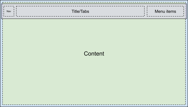
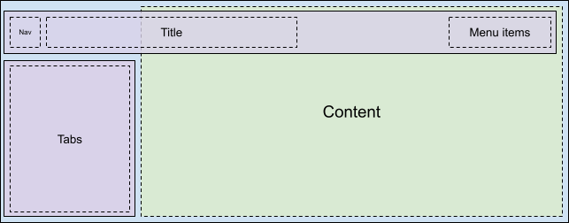
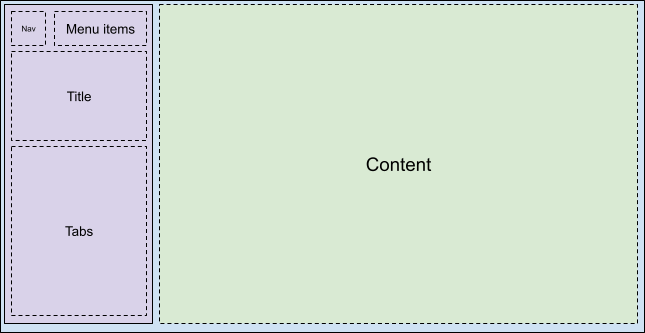
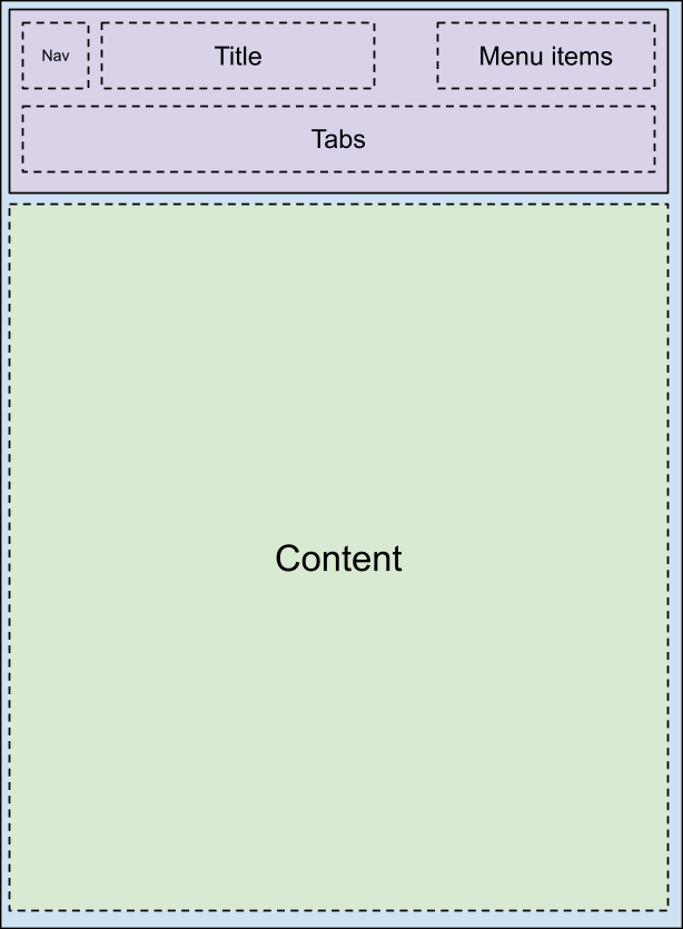
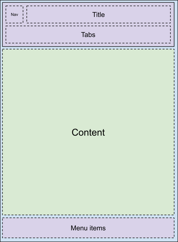
car-ui-lib ツールバーのカスタマイズは car_ui_base_layout_toolbar.xml
レイアウト ファイルで行います。このレイアウト ファイルは、ID が car_ui_base_layout_content_container
の FrameLayout
を含み、レイアウトがインフレートした直後にアプリのコンテンツをすべて含むことから、このツールバーを *ベース レイアウト* ツールバーといいます。これにより、OEM はツールバーを画面の上部以外の場所に配置できます。
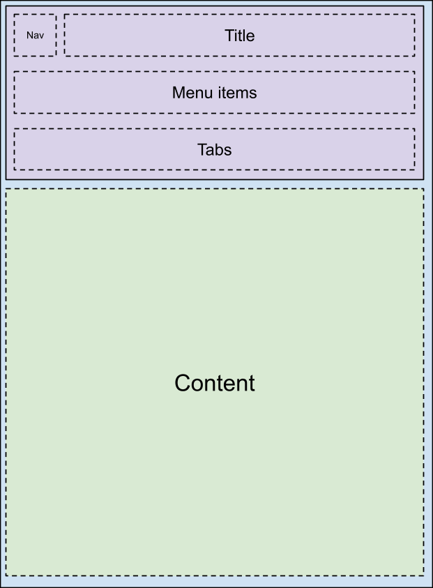
car_ui_base_layout_content_container
のレイアウト パラメータを変更することで、アプリの領域を小さく圧縮して、ツールバーのための空間を確保できます。ただしカスタマイズによっては、ツールバーを透明にしてアプリの上に重ねる必要が出る場合もあります。この場合、ビューに car_ui_top/bottom/left/right_inset
をタグ付けできます。car-ui-lib は、このようなタグの付いたビューを検出すると、そのビューの位置とサイズをアプリに伝えることで、コンテンツをその分だけ内側にインデントしつつも、ツールバー下部の空間に適度な背景を保つことができます。たとえばほとんどのアプリでは、CarUiRecyclerView の最初のアイテムは指定されたインセットの下で開始されますが、ユーザーが下にスクロールするとツールバーの背後に表示されます。
ロータリーのサポート
ロータリー コントローラをサポートするには、レイアウトのできるだけ早い段階でベース レイアウトに FocusParkingView
を含める必要があります。このビューは、ユーザーにフォーカスが表示されていないときにフォーカスされます。また、ツールバーは FocusParkingView
でラップする必要があります。これにより、ロータリー コントローラの別のナッジゾーンであることを指定します。FocusParkingView にラップされていない場合、ユーザーはロータリー コントローラでツールバーを操作できません。
タブ
ツールバータブのカスタマイズは、car_ui_toolbar_tab_item.xml
または car_ui_toolbar_tab_item_flexible.xml
レイアウト ファイルで行います。ファイル間で機能的な違いはありません。どちらのファイルが使用されるかは、car_ui_toolbar_tab_flexible_layout
ブール値リソースによって決まります。そのため、car_ui_toolbar_tab_flexible_layout
を false
に設定したままにし、通常のレイアウト ファイルのみをカスタマイズすることをおすすめします。
タブの ImageView
は Java コードでは car_ui_toolbar_tab_item_selector
の色合いになるため、car_ui_toolbar_tab_item_selector
をレイアウトと一緒にカスタマイズする必要があります。アプリは、タブのアイコンをこの色合いにしないようにリクエストできます。
タブの TextView
は、テキストの外観が Java コードで TextAppearance.CarUi.Widget.Toolbar.Tab
または TextAppearance.CarUi.Widget.Toolbar.Tab.Selected
に設定されているため、レイアウト ファイルで設定されたテキストの外観は適用されません。こうしたスタイルもカスタマイズする必要があります。
MenuItems
は、デフォルトのツールバーの右上隅にあるボタンです。テキスト、アイコン、アイコンとテキスト、またはスイッチです。これらのバリエーションはすべて car_ui_toolbar_menu_item
レイアウト ファイルの一部です。これは、MenuItems
はアプリがリクエストした場合に各フォーム間で変更できる必要があるためです。
MenuItems
は「primary」にすることができ、その場合、別のレイアウト ファイル car_ui_toolbar_menu_item_primary
がインフレートされます。primary の MenuItem は、枠線付き / 枠線なしのボタンなどで、通常の MenuItem と視覚的に区別する必要があります。デフォルトでは、car_ui_toolbar_menu_item_primary
は car_ui_toolbar_menu_item
にリダイレクトされるだけなので、同じに見えます。
MenuItems
は「activated」にすることができます。これは、この MenuItem が切り替えられたことを示す別の視覚的状態です。この状態を実装するには、MenuItem ビューで setActivated(true)
を呼び出します。これにより、MenuItem ビューのすべてのドローアブルに state_activated
状態が追加されます。このドローアブルの状態には、ランタイム リソース オーバーレイ(RRO)のドローアブル セレクタで対応できます。
車両が移動しているとき、MenuItems
は「UX restricted」にできます。「UX restricted」は「activated」と同様にドローアブルの状態の一つですが、この場合 Android フレームワークではなくアプリで定義される点が異なります。つまり、RRO で定義された属性がアプリで定義された属性と一致するように、state_ux_restricted
属性を RRO と重ねる必要もあります。
検索
検索バーは、検索バーを必要としないアプリでのレイアウトのインフレーション パフォーマンスを高めるために、個別の
car_ui_toolbar_search_view
レイアウト ファイルに含まれています。ID が
car_ui_toolbar_search_view_container
である
FrameLayout
には、インフレート時に検索バーが含まれます。
このページのコンテンツやコードサンプルは、コンテンツ ライセンスに記載のライセンスに従います。Java および OpenJDK は Oracle および関連会社の商標または登録商標です。
最終更新日 2025-07-27 UTC。
[[["わかりやすい","easyToUnderstand","thumb-up"],["問題の解決に役立った","solvedMyProblem","thumb-up"],["その他","otherUp","thumb-up"]],[["必要な情報がない","missingTheInformationINeed","thumb-down"],["複雑すぎる / 手順が多すぎる","tooComplicatedTooManySteps","thumb-down"],["最新ではない","outOfDate","thumb-down"],["翻訳に関する問題","translationIssue","thumb-down"],["サンプル / コードに問題がある","samplesCodeIssue","thumb-down"],["その他","otherDown","thumb-down"]],["最終更新日 2025-07-27 UTC。"],[],[],null,["# Customize the toolbar with runtime resource overlays\n\nBase layout overview\n--------------------\n\nThe car-ui-lib toolbar is customized through the `car_ui_base_layout_toolbar.xml`\nlayout file. It's called the \\*base layout\\* toolbar because this layout file\ncontains a `FrameLayout` with id `car_ui_base_layout_content_container`, which\nwill contain all of the app's content shortly after the layout is inflated. This structure lets\nthe OEM place the toolbar in locations other than the top of the screen.\n\n| Possible layouts |||\n|---|---|---|\n| | | |\n| | | |\n\nBy changing the layout parameters on the `car_ui_base_layout_content_container`, the\napp can be compressed into a smaller area to make space for the toolbar. However, some\ncustomizations may call for the toolbar to be transparent and overlaid on top of the app. In this\ncase, views can be tagged with `car_ui_top/bottom/left/right_inset`. If car-ui-lib\ndetects a view with such a tag, it communicates the position and dimensions of that view to the app,\nso it can indent its content inward by that amount, but still keep a reasonable background in the\nspace underneath the toolbar. For example, most apps will have the first item in their\nCarUiRecyclerView start below the specified insets, but still be visible behind the toolbar when the\nuser scrolls down.\n\nRotary support\n--------------\n\nTo support rotary controllers, the base layout must contain a `FocusParkingView` as\nearly as possible in the layout. This view is what gets focused when there is no focus\nvisible to the user. The toolbar must also be wrapped in a `FocusParkingView`, which\nspecifies that it's a separate nudge zone for the rotary controller. If it is not wrapped in a\nFocusParkingView, then the user can't interact with the toolbar with the rotary controller.\n\nTabs\n----\n\nToolbar tabs are customized by either the `car_ui_toolbar_tab_item.xml` or\n`car_ui_toolbar_tab_item_flexible.xml` layout files. There is no functional difference\nbetween the files, the `car_ui_toolbar_tab_flexible_layout` Boolean resource determines\nwhich is used. As a result, it's recommended to keep `car_ui_toolbar_tab_flexible_layout`\nset to `false` and only customize the regular layout file.\n\nThe tab's `ImageView` will be tinted with the color\n`car_ui_toolbar_tab_item_selector` in Java code, so\n`car_ui_toolbar_tab_item_selector` must be customized alongside the layout. Apps can\nrequest that their tab's icons not be tinted with this color as well.\n\nThe tab's `TextView` has its text appearance set to either\n`TextAppearance.CarUi.Widget.Toolbar.Tab` or\n`TextAppearance.CarUi.Widget.Toolbar.Tab.Selected` in Java code, so the text appearance\nset on the layout file won't apply. These styles must be customized as well.\n\nMenuItems\n---------\n\n`MenuItems` are the buttons in the top right corner of the default toolbar. They can\nbe text, icons, icons and text, or switches. These variations are all part of the\n`car_ui_toolbar_menu_item` layout file, as the `MenuItems` need to be able to\nchange between each form if the app requests it.\n\n`MenuItems` can be *primary* , which inflates a different layout file:\n`car_ui_toolbar_menu_item_primary`. A primary MenuItem must look visually\ndistinct from the normal MenuItem, for example via a bordered/borderless button. By default,\n`car_ui_toolbar_menu_item_primary` just redirects to\n`car_ui_toolbar_menu_item`, so they look the same.\n\n`MenuItems` can be *activated* , which is another visual state that indicates\nthat this MenuItem is toggled. This state is implemented by calling `setActivated(true)`\non the MenuItem view, which adds the `state_activated` state to all the drawables in the\nMenuItem's views. This drawable state can be responded to with a drawable selector in the runtime\nresource overlay (RRO).\n\n`MenuItems` can be *UX restricted* when the vehicle is moving. UX restricted is\njust another drawable state like *activated* , but this time the state is defined in the app\ninstead of the Android framework. This means the `state_ux_restricted` attribute must\nalso be overlaid with the RRO, so that the attribute defined in the RRO matches the attribute\ndefined in the app.\n\nSearch\n------\n\nThe search bar is contained in a separate `car_ui_toolbar_search_view` layout file, in order to improve layout inflation performance for apps that don't need a search bar. The `FrameLayout` with id `car_ui_toolbar_search_view_container` will contain the search bar when it is inflated."]]