2025 年 3 月 27 日より、AOSP のビルドとコントリビューションには aosp-main
ではなく android-latest-release
を使用することをおすすめします。詳細については、AOSP の変更をご覧ください。
デュアルペインのカスタマイズ
コレクションでコンテンツを整理
必要に応じて、コンテンツの保存と分類を行います。
Android 12 ではデュアルペイン デザインが導入され、左側に静的 L0 メニュー、右側にコンテンツ ペインが表示されるようになりました。この機能により、多数のカスタマイズ オプションが新たに導入されています。このページでは、これらの機能の詳細と、設定をカスタマイズする方法について説明します。
シングルペインに戻す
CarSettings は、デフォルトでアプリ ウィンドウの幅が 1,400 dp 以上の場合にデュアルペイン ビューで表示され、それ以外の場合はシングルペイン ビューで表示されるようになりました。CarSettings を特定のデバイスに合わせてカスタマイズするには、ランタイム リソース オーバーレイ(RRO)を使用して、必要な構成値をターゲットにします。
値 |
説明 |
config_global_force_single_pane |
アプリ全体をシングルペイン構成で実行する場合は、true に設定します。 |
config_homepage_fragment_class |
ホームページの開始フラグメントを指定します。デュアルペインでは、コンテンツ ペインの最初のフラグメントに使用されます。シングルペインでは、これがホームページのフラグメントになります。 |
さまざまな CarSettings アクティビティで IA をカスタマイズできるため、カスタマイズを簡単にするためにヘッダーキーのマッピングが用意されています。AndroidManifest.xml
では、デュアルペインをサポートするすべてのアクティビティについて、メタデータに TOP_LEVEL_HEADER_KEY
が指定されています。この値は、res/values/header_keys.xml
で指定されたキーを指し、開始フラグメントが属するトップレベル メニュー項目の設定キーにマッピングされます。
そのため、アクティビティの開始フラグメントが変更された場合、または特定のフラグメントが異なるトップレベル設定に属するように IA が並べ替えられた場合、header_keys.xml
ファイル内の関連するマッピングを更新して正しい値を指定できます。
アクティビティ レイアウトをカスタマイズする
BaseCarSettingsActivity
のレイアウトは res/layout/car_setting_activity
と以下のセクションにあります。
値 |
説明 |
top_level_menu |
デュアルペイン構成に表示されるトップレベル メニュー フラグメント。このセクションの幅は、top_level_menu_width で指定します。シャーシのベース レイアウト(ツールバー付き)が、このビューの周囲にラップされています。 |
top_level_divider |
2 つのペインを分割する垂直線。この幅は top_level_divider_width でカスタマイズできます。 |
fragment_container_wrapper |
コンテンツ ペイン(またはシングルペイン構成のメインペイン)のラッパー レイアウト。
シャーシのベース レイアウト(ツールバー付き)が、このビューの周囲にラップされています。 |
settings_focus_parking_view |
必要に応じてロータリー フォーカスを保持する FocusParkingView のカスタム実装。 |
fragment_container |
メイン コンテンツのコンテナ。コンテンツ フラグメントはターゲット レイアウトとしてこれを使用します。 |
restricted_message |
BaseFragment のインスタンスで表示される UX 制限付きブロックビュー。 |
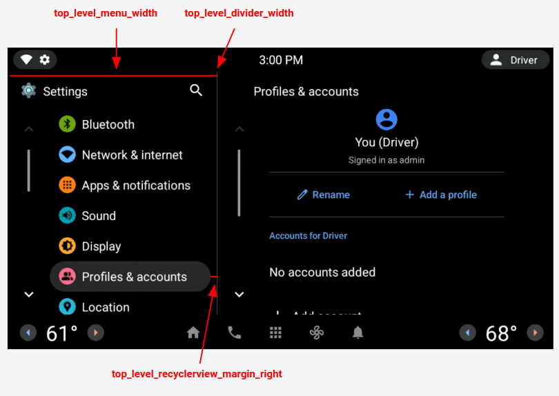
図 1. デュアルペイン レイアウト
トップレベル設定
トップレベル設定は、設定の高さと背景の形状を変更するように若干レイアウトが変更されている、カスタムの CarUiPreferences です。これらの設定の外観はさまざまな方法でカスタマイズできます。
値 |
説明 |
res/layout/top_level_preference.xml |
設定レイアウト全体をオーバーレイします。 |
top_level_preference_min_height |
トップレベル設定の最小の高さ。コンテンツによっては(サブタイトル付きの場合など)、設定がこの値よりも高くなる場合があります。 |
top_level_preference_corner_radius |
角の丸みの半径。 |
top_level_preference_background |
トップレベル設定の背景(ハイライト表示されていない場合)。 |
top_level_preference_highlight |
トップレベル設定の背景(ハイライト表示されている場合)。 |
トップレベル アイコン
図 2 は、色付きの背景図形内のベクター アイコンで構成されているトップレベル アイコンを示しています。この形状は現在、楕円形と長方形のいずれかをサポートするように構成されています。デフォルトでは、形状は楕円形に設定されています。
デフォルトを変更するには、config_top_level_icon_shape
の値を変更します(0 は長方形、1 は楕円形を示します)。アイコンは、top_level_foreground_icon_inset
によって背景の形状から前景アイコンを挿入することで作成されます。各トップレベル アイコンは、res/values/colors.xml
で指定された前景色と、res/color
フォルダで指定された背景色で構成されます。
カスタマイズした外観を作成するには、すべての色の値をオーバーライドします。

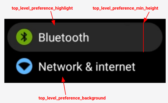
図 2. トップレベル設定のコンポーネント
config_top_level_injection_categories
で指定されたカテゴリに該当する挿入設定のアイコンも、トップレベル アイコンとして扱われます。
指定されたアイコンは、他のすべてのトップレベル アイコンに指定されているものと同じ値、同じ形状で挿入されます(上記参照)。ただし、背景は次の属性をこの順番で確認することによって決定されます。
com.android.settings.bg.argb
挿入アプリからのメタデータ。
com.android.settings.bg.hint
挿入アプリからのメタデータ。
top_level_injected_default_background
: res/values/colors.xml
で指定。
挿入アプリのデータを無視し、常にデフォルトの背景を使用するには、config_top_level_injection_background_always_use_default
を true
に設定します。
このページのコンテンツやコードサンプルは、コンテンツ ライセンスに記載のライセンスに従います。Java および OpenJDK は Oracle および関連会社の商標または登録商標です。
最終更新日 2025-07-27 UTC。
[[["わかりやすい","easyToUnderstand","thumb-up"],["問題の解決に役立った","solvedMyProblem","thumb-up"],["その他","otherUp","thumb-up"]],[["必要な情報がない","missingTheInformationINeed","thumb-down"],["複雑すぎる / 手順が多すぎる","tooComplicatedTooManySteps","thumb-down"],["最新ではない","outOfDate","thumb-down"],["翻訳に関する問題","translationIssue","thumb-down"],["サンプル / コードに問題がある","samplesCodeIssue","thumb-down"],["その他","otherDown","thumb-down"]],["最終更新日 2025-07-27 UTC。"],[],[],null,["# Dual pane customization\n\nAndroid 12 introduces a *dual pane* design, with a static L0 menu on the left and\na content pane on the right. This feature introduces many new customization options. This page\ndetails those features and explains how you can customize your own preferences.\n\nRevert to single pane\n---------------------\n\nBy default, CarSettings now displays the dual pane view when the app window is\ngreater than or equal to 1400dp in width and the single pane view otherwise. To customize\nthis for a specific device, use a runtime resource overlay (RRO) to target the necessary\nconfiguration values:\n\n| Value | Description |\n|-----------------------------------|----------------------------------------------------------------------------------------------------------------------------------------------------------------------------------|\n| `config_global_force_single_pane` | Set to `true` if the entire app is to run in single-pane configuration. |\n| `config_homepage_fragment_class` | Specifies the starting fragment for the homepage. In dual pane, this is used for the initial fragment in the content pane. In single-pane, this should be the homepage fragment. |\n\nHeader keys\n-----------\n\nBecause different CarSettings activities can have a customized IA, a header key mapping\nis provided to simplify customizations. In `AndroidManifest.xml`, every activity\nthat supports dual pane has a `TOP_LEVEL_HEADER_KEY` specified in its metadata.\nThis value points to a key specified in `res/values/header_keys.xml`, which is\nmapped to the preference key of the top-level menu item that the starting fragment falls under.\nTherefore, if the starting fragment of an activity is changed or the IA is rearranged such\nthat a particular fragment falls under a different top-level preference, the relevant mapping(s)\nin the `header_keys.xml` file can be updated to specify the correct value.\n\nCustomize activity layout\n-------------------------\n\nThe layout for `BaseCarSettingsActivity` is located in\n`res/layout/car_setting_activity` and in these sections:\n\n| Value | Description |\n|-------------------------------|--------------------------------------------------------------------------------------------------------------------------------------------------------------------------------------------|\n| `top_level_menu` | Top-level menu fragment shown in dual pane configurations. Width of this section is specified by `top_level_menu_width`. A chassis base layout (with toolbar) is wrapped around this view. |\n| `top_level_divider` | Vertical line that splits the two panes and whose width you can customize with `top_level_divider_width`. |\n| `fragment_container_wrapper` | Wrapper layout for the content pane (or the main pane in a singlepane configuration). A chassis baselayout (with toolbar) is wrapped around this view. |\n| `settings_focus_parking_view` | Custom implementation of `FocusParkingView` to hold rotary focus when needed. |\n| `fragment_container` | Main content container. Content fragments use this as the target layout. |\n| `restricted_message` | UX-restricted blocking view to be shown on instances of `BaseFragment`. |\n\n**Figure 1.** Dual pane layout\n\nTop-level preferences\n---------------------\n\nTop-level preferences are custom CarUiPreferences with a slightly modified layout to change\nthe preference height and background shape. There are many different ways to customize the look\nof these preferences:\n\n| Value | Description |\n|---------------------------------------|---------------------------------------------------------------------------------------------------------------------------------------------------|\n| `res/layout/top_level_preference.xml` | Overlay the *entire* preference layout. |\n| `top_level_preference_min_height` | Minimum height of the top-level preference. Depending on content (for example, a subtitle is present), preferences may be taller than this value. |\n| `top_level_preference_corner_radius` | Radius of the corner rounding. |\n| `top_level_preference_background` | Background of the top-level preferences when not currently highlighted. |\n| `top_level_preference_highlight` | Background of top-level preferences when highlighted. |\n\nTop-level icons\n---------------\n\nFigure 2 illustrates how the top-level icons now consist of a vector icon inside a colored\nbackground shape. This shape is currently configured to support either an oval a rectangular\nshape. By default, shape is set to oval.\n\nTo change the default, modify the value in `config_top_level_icon_shape`\n(where 0 is rectangle and 1 is oval). The icons are created by insetting the foreground icon by\n`top_level_foreground_icon_inset` from the background shape. Each top-level icon has\na foreground color specified in `res/values/colors.xml` and a background color\nspecified in the `res/color` folder.\n\nTo create a customized appearance, you can override all color values.\n\n**Figure 2.** Top-level preference components\n\nIcons for injected preferences that fall into the categories specified by\n`config_top_level_injection_categories` are also treated as top-level icons.\nThe provided icons are inset by the same value and into the same shape as specified for\nall other top-level icons (see above). However, the background is determined by looking\nat the following attributes in this order:\n\n1. `com.android.settings.bg.argb` Meta data from the injecting app.\n2. `com.android.settings.bg.hint` Meta data from the injecting app.\n3. `top_level_injected_default_background` Specified in `res/values/colors.xml`.\n\nTo ignore the injecting app data and always use the default background, set\n`config_top_level_injection_background_always_use_default` to `true`."]]