
受保護的確認使用者介面 (UI) 包含六個必要元素。您可以自訂部分元素,但必須符合某些規定。 自訂 UI 時,請遵守下列規範,並確保符合相關規定。如果元素標示為「必要」,則該元素必須使用列出的屬性。
下列規範使用 Roboto 字型系列,您可以從 Google Fonts 下載。
使用硬體按鈕的 UI
Android Protected Confirmation 可使用裝置上的硬體按鈕確認及取消輸入。
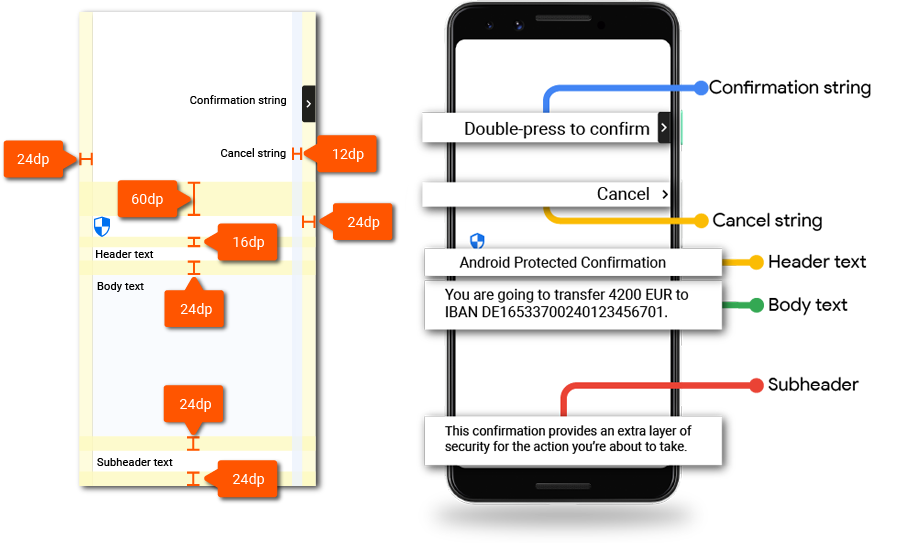
圖 1. 設計版面配置。
圖示
本節說明使用者介面中使用的圖示。
盾牌圖示
| Icon |  |
|---|---|
| 下載 | 安全盾牌 |
| 圖示大小 | 32dp |
「箭頭」圖示
| Icon |  |
|---|---|
| 下載 | 鍵盤向右鍵 |
| 圖示大小 | 24dp |
| 容器圓角半徑 | 4dp |
輸入訊息
受保護的確認功能有兩種輸入類型:確認和取消。
確認字串
訊息必須指出哪個按鈕用於確認。
| 訊息 | 按兩下 (按鈕) 即可確認 |
|---|---|
| 長度上限 | 規定:確認訊息不得超過兩行。 |
| 顏色 | #000000 87% |
| 字體 | Roboto-Medium |
| 字型大小 | 條件需求:14sp |
| 行高 | 條件需求:20dp |
取消字串
取消訊息必須清楚顯示,且與確認按鈕容易區別。請搭配單字「取消」使用下列屬性:
| 訊息 | 取消 |
|---|---|
| 顏色 | #000000 87% |
| 字體 | Roboto-Medium |
| 字型大小 | 條件需求:14sp |
| 行高 | 條件需求:20dp |
標題文字
在「信任的 UI」中加入標題文字「Android Protected Confirmation」,以識別這項功能。請使用下列屬性設定標題文字:
| 訊息 | 規定:Android 保護確認 |
|---|---|
| 顏色 | #000000 87% |
| 字體 | Roboto-Regular |
| 字型大小 | 條件需求:22sp |
| 行高 | 條件需求:28 dp |
內文
實作內文元素時,請使用下列屬性。實際訊息是由 API 開發人員 (應用程式開發人員) 編寫。
| 訊息 | 內文是由呼叫「受保護的確認」的應用程式開發人員提供。 |
|---|---|
| 顏色 | #000000 87% |
| 字體 | Roboto-Regular |
| 字型大小 | 條件需求:16sp |
| 行高 | 條件需求:24dp |
副標題文字
使用副標題文字說明使用者為何會看到「受保護的確認」畫面。將這段文字放在畫面底部,並使用下列屬性:
| 訊息 | 必要條件:這項確認程序可為您即將執行的動作多添一層安全保障。 |
|---|---|
| 長度上限 | 規定:確認訊息最多四行。 |
| 顏色 | #000000 87% |
| 字體 | Roboto-Regular |
| 字型大小 | 條件需求:14sp |
| 行高 | 條件需求:20dp |
軟體按鈕的使用者介面
Android Protected Confirmation 可以使用軟體按鈕確認及取消輸入內容。以下指引說明如何使用軟體按鈕操作 UI:
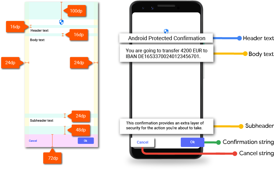
圖 2. 確認 UI 軟體設計版面配置。
盾牌圖示
在「Android Protected Confirmation Shield Icon」(Android 受保護的確認盾牌圖示) 下載圖示素材資源。 將圖示放在畫面頂端。

圖 3. 盾牌圖示。
受保護的確認盾牌圖示為必要元素。您可以自訂盾牌的顏色,但盾牌必須清楚顯示。
輸入
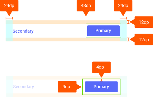
圖 4. 軟體按鈕尺寸。
確認和取消輸入內容時,請使用主要和次要按鈕的形式。
| 按鈕標籤 | 按鈕標籤應採用句首字母大寫格式。 |
|---|---|
| 按鈕半徑 | 4dp |
| 強調色 | #1a73e8 |
| 字體 | Roboto-Medium |
| 字型大小 | 條件需求:14sp |
標題文字
在「信任的 UI」中加入標題文字「Android Protected Confirmation」,以識別這項功能。請使用下列屬性設定標題文字:
| 訊息 | 規定:Android 保護確認 |
|---|---|
| 顏色 | #000000 87% |
| 字體 | Roboto-Medium |
| 字型大小 | 條件需求:24sp |
| 行高 | 條件需求:20dp |
內文
實作內文元素時,請使用下列屬性。實際訊息是由應用程式開發人員撰寫。
| 訊息 | 內文是由呼叫「受保護的確認」的應用程式開發人員提供。 |
|---|---|
| 顏色 | #000000 87% |
| 字體 | Roboto-Medium |
| 字型大小 | 條件需求:16sp |
| 行高 | 條件需求:24dp |
副標題文字
使用副標題文字說明使用者為何會看到「受保護的確認」畫面。將這段文字放在畫面底部,並使用下列屬性:
| 訊息 | 必要條件:這項確認程序可為您即將執行的動作多添一層安全保障。 |
|---|---|
| 長度上限 | 規定:確認訊息最多四行。 |
| 顏色 | #000000 54% |
| 字體 | Roboto-Medium |
| 字型大小 | 條件需求:14sp |
| 行高 | 條件需求:20dp |
本地化
您可以在 AOSP 中,找到查閱資料表的獨立 C 實作項目,其中包含所述元件的本地化版本。