اعتبارًا من 27 آذار (مارس) 2025، ننصحك باستخدام android-latest-release
بدلاً من aosp-main
لإنشاء AOSP والمساهمة فيه. لمزيد من المعلومات، يُرجى الاطّلاع على التغييرات في AOSP.
تخصيص العرض المزدوج
تنظيم صفحاتك في مجموعات
يمكنك حفظ المحتوى وتصنيفه حسب إعداداتك المفضّلة.
يقدّم نظام التشغيل Android 12 تصميم لوحة مزدوجة، مع قائمة L0 ثابتة على اليسار
ولوحة محتوى على اليمين. توفّر هذه الميزة العديد من خيارات التخصيص الجديدة. توضّح هذه الصفحة بالتفصيل هذه الميزات وتشرح كيفية تخصيص إعداداتك المفضّلة.
الرجوع إلى اللوحة الواحدة
يعرض تطبيق CarSettings الآن تلقائيًا طريقة العرض المكوّنة من لوحتَين عندما يكون عرض نافذة التطبيق
أكبر من 1400dp أو يساويه، ويعرض طريقة العرض المكوّنة من لوحة واحدة في الحالات الأخرى. لتخصيص
هذا لجهاز معيّن، استخدِم تراكب موارد وقت التشغيل (RRO) لاستهداف قيم الإعدادات اللازمة:
القيمة |
الوصف |
config_global_force_single_pane |
اضبط القيمة على true إذا كان سيتم تشغيل التطبيق بأكمله في وضع
اللوحة الواحدة. |
config_homepage_fragment_class |
تُحدِّد المقتطف الأوّلي للصفحة الرئيسية. في وضع "الشريحة المزدوجة"، يتم استخدام هذا الخيار لتحديد
المقتطف الأولي في لوحة المحتوى. في اللوحة الواحدة، يجب أن يكون هذا المقتطف هو مقتطف الصفحة الرئيسية. |
بما أنّ أنشطة CarSettings المختلفة يمكن أن تتضمّن واجهة مستخدم مخصّصة، يتم توفير تعيين مفتاح العنوان
لتبسيط عمليات التخصيص. في AndroidManifest.xml
، يحتوي كل نشاط
يتوافق مع وضع "لوحةَان" على TOP_LEVEL_HEADER_KEY
محدّد في البيانات الوصفية.
تشير هذه القيمة إلى مفتاح محدّد في res/values/header_keys.xml
، والذي يتم
ربطه بمفتاح الإعدادات المفضّلة لعنصر القائمة من المستوى الأعلى الذي يندرج تحته الجزء الافتتاحي.
لذلك، في حال تغيير المقتطف الأوّلي لنشاط معيّن أو إعادة ترتيب ملف IA بحيث يقع مقتطف معيّن ضمن إعدادات مفضّلة مختلفة من المستوى الأعلى، يمكن تعديل عمليات الربط ذات الصلة في ملف header_keys.xml
لتحديد القيمة الصحيحة.
تخصيص تنسيق النشاط
يمكن العثور على تنسيق BaseCarSettingsActivity
في
res/layout/car_setting_activity
وفي الأقسام التالية:
القيمة |
الوصف |
top_level_menu |
جزء من القائمة ذات المستوى الأعلى يظهر في الإعدادات المزوّدة بشقّين يتم تحديد عرض هذا القسم
بواسطة top_level_menu_width . يتم عرض تنسيق قاعدة الشاسيه (مع شريط الأدوات)
حول هذا العرض. |
top_level_divider |
خط عمودي يقسم النافذتَين ويمكن تخصيص عرضه باستخدام
top_level_divider_width . |
fragment_container_wrapper |
تنسيق الغلاف للوحة المحتوى (أو اللوحة الرئيسية في الإعداد المكوّن من لوحة واحدة)
يتم لفّ تنسيق أساسي للهيكل (مع شريط الأدوات) حول هذا العرض. |
settings_focus_parking_view |
التنفيذ المخصّص لـ FocusParkingView للحفاظ على التركيز الدوّار
عند الحاجة |
fragment_container |
حاوية المحتوى الرئيسي وتستخدم أجزاء المحتوى هذا كتنسيق مستهدَف. |
restricted_message |
عرض الحظر المحدود لتجربة المستخدم ليتم عرضه على نُسخ BaseFragment |

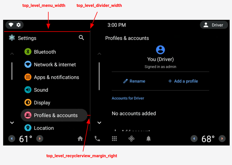
الشكل 1: تنسيق اللوحة المزدوجة
الإعدادات المفضّلة على مستوى أعلى
الإعدادات المفضّلة ذات المستوى الأعلى هي CarUiPreferences مخصّصة بتنسيق معدَّل قليلاً لتغيير
ارتفاع الإعدادات المفضّلة وشكل الخلفية. هناك العديد من الطرق المختلفة لتخصيص مظهر
هذه الخيارات المفضّلة:
القيمة |
الوصف |
res/layout/top_level_preference.xml |
التراكب على تنسيق الإعدادات المفضّلة الكاملة |
top_level_preference_min_height |
الحد الأدنى لارتفاع الإعدادات المفضّلة ذات المستوى الأعلى استنادًا إلى المحتوى (على سبيل المثال، إذا كان هناك ترجمة ملفوظة
)، قد تكون الإعدادات المفضّلة أطول من هذه القيمة. |
top_level_preference_corner_radius |
نصف قطر التقريب في الزاوية. |
top_level_preference_background |
خلفية الإعدادات المفضّلة على المستوى الأعلى عندما لا تكون مميّزة حاليًا |
top_level_preference_highlight |
خلفية الإعدادات المفضّلة ذات المستوى الأعلى عند تمييزها |
الرموز ذات المستوى الأعلى
يوضّح الشكل 2 كيف تتكوّن الرموز من المستوى الأعلى الآن من رمز متّجه داخل شكل
خلفية ملون. تم ضبط هذا الشكل حاليًا ليتوافق مع شكل بيضاوي أو مستطيل. يتم ضبط الشكل تلقائيًا على بيضاوي.
لتغيير القيمة التلقائية، عدِّل القيمة في config_top_level_icon_shape
(حيث يكون 0 مستطيلاً و1 بيضاويًا). يتم إنشاء الرموز من خلال إدراج رمز المقدّمة باستخدام الرمز
top_level_foreground_icon_inset
من شكل الخلفية. يحتوي كل رمز من رموز المستوى الأعلى على
لون واجهة محدّد في res/values/colors.xml
ولون خلفية
محدّد في مجلد res/color
.
لإنشاء مظهر مخصّص، يمكنك إلغاء جميع قيم الألوان.

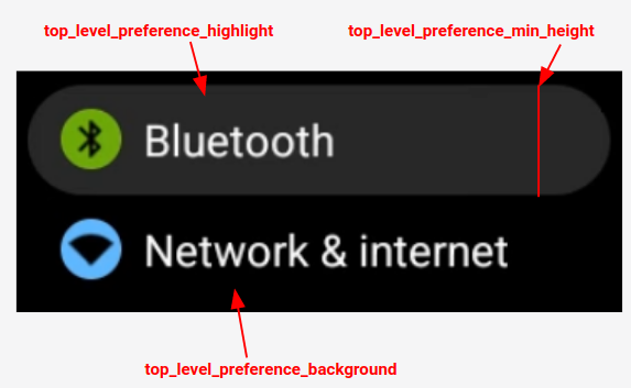
الشكل 2: مكوّنات الإعدادات المفضّلة ذات المستوى الأعلى
تُعامل أيضًا رموز الإعدادات المفضّلة المُدرَجة ضمن الفئات المحدّدة باستخدام
config_top_level_injection_categories
كرموز من المستوى الأعلى.
يتمّ إدراج الأيقونات المقدّمة بالقيمة نفسها وبالشكل نفسه المحدّد
لجميع الأيقونات الأخرى ذات المستوى الأعلى (راجِع أعلاه). ومع ذلك، يتم تحديد الخلفية من خلال النظر
في السمات التالية بهذا الترتيب:
com.android.settings.bg.argb
البيانات الوصفية من التطبيق الذي يتمّ من خلاله حقن البيانات
com.android.settings.bg.hint
البيانات الوصفية من التطبيق الذي يتمّ من خلاله حقن البيانات
top_level_injected_default_background
تم تحديده في
res/values/colors.xml
.
لتجاهل بيانات التطبيق التي يتم حقنها واستخدام الخلفية التلقائية دائمًا، اضبط
config_top_level_injection_background_always_use_default
على true
.
يخضع كل من المحتوى وعيّنات التعليمات البرمجية في هذه الصفحة للتراخيص الموضحّة في ترخيص استخدام المحتوى. إنّ Java وOpenJDK هما علامتان تجاريتان مسجَّلتان لشركة Oracle و/أو الشركات التابعة لها.
تاريخ التعديل الأخير: 2025-07-27 (حسب التوقيت العالمي المتفَّق عليه)
[[["يسهُل فهم المحتوى.","easyToUnderstand","thumb-up"],["ساعَدني المحتوى في حلّ مشكلتي.","solvedMyProblem","thumb-up"],["غير ذلك","otherUp","thumb-up"]],[["لا يحتوي على المعلومات التي أحتاج إليها.","missingTheInformationINeed","thumb-down"],["الخطوات معقدة للغاية / كثيرة جدًا.","tooComplicatedTooManySteps","thumb-down"],["المحتوى قديم.","outOfDate","thumb-down"],["ثمة مشكلة في الترجمة.","translationIssue","thumb-down"],["مشكلة في العيّنات / التعليمات البرمجية","samplesCodeIssue","thumb-down"],["غير ذلك","otherDown","thumb-down"]],["تاريخ التعديل الأخير: 2025-07-27 (حسب التوقيت العالمي المتفَّق عليه)"],[],[],null,["# Dual pane customization\n\nAndroid 12 introduces a *dual pane* design, with a static L0 menu on the left and\na content pane on the right. This feature introduces many new customization options. This page\ndetails those features and explains how you can customize your own preferences.\n\nRevert to single pane\n---------------------\n\nBy default, CarSettings now displays the dual pane view when the app window is\ngreater than or equal to 1400dp in width and the single pane view otherwise. To customize\nthis for a specific device, use a runtime resource overlay (RRO) to target the necessary\nconfiguration values:\n\n| Value | Description |\n|-----------------------------------|----------------------------------------------------------------------------------------------------------------------------------------------------------------------------------|\n| `config_global_force_single_pane` | Set to `true` if the entire app is to run in single-pane configuration. |\n| `config_homepage_fragment_class` | Specifies the starting fragment for the homepage. In dual pane, this is used for the initial fragment in the content pane. In single-pane, this should be the homepage fragment. |\n\nHeader keys\n-----------\n\nBecause different CarSettings activities can have a customized IA, a header key mapping\nis provided to simplify customizations. In `AndroidManifest.xml`, every activity\nthat supports dual pane has a `TOP_LEVEL_HEADER_KEY` specified in its metadata.\nThis value points to a key specified in `res/values/header_keys.xml`, which is\nmapped to the preference key of the top-level menu item that the starting fragment falls under.\nTherefore, if the starting fragment of an activity is changed or the IA is rearranged such\nthat a particular fragment falls under a different top-level preference, the relevant mapping(s)\nin the `header_keys.xml` file can be updated to specify the correct value.\n\nCustomize activity layout\n-------------------------\n\nThe layout for `BaseCarSettingsActivity` is located in\n`res/layout/car_setting_activity` and in these sections:\n\n| Value | Description |\n|-------------------------------|--------------------------------------------------------------------------------------------------------------------------------------------------------------------------------------------|\n| `top_level_menu` | Top-level menu fragment shown in dual pane configurations. Width of this section is specified by `top_level_menu_width`. A chassis base layout (with toolbar) is wrapped around this view. |\n| `top_level_divider` | Vertical line that splits the two panes and whose width you can customize with `top_level_divider_width`. |\n| `fragment_container_wrapper` | Wrapper layout for the content pane (or the main pane in a singlepane configuration). A chassis baselayout (with toolbar) is wrapped around this view. |\n| `settings_focus_parking_view` | Custom implementation of `FocusParkingView` to hold rotary focus when needed. |\n| `fragment_container` | Main content container. Content fragments use this as the target layout. |\n| `restricted_message` | UX-restricted blocking view to be shown on instances of `BaseFragment`. |\n\n**Figure 1.** Dual pane layout\n\nTop-level preferences\n---------------------\n\nTop-level preferences are custom CarUiPreferences with a slightly modified layout to change\nthe preference height and background shape. There are many different ways to customize the look\nof these preferences:\n\n| Value | Description |\n|---------------------------------------|---------------------------------------------------------------------------------------------------------------------------------------------------|\n| `res/layout/top_level_preference.xml` | Overlay the *entire* preference layout. |\n| `top_level_preference_min_height` | Minimum height of the top-level preference. Depending on content (for example, a subtitle is present), preferences may be taller than this value. |\n| `top_level_preference_corner_radius` | Radius of the corner rounding. |\n| `top_level_preference_background` | Background of the top-level preferences when not currently highlighted. |\n| `top_level_preference_highlight` | Background of top-level preferences when highlighted. |\n\nTop-level icons\n---------------\n\nFigure 2 illustrates how the top-level icons now consist of a vector icon inside a colored\nbackground shape. This shape is currently configured to support either an oval a rectangular\nshape. By default, shape is set to oval.\n\nTo change the default, modify the value in `config_top_level_icon_shape`\n(where 0 is rectangle and 1 is oval). The icons are created by insetting the foreground icon by\n`top_level_foreground_icon_inset` from the background shape. Each top-level icon has\na foreground color specified in `res/values/colors.xml` and a background color\nspecified in the `res/color` folder.\n\nTo create a customized appearance, you can override all color values.\n\n**Figure 2.** Top-level preference components\n\nIcons for injected preferences that fall into the categories specified by\n`config_top_level_injection_categories` are also treated as top-level icons.\nThe provided icons are inset by the same value and into the same shape as specified for\nall other top-level icons (see above). However, the background is determined by looking\nat the following attributes in this order:\n\n1. `com.android.settings.bg.argb` Meta data from the injecting app.\n2. `com.android.settings.bg.hint` Meta data from the injecting app.\n3. `top_level_injected_default_background` Specified in `res/values/colors.xml`.\n\nTo ignore the injecting app data and always use the default background, set\n`config_top_level_injection_background_always_use_default` to `true`."]]