自 2025 年 3 月 27 日起,我們建議您使用 android-latest-release
而非 aosp-main
建構及貢獻 AOSP。詳情請參閱「Android 開放原始碼計畫變更」。
雙窗格自訂
透過集合功能整理內容
你可以依據偏好儲存及分類內容。
Android 12 推出雙窗格設計,左側為靜態 L0 選單,右側則是內容窗格。這項功能推出許多新的自訂選項。本頁面將詳細說明這些功能,並說明如何自訂個人偏好設定。
還原為單一窗格
根據預設,如果應用程式視窗的寬度大於或等於 1400dp,CarSettings 就會顯示雙窗格檢視畫面,否則則會顯示單一窗格檢視畫面。如要針對特定裝置自訂這項設定,請使用執行階段資源覆蓋 (RRO) 指定必要的設定值:
值 |
說明 |
config_global_force_single_pane |
如果整個應用程式要在單一檢視窗設定中執行,請將其設為 true 。 |
config_homepage_fragment_class |
指定首頁的起始片段。在雙窗格中,這會用於內容窗格中的初始片段。在單一窗格中,這應該是首頁片段。 |
由於不同的 CarSettings 活動可以有自訂的 IA,因此我們提供標頭鍵對應項目,以簡化自訂程序。在 AndroidManifest.xml
中,每個支援雙窗格模式的活動在中繼資料中都會指定 TOP_LEVEL_HEADER_KEY
。這個值會指向 res/values/header_keys.xml
中指定的索引鍵,該索引鍵會對應至所屬起始片段的上層選單項目偏好設定鍵。因此,如果活動的起始片段有所變更,或是 IA 重新排序,導致特定片段落在不同的頂層偏好設定下,您可以更新 header_keys.xml
檔案中的相關對應項目,指定正確的值。
自訂活動版面配置
BaseCarSettingsActivity
的版面配置位於 res/layout/car_setting_activity
和以下各節:
值 |
說明 |
top_level_menu |
雙窗格設定中顯示的頂層選單片段。這個區段的寬度由 top_level_menu_width 指定。這個檢視畫面會包裝在底層機殼版面配置 (含工具列) 中。 |
top_level_divider |
分割兩個窗格的垂直線,您可以使用 top_level_divider_width 自訂其寬度。 |
fragment_container_wrapper |
內容窗格 (或單一窗格設定中的主窗格) 的包裝函式版面配置。這個檢視畫面會包覆底層結構 baselayout (含工具列)。 |
settings_focus_parking_view |
自訂實作 FocusParkingView ,以便在需要時保留旋轉焦點。 |
fragment_container |
主要內容容器。內容片段會將此值做為目標版面配置。 |
restricted_message |
在 BaseFragment 的例項中顯示 UX 受限封鎖檢視畫面。 |
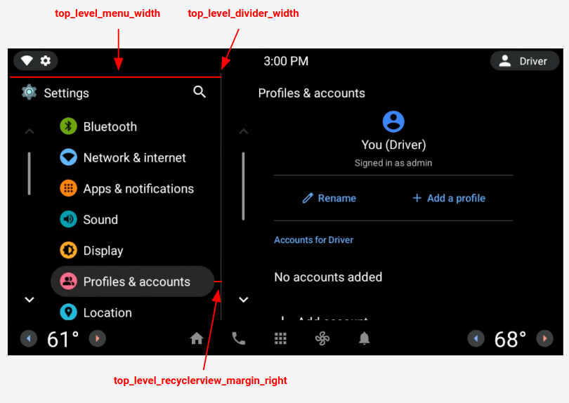
圖 1. 雙窗格版面配置
頂層偏好設定
頂層偏好設定是自訂的 CarUiPreferences,其中的版面配置經過微幅修改,可變更偏好設定的高度和背景形狀。您可以透過多種方式自訂這些偏好設定的外觀:
值 |
說明 |
res/layout/top_level_preference.xml |
疊加整個偏好設定版面配置。 |
top_level_preference_min_height |
頂層偏好設定的最小高度。視內容而定 (例如是否有字幕),偏好設定可能會比這個值高。 |
top_level_preference_corner_radius |
圓角半徑。 |
top_level_preference_background |
頂層偏好設定的背景,當前未醒目顯示時。 |
top_level_preference_highlight |
醒目顯示時的頂層偏好設定背景。 |
頂層圖示
圖 2 說明頂層圖示現在如何由彩色背景形狀內的向量圖示組成。這個形狀目前已設定為支援橢圓形或矩形。預設形狀為橢圓形。
如要變更預設值,請修改 config_top_level_icon_shape
中的值 (0 為矩形,1 為橢圓形)。建立圖示的方式是使用 top_level_foreground_icon_inset
從背景形狀內嵌入前景圖示。每個頂層圖示都有在 res/values/colors.xml
中指定的前景色,以及在 res/color
資料夾中指定的背景色。
如要建立自訂外觀,您可以覆寫所有色彩值。
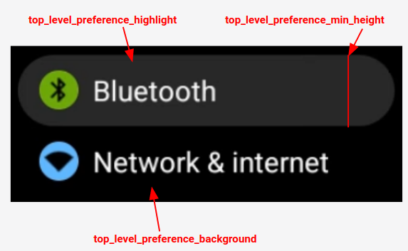
圖 2. 頂層偏好設定元件
對於由 config_top_level_injection_categories
指定的類別,系統也會將注入偏好設定的圖示視為頂層圖示。提供的圖示會以相同的值內嵌,並採用與所有其他頂層圖示相同的形狀 (請參閱上方說明)。不過,系統會依序查看下列屬性,判斷背景:
com.android.settings.bg.argb
來自注入應用程式的中繼資料。
com.android.settings.bg.hint
來自注入應用程式的中繼資料。
top_level_injected_default_background
已在 res/values/colors.xml
中指定。
如要忽略插入的應用程式資料,並一律使用預設背景,請將 config_top_level_injection_background_always_use_default
設為 true
。
這個頁面中的內容和程式碼範例均受《內容授權》中的授權所規範。Java 與 OpenJDK 是 Oracle 和/或其關係企業的商標或註冊商標。
上次更新時間:2025-07-27 (世界標準時間)。
[[["容易理解","easyToUnderstand","thumb-up"],["確實解決了我的問題","solvedMyProblem","thumb-up"],["其他","otherUp","thumb-up"]],[["缺少我需要的資訊","missingTheInformationINeed","thumb-down"],["過於複雜/步驟過多","tooComplicatedTooManySteps","thumb-down"],["過時","outOfDate","thumb-down"],["翻譯問題","translationIssue","thumb-down"],["示例/程式碼問題","samplesCodeIssue","thumb-down"],["其他","otherDown","thumb-down"]],["上次更新時間:2025-07-27 (世界標準時間)。"],[],[],null,["# Dual pane customization\n\nAndroid 12 introduces a *dual pane* design, with a static L0 menu on the left and\na content pane on the right. This feature introduces many new customization options. This page\ndetails those features and explains how you can customize your own preferences.\n\nRevert to single pane\n---------------------\n\nBy default, CarSettings now displays the dual pane view when the app window is\ngreater than or equal to 1400dp in width and the single pane view otherwise. To customize\nthis for a specific device, use a runtime resource overlay (RRO) to target the necessary\nconfiguration values:\n\n| Value | Description |\n|-----------------------------------|----------------------------------------------------------------------------------------------------------------------------------------------------------------------------------|\n| `config_global_force_single_pane` | Set to `true` if the entire app is to run in single-pane configuration. |\n| `config_homepage_fragment_class` | Specifies the starting fragment for the homepage. In dual pane, this is used for the initial fragment in the content pane. In single-pane, this should be the homepage fragment. |\n\nHeader keys\n-----------\n\nBecause different CarSettings activities can have a customized IA, a header key mapping\nis provided to simplify customizations. In `AndroidManifest.xml`, every activity\nthat supports dual pane has a `TOP_LEVEL_HEADER_KEY` specified in its metadata.\nThis value points to a key specified in `res/values/header_keys.xml`, which is\nmapped to the preference key of the top-level menu item that the starting fragment falls under.\nTherefore, if the starting fragment of an activity is changed or the IA is rearranged such\nthat a particular fragment falls under a different top-level preference, the relevant mapping(s)\nin the `header_keys.xml` file can be updated to specify the correct value.\n\nCustomize activity layout\n-------------------------\n\nThe layout for `BaseCarSettingsActivity` is located in\n`res/layout/car_setting_activity` and in these sections:\n\n| Value | Description |\n|-------------------------------|--------------------------------------------------------------------------------------------------------------------------------------------------------------------------------------------|\n| `top_level_menu` | Top-level menu fragment shown in dual pane configurations. Width of this section is specified by `top_level_menu_width`. A chassis base layout (with toolbar) is wrapped around this view. |\n| `top_level_divider` | Vertical line that splits the two panes and whose width you can customize with `top_level_divider_width`. |\n| `fragment_container_wrapper` | Wrapper layout for the content pane (or the main pane in a singlepane configuration). A chassis baselayout (with toolbar) is wrapped around this view. |\n| `settings_focus_parking_view` | Custom implementation of `FocusParkingView` to hold rotary focus when needed. |\n| `fragment_container` | Main content container. Content fragments use this as the target layout. |\n| `restricted_message` | UX-restricted blocking view to be shown on instances of `BaseFragment`. |\n\n**Figure 1.** Dual pane layout\n\nTop-level preferences\n---------------------\n\nTop-level preferences are custom CarUiPreferences with a slightly modified layout to change\nthe preference height and background shape. There are many different ways to customize the look\nof these preferences:\n\n| Value | Description |\n|---------------------------------------|---------------------------------------------------------------------------------------------------------------------------------------------------|\n| `res/layout/top_level_preference.xml` | Overlay the *entire* preference layout. |\n| `top_level_preference_min_height` | Minimum height of the top-level preference. Depending on content (for example, a subtitle is present), preferences may be taller than this value. |\n| `top_level_preference_corner_radius` | Radius of the corner rounding. |\n| `top_level_preference_background` | Background of the top-level preferences when not currently highlighted. |\n| `top_level_preference_highlight` | Background of top-level preferences when highlighted. |\n\nTop-level icons\n---------------\n\nFigure 2 illustrates how the top-level icons now consist of a vector icon inside a colored\nbackground shape. This shape is currently configured to support either an oval a rectangular\nshape. By default, shape is set to oval.\n\nTo change the default, modify the value in `config_top_level_icon_shape`\n(where 0 is rectangle and 1 is oval). The icons are created by insetting the foreground icon by\n`top_level_foreground_icon_inset` from the background shape. Each top-level icon has\na foreground color specified in `res/values/colors.xml` and a background color\nspecified in the `res/color` folder.\n\nTo create a customized appearance, you can override all color values.\n\n**Figure 2.** Top-level preference components\n\nIcons for injected preferences that fall into the categories specified by\n`config_top_level_injection_categories` are also treated as top-level icons.\nThe provided icons are inset by the same value and into the same shape as specified for\nall other top-level icons (see above). However, the background is determined by looking\nat the following attributes in this order:\n\n1. `com.android.settings.bg.argb` Meta data from the injecting app.\n2. `com.android.settings.bg.hint` Meta data from the injecting app.\n3. `top_level_injected_default_background` Specified in `res/values/colors.xml`.\n\nTo ignore the injecting app data and always use the default background, set\n`config_top_level_injection_background_always_use_default` to `true`."]]