
An AppCard is a grouping of UI elements with styling controlled by the OEM, and populated with information provided by apps. AppCards display an app's most relevant data and functionality to users in a way that is accessible and always available.

Figure 1. AppCard components.
Third-party developers can use AppCards to:
- Display the status of a takeout food order to a driver while en route.
- Show photos to passengers in vehicles to form a pleasant ambiance.
- Track and periodically update the price of crypto coins for investors.
Examples include:
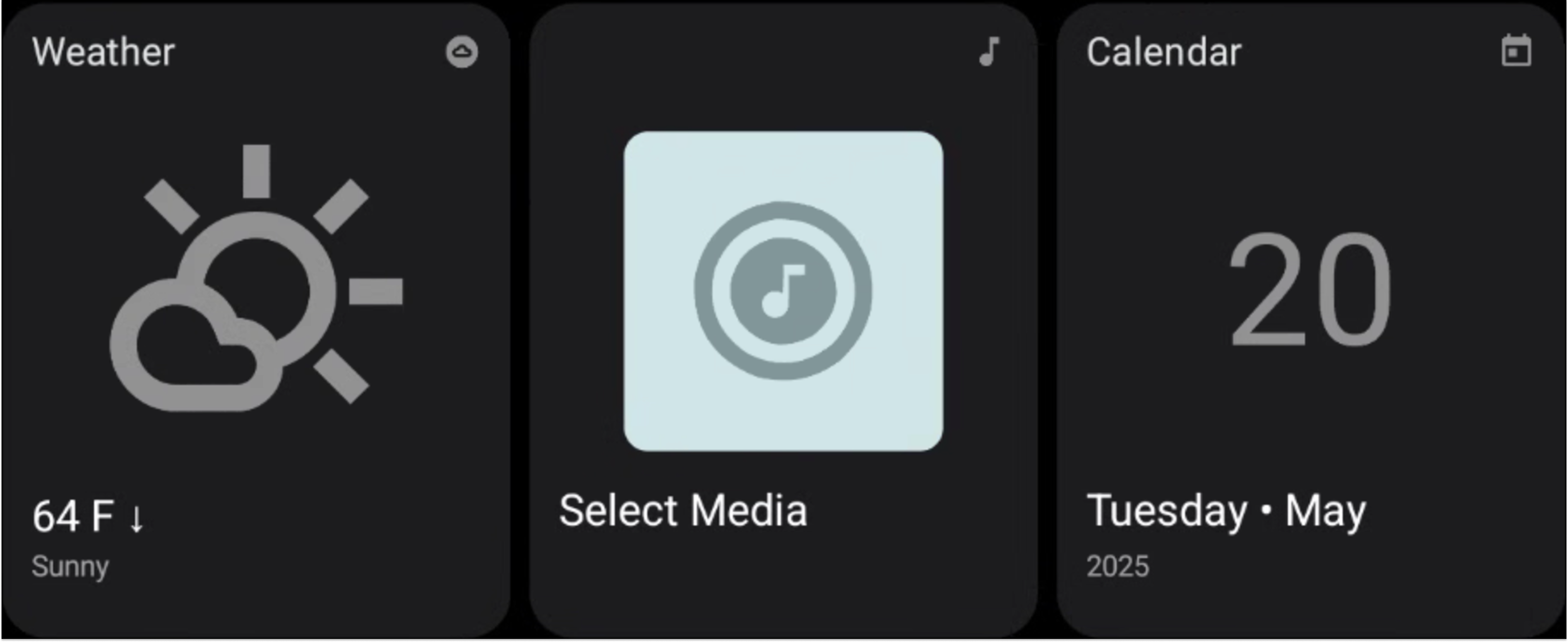
Figure 2. AppCard examples.
AppCard
Source: AppCard.kt
An AppCard is an object that holds data. We support an ImageAppCard, that has
two states. When defining any type of AppCard, each component must have a
unique ID.

Figure 3. Image with text. |
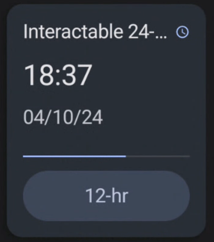
Figure 4. Progress bar and buttons with text. |
AppCard ContentProvider
Source: AppCardContentProvider.kt
A content provider that exists in an app, creates AppCards, and is instantiated
and communicates with AppCardHost. To learn more, see
AppCardContentProviderExtension.
AppCard Host
Source: AppCardHost.kt
A system app that connects to AppCardContentProvider(s) to display and manage
App Cards. To learn more, see Configure an AppCard host.
AppCard Context
Source: AppCardContext.kt
An object that provides hints to an AppCardContentProvider about how an
AppCardHost might display an AppCard. AppCardContext contains this
information:
- API level
Refresh period for:
- Complete AppCard updates
- AppCard components tagged with
EnforceFastUpdateRate
Is the host to support interactions with AppCard?
Maximum image size:
- Center image
- Button image
- Header image
Minimum number of buttons expected to be displayed.
This information allows AppCard developers to optimize the information sent to hosts.