
Starting in Android 12, Material You design focuses on expression and fluidity in the Android OS, with the goal of helping users create and own a single, cohesive experience catered to their needs. As an Android partner, you're encouraged to incorporate Material You design into your Android devices in the following areas:
- Dynamic color
- Motion
- Widgets
Dynamic color
Dynamic color is the centerpiece of Material You design and a key part of Android's multi-year strategy to bring simpler and deeper customization to its users in a way no other devices do. Material You offers:
Users and developers a consistent, rich story of personalization available in any Android device.
Android OEMs opportunities to continue innovating system UI and first-party apps in a way that's inline with their hardware and brand color, make, and form.
To take advantage of dynamic color, use the Android 12 Material You color extraction story as a key part of your software offering to users. On the device, use the color extraction logic that's in AOSP, especially the logic that takes in a single wallpaper or theme source color and outputs it through 65 color APIs. For dynamic color requirements, see Using Dynamic Color.
The full dynamic color flow includes four steps, as illustrated below:
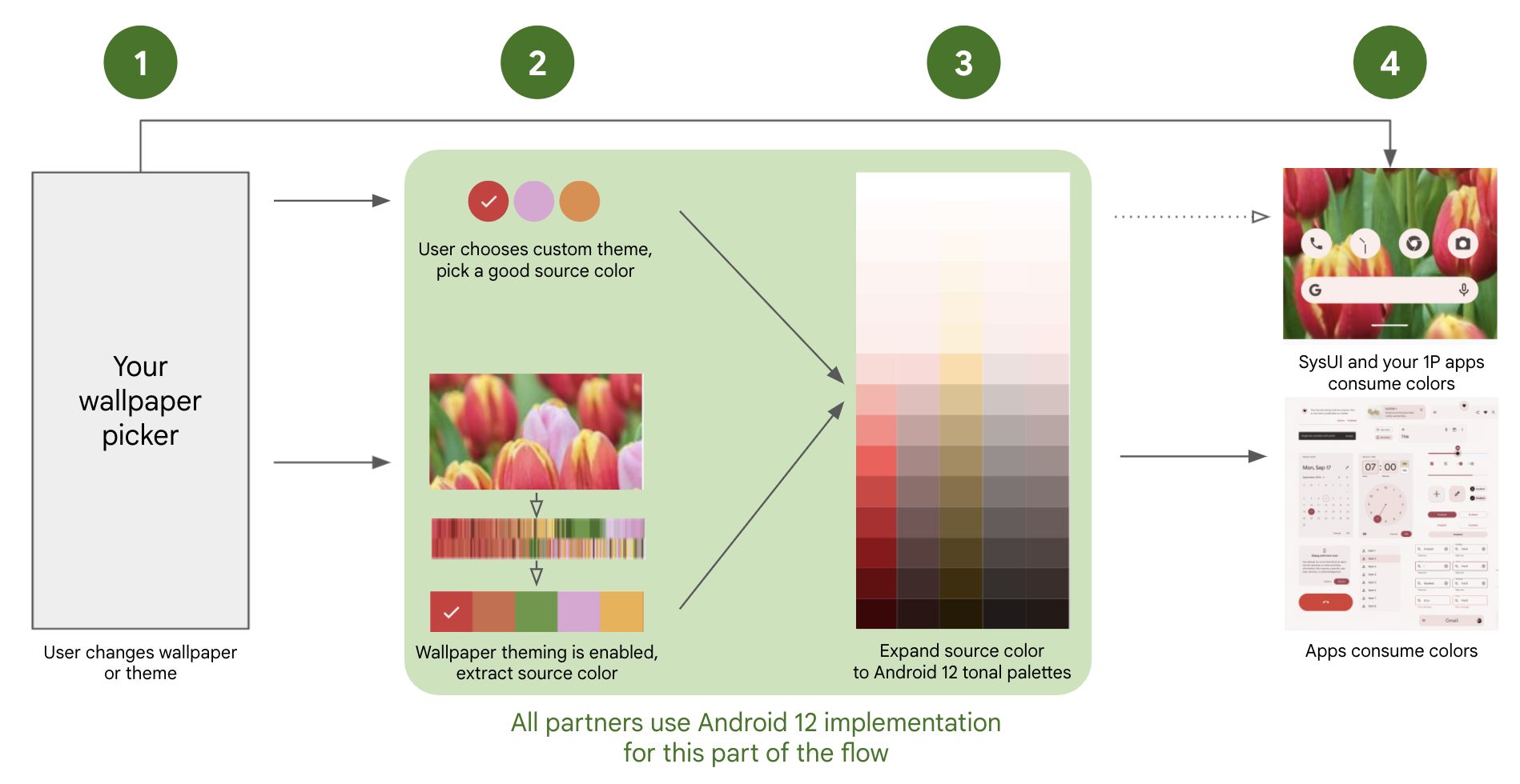
Figure 1. Material You dynamic color flow
The user changes the wallpaper or theme through the OEM picker.
The user selects one of the following:
Device theme. When selected, Android automatically picks a single source color that meets requirements.
New wallpaper + theme. When selected, AOSP logic automatically picks a single source color from the selected wallpaper.
AOSP expands the single source color into 5 tonal palettes with 13 tonal color variants each, as per the AOSP logic, which then populate the 65 color attributes.
The app UI uses the 65 color attributes in a way that's consistent across the Android app ecosystem. You are encouraged to use the same color palette for the device System UI and OEM-specific apps.
Android 12 patches
To get the end-to-end logic for wallpaper color extraction and to enable the device to fill the 65-color APIs in a way that's consistent with the ecosystem, include the following patches in your Android 12 implementation:
Mandatory
Strongly Recommended
- Fix race condition when setting boot color sysprops.
- Allow overlays to be notified about theme changes
- Fix race condition when setting boot color sysprops (round 2)
- Move FeatureFlags to flags package.
- Correctly implement multi-user theming support
- Fix specified wallpaper color option missing after reboot
- Fix error computing tertiary hue
- Don't allow background apps to change theme
Specifying custom colors on the ThemePicker
If you are using the AOSP ThemePicker app, the WallpaperPicker app shows the color section if both of the following conditions are met:
flag_monetonframeworks/base/packages/SystemUI/res/values/flags.xmlistrue.- A system stub APK with the package name is defined in
themes_stub_packagein thepackages/apps/ThemePicker/res/values/override.xmlfile.
Stub APK format
A sample version of this APK can be found in packages/apps/ThemePicker/themes.
This APK should contain only resources, detailing the available basic colors and their names.
The stub should contain an XML file under res/xml with the following format:
<?xml version="1.0" encoding="utf-8"?>
<resources>
    <array name="color_bundles">
        <item>color1</item>
        <item>color2</item>
        <item>color3</item>
        <item>color4</item>
    </array>

    <string name="bundle_name_color1">Blue</string>
    <string name="bundle_name_color2">Red</string>
    <string name="bundle_name_color3">Yellow</string>
    <string name="bundle_name_color4">Green</string>

</resources>
In this file, each item within color_bundles has a distinct
name, as long as the strings below are named bundle_name_item.
There should be a bundle_name_item string for each color,
with a descriptive name for each color. These can be translated by adding
the corresponding translated strings into the
res/values-language code directories.
The actual color values can be either on the same XML or on a separate resources XML file with the following format:
<resources>
    <color name="color_primary_color1">#0000FF</color>
    <color name="color_secondary_color1">#0000FF</color>

    <color name="color_primary_color2">#ff0000</color>
    <color name="color_secondary_color2">#ff0000</color>

    <color name="color_primary_color3">#ffff00</color>
    <color name="color_secondary_color3">#ffff00</color>

    <color name="color_primary_color4">#00ff00</color>
    <color name="color_secondary_color4">#00ff00</color>
</resources>
For each item in the color bundles array, there
should be a color_primary_item and a
color_secondary_item entry (and
both colors should be the same color). The values for these color
entries are the actual color codes for each color to show in the basic color
section.
Step 1: Build a user theming experience
The theme picker is where users engage with the new Material You personalization capabilities and potentially choose between color options or presets. As it fits your product and user demographic, you can offer users a richer personalization and color experience through the use of a theme picker or a wallpaper picker.
- When using a wallpaper picker, wallpaper color extraction is on by default. However, you can make some customizations to the picker to provide more options to the user.
Step 2: Extract wallpaper color into a source color
To enable wallpaper color extraction, cherrypick the Android
12 patches listed above (this functionality will be
enabled by default in a future AOSP release).
The AOSP logic that triggers wallpaper extraction starts at
frameworks/base/packages/SystemUI/src/com/android/systemui/theme/ThemeOverlayController.java,
on ThemeOverlayController#mOnColorsChangedListener, by way of
WallpaperManager#onWallpaperColorsChanged. We recommend using the unmodified
AOSP logic to ensure a consistent development experience.
By default, the logic picks the highest frequency color that's suitable for use.
To take advantage of other source colors returned by the algorithm and
present those colors to users in the theme picker, use
ColorScheme#getSeedColors(wallpaperColors: WallpaperColors).
To be suitable for use, a source color (whether extracted from wallpaper or a
user-chosen preset) must have a minimum
CAM16
chroma value of 5; this ensures that the source color isn't affected by subtle
dark tones when it's converted from a single color to 65 tonal colors and
remains representative of the user choice. To read and modify colors in CAM16,
use Cam#fromInt or Cam#getInt.
Using a non-dynamic color palette For devices that don't support wallpaper color extraction, you can still ensure that Google apps and third-party apps that support dynamic color look great by doing the following:
- Use the default Material palette by disabling
flag_monetonframeworks/base/packages/SystemUI/res/values/flags.xml.- Ensure users can still personalize their OS using a preset theme picker.
Step 3: Expand the source color into color APIs
Using the single source color derived from the previous step, Android generates 5 unique tonal palettes (accent 1-3, neutral 1-2), each palette including 13 colors, and each color including different luminance values (0 to 1000), for a total of 65 colors. The logic provided in the Android 12 patches implements this color expansion correctly; the details provided below describe the implementation.
For developer consistency, the 5 tonal palettes (accent1, accent2, accent3, neutral1, neutral2) and their corresponding 13 colors must be based on the single source color with the respective changes to CAM16 chroma and hue values as written below:
-
- Chroma: use "16"
- Hue: same as source
-
- Chroma: use "32"
- Hue: rotate by 60 degrees positive
-
- Chroma: use "4"
- Hue: same as source
-
- Chroma: use "8"
- Hue: same as source
CTS includes tests for validating luminance and hue API calls. To run, use
atest SystemPalette.
Step 4: Use dynamic colors in apps and System UI
After dynamic colors are set on a device, apps follow Material guidelines to utilize the colors. Material guidelines are due to release on material.io by October 26, 2021 for third-party apps to adopt. For System UI and first-party apps, we strongly recommend integrating dynamic colors throughout the user experience in a way that fits with your hardware and brand and helps you to differentiate your devices.
For general dynamic color guidance, see the following:
Use accent colors for foreground elements in apps and the System UI:
@android:color/system_accent1_0 … 1000 // most-used foreground color group
@android:color/system_accent2_0 … 1000 // alternate accent, used for surfaces
@android:color/system_accent3_0 … 1000 // playful, analogous color
Use neutral colors for background elements in apps and the System UI:
@android:color/system_neutral1_0 … 1000 // most-used background color group
@android:color/system_neutral2_0 … 1000 // used for higher-elevation surfaces
For more information on how Material You maps colors and how APIs are used in SysUI, see Additional Resources.
Step 5: Add dynamic color options in your AOSP WallpaperPicker implementation
Build for Android 13 and higher
Starting with Android 13, android.theme.customization.accent_color
is deprecated. A new attribute android.theme.customization.theme_style is
added to support different color variants. We currently
have four variants in the codebase as follows:
TONAL_SPOT = Default Material You theme since Android S.
VIBRANT = Theme where accent 2 and 3 are analogous to accent 1.
EXPRESSIVE = Highly chromatic theme.
SPRITZ = Desaturated theme, almost grayscale.
These are sent to Settings.Secure.THEME_CUSTOMIZATION_OVERLAY_PACKAGES, as
shown in JSON below:
{
    "android.theme.customization.system_palette":"B1611C",
    "android.theme.customization.theme_style":"EXPRESSIVE"
}
Build for Android 12 and lower
When using a custom theme picker, the device must send a valid source color to
Settings.Secure.THEME_CUSTOMIZATION_OVERLAY_PACKAGES by
providing a JSON file in the following format (where 746BC1 is an example
valid source color):
{
      "android.theme.customization.system_palette":"746BC1",
      "android.theme.customization.accent_color":"746BC1"
}
Doing this skips wallpaper color extraction (Step 2) and directly expands the provided source color into 65 color attributes (Step 3).
Step 6: File a ticket
Besides the system integration, you need to file a ticket and let us
know your brand name (Build.MANUFACTURER). Since most of 3rd-party apps are
using the
Material Components for Android
to show dynamic colors, we
are using a hardcoded
allowlist
to tell which devices have
integrated the Dynamic color tonal palettes feature.
Motion
Fluid motion makes devices feel modern and premium. To build and maintain developer trust and happiness, overscroll and ripple are two key parts of fluid motion that need to look and feel consistent.
Using overscroll in your OS
Android 12 includes a more responsive, dynamic overscroll motion in the form of a view stretch, shown when the user tries to scroll past the edge of a list. An example is shown below:
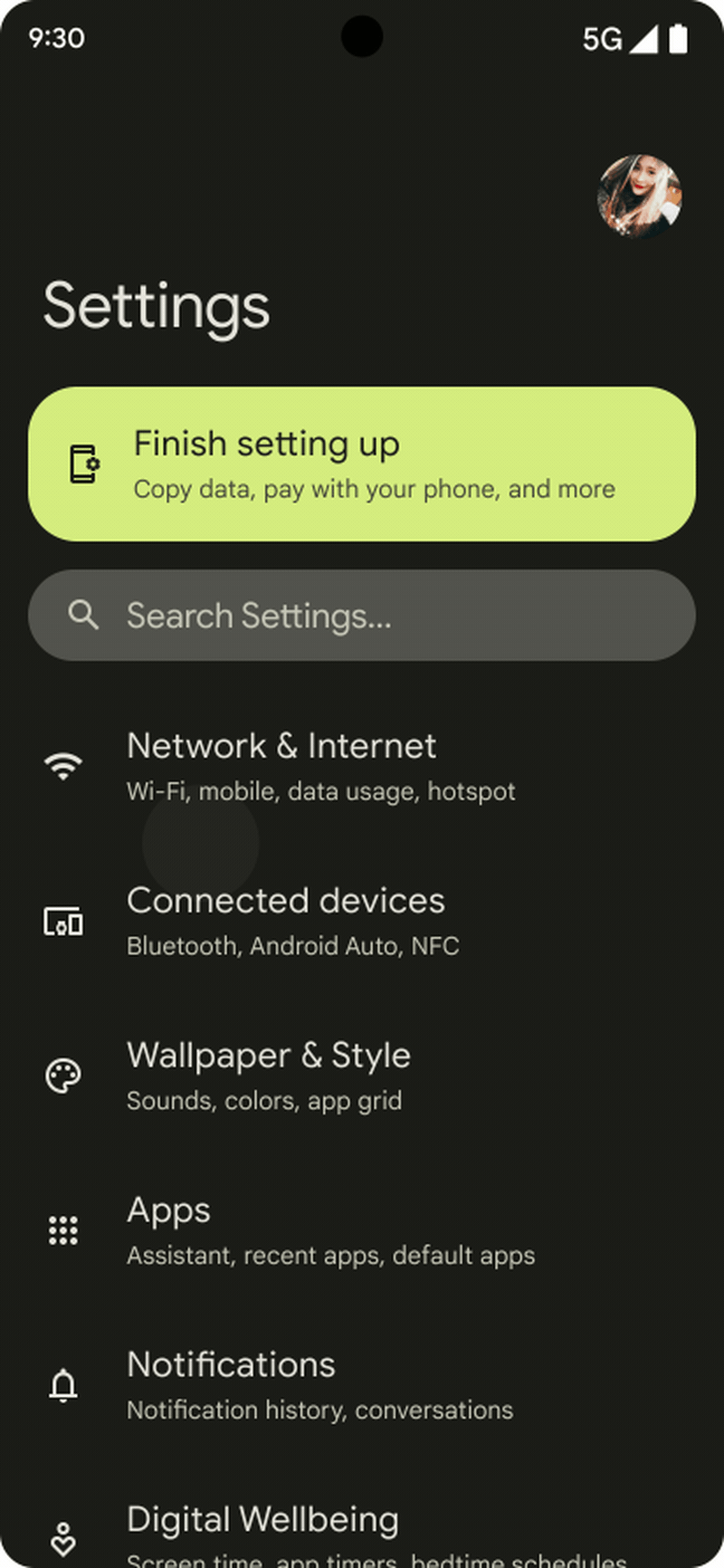
Figure 2. Android 12 overscroll effect, as shown in Settings
For developer consistency, ensure that the overall overscroll effect on your devices is similar to the following:
On devices that return true for
ActivityManager.isHighEndGfx(), the overscroll effect is non-linear stretch of the screen (as shown above).On lower-performance devices, the stretch effect is simplified to a linear stretch (to reduce load on the system).
Using overscroll in first-party apps
When using custom views, you might need to tweak some apps and system UI that use the stretch effect.
To support stretch overscroll, upgrade to the latest libraries:
androidx.recyclerview:recyclerview:1.3.0-alpha01forRecyclerViewandroidx.core:core:1.7.0-alpha01forNestedScrollViewandEdgeEffectCompatandroidx.viewpager:viewpager:1.1-alpha01forViewPager
For custom layouts that use
EdgeEffect, consider the following UX changes:With stretch overscroll, users shouldn't interact with the contents of the layout while it's being stretched. Users should manipulate only the stretch itself and not, for example, be able to push a button in the content.
When users touches the content while the
EdgeEffectanimation is happening, they should catch the animation and be allowed to manipulate the stretch. The current pull value is available fromEdgeEffectCompat.getDistance().To manipulate the pull value and return the amount consumed, use
onPullDistance(). This allows developers to smoothly transition from stretching to scrolling as the finger destretches the content past the starting position.When working with nested scrolling, if the content is stretched, the stretch should consume the touch motion before the nested content, or else nesting may scroll when the finger changes direction instead of releasing the stretch.
For details on overscroll, refer to Animate a Scroll Gesture.
Using ripple (touch feedback) in your OS
Android 12 includes a softer, more subtle touch ripple to provide feedback to users on tap down.
Figure 3. Android 12 ripple effect, with a softer fill animation
For developer predictability and to provide a great user experience, ensure that the ripple effect on your devices is similar to example shown above. While you don't need to perform any specific integration steps to support ripple effects, you should test the effect on your devices to check for any unintended regressions introduced in your implementation.
Widgets
Widgets are key components of an Android device. Android 12 includes new APIs and API capabilities that all OEMs should support.
In your OS, support developer APIs related to widget layouts, sizing, and software parameters (for example, rounded corner size). Your implementation should correctly support widgets in providing parameters through APIs and in ensuring widgets are sizable and configurable by the user.
In your apps, take advantage of new API capabilities to update or build new first-party widgets where possible. For all first-party app widgets in your purview, run through the developer checklist below.
- Priority is based on recommendations from the platform.
- For details on a recommendation, follow the link in the Change column.
Area Change Implementation priority Improve home experience Add scalable previews P1 Add a widget description P1 Make it easier to personalize widgets P2 (optional) Enable smoother transitions P0 Avoid broadcast trampolines P0 Adopt widget guidelines Improve widget sizes and layouts P2 Apply dynamic colors P0 Implement rounded corners P0 Add new compound buttons P2 Simplify existing widget code Simplify RemoteView Collections P2 Simplify RemoteView runtime P2
Additional resources
SysUI color use
(accent1 = A1, accent2 = A2, accent3 = A3, neutral1 = N1, neutral2 = N2)
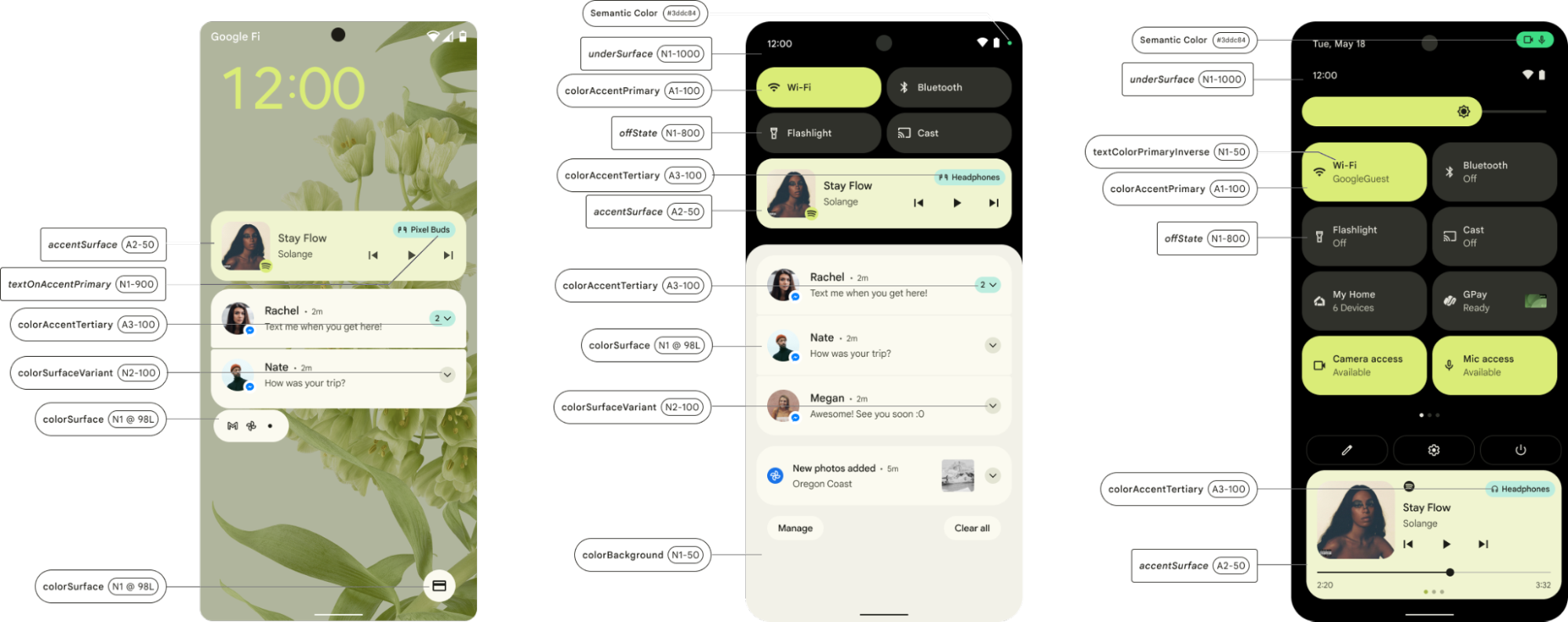
Figure 4. Dynamic color use in the System UI
Material library color attribute updates
Material will be updating its theme attributes in the coming release by creating color roles used to supply color to specific views.
| Color role | Android Theme Attribute | Light Theme Dynamic Color |
Dark Theme Dynamic Color |
|---|---|---|---|
| Primary | colorPrimary | system_accent1_600 | system_accent1_200 |
| On Primary | colorOnPrimary | system_accent1_0 | system_accent1_800 |
| Secondary | colorSecondary | system_accent2_600 | system_accent2_200 |
| On Secondary | colorOnSecondary | system_accent2_0 | system_accent2_800 |
| Error | colorError | N/A (red_600) | N/A (red_200) |
| On Error | colorOnError | N/A (white) | N/A (red_900) |
| Background | android:colorBackground | system_neutral1_10 | system_neutral1_900 |
| On Background | colorOnBackground | system_neutral1_900 | system_neutral1_100 |
| Surface | colorSurface | system_neutral1_10 | system_neutral1_900 |
| On Surface | colorOnSurface | system_neutral1_900 | system_neutral1_100 |
Material will be updating its states attributes with the following pointers:
| Color role | Android Theme Attribute | Light Theme Dynamic Color |
Dark Theme Dynamic Color |
|---|---|---|---|
| Primary State Content | colorPrimaryStateContent | system_accent1_700 | system_accent1_200 |
| Primary State Layer | colorPrimaryStateLayer | system_accent1_600 | system_accent1_300 |
| Secondary State Content | colorSecondaryStateContent | system_accent2_700 | system_accent2_200 |
| Secondary State Layer | colorSecondaryStateLayer | system_accent2_600 | system_accent2_300 |
| On Primary State Content | colorOnPrimaryStateContent | system_accent1_0 | system_accent1_800 |
| On Primary State Layer | colorOnPrimaryStateLayer | system_accent1_900 | system_accent1_800 |
| On Secondary State Content | colorOnSecondaryStateContent | system_accent2_0 | system_accent2_800 |
| On Secondary State Layer | colorOnSecondaryStateLayer | system_accent2_900 | system_accent2_800 |
| On Primary Container State Content | colorOnPrimaryContainerStateContent | system_accent1_900 | system_accent1_900 |
| On Primary Container State Layer | colorOnPrimaryContainerStateLayer | system_accent1_900 | system_accent1_900 |
| On Secondary Container State Content | colorOnSecondaryContainerStateContent | system_accent2_900 | system_accent2_900 |
| On Secondary Container State Layer | colorOnSecondaryContainerStateLayer | system_accent2_900 | system_accent2_900 |
| On Tertiary Container State Content | colorOnTertiaryContainerStateContent | system_accent3_900 | system_accent3_900 |
| On Tertiary Container State Layer | colorOnTertiaryContainerStateLayer | system_accent3_900 | system_accent3_900 |
| On Surface State Content | colorOnSurfaceStateContent | system_neutral1_900 | system_neutral1_100 |
| On Surface State Layer | colorOnSurfaceStateLayer | system_neutral1_900 | system_neutral1_100 |
| On Surface Variant State Content | colorOnSurfaceVariantStateContent | system_neutral2_700 | system_neutral2_200 |
| On Surface Variant State Layer | colorOnSurfaceVariantStateLayer | system_neutral2_700 | system_neutral2_200 |
| Error State Content | colorErrorStateContent | red800 | red200 |
FAQs
Color extraction
Once a user changes a wallpaper, is the color extraction automatically done or does it need to be triggered from somewhere?
With the Android 12 patches, the wallpaper color extraction is on by default.
ThemeOverlayController.java triggers the logic with
ThemeOverlayController#mOnColorsChangedListener and
WallpaperManager#onWallpaperColorsChanged.
For Live Wallpapers or Video Wallpapers, could we know when Color Extraction takes the color from the screen? Some users may want the colors from the last frame since it shows at the most time.
Color extraction is triggered when the user sets the wallpaper or after a screen
power cycle (in response to WallpaperEngine#notifyColorsChanged). The last
WallpaperColors event (from the live wallpaper) is applied after the user
turns off the screen and turns it on again.
Theme/wallpaper picker
How do I enable the theme picker to show multiple source colors for users to choose than the highest frequency color? Is there a way to get those colors from extraction logic?
Yes. In your theme picker, you can use
ColorScheme#getSeedColors(wallpaperColors: WallpaperColors).
There is a feature on Pixel names as themed Icon. Is it included in the three patches you have shared? How can OEMs implement that?
No. Themed icons are in Beta and aren't available in Android 12.
Is there a way to use the Google Wallpaper app with the color extraction and selection features enabled?
Yes. The features can be implemented in the latest version of Google Wallpaper app by following the integration steps described earlier on this page.
Reach out to your TAM for more details.
Can Google share the app or source code so that OEMs can implement their own version of the dynamic color preview on their settings menu, which looks similar to the preview section shown on Google's Wallpaper picker app?
The main classes that render the preview are
WallpaperPicker2
and
Launcher3.
The wallpaper preview screen is
WallpaperSectionController.
How to implement the Preview after changing the color, as shown in the Google Wallpaper app?
The Wallpaper picker app expects a ContentProvider to be available from
Launcher (a Launcher3-based launcher has it). The preview is provided
by
GridCustomizationsProvider
in Launcher, which should be referenced in Launcher's main Activity's
metadata
for the wallpaper and style app to read it. All of this is implemented in AOSP's
Launcher3 and is available to the OEMs.